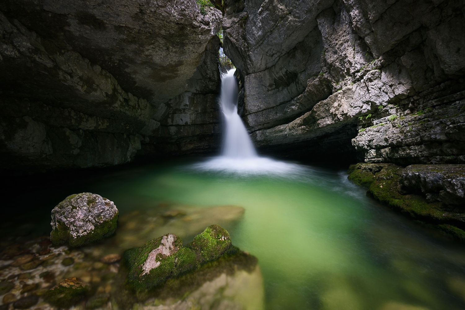
This is my first image for critique on NPN so I’m looking forward to hearing what you all think. I shot this in June in the Italian Dolomites. This little waterfall in the Parco delle Dolomiti d’ Ampezzo comes down through the top of a “cave” and was just a great little scene. I have other images and different comps but I particularly liked this one. Really interested in what you think? Thanks!
What technical feedback would you like if any?
Any Feedback
What artistic feedback would you like if any?
Any Feedback
Any pertinent technical details:
Shot with a Nikon D850, 16-35mm f4 @ 16mm - ISO64, F11, 5.0sec
You may only download this image to demonstrate post-processing techniques.
Welcome to NPN and the Landscape Critique Gallery! I’d say a wonderful first post and understand why this may be a favorite of yours from this location.
Honestly, no real suggestions on what you could improve or change. I really like the color in the water and the clean look to the falls. The surrounding rock walls are impressive in the inclusion of the exposed and submerged rock add great interest. Simple, straight forward comp that presents very well.
I think you handled the light well also given the nature of the scene. Of course dark with no detail in those areas between the rock and water. Perhaps a little dark to the left of the rounded boulder, but again I think it represents the scene as you viewed it.
I’m not sure if this would add or improve anything, but I’m wondering if warming up the light on the right hand wall might look good. The light striking the wall seems like white light. Minor thought.
I agree with Lon’s comments. I love the color in the water, and you did a good lob handling the dynamic range. I think the sunlit spot on the right could be warmed up, or, alternatively, select that area and use a curves layer to brings its tones down to that of the surrounding rock.
Welcome. I think you have a very nice image. The mood presented is very nice as is the choice of shutter speed for the water. My eye is drawn to the bright rocks on the right side. I’d look at selectively toning that down. The other spot that tends to draw me is the bare rock in the middle of the mossy covered rock. I think about toning that down and/or cloning it in with moss if you’re comfortable with that.
Real nice first critique post! I would agree with Keith’s suggestions about burning down the two areas. A bit of an eye magnet for me. But pretty minor stuff. Good work.
Hi Lon, Thanks for your feedback. I think you are right about the light on the right wall, I’m going to warm it up and see how it looks. I played around with the darks and opened them up but went back to a more “moody” balance for this version, it seemed to set off the nice color of the water.
Hi Preston, Keith and Harley - ( I was initially responding to each of you but then a “suggestion” appeared and said I should comment all in a single post ) Thanks for taking the time to comment - I think from all the comments so far that the light on the right is an area I can try to refine. I’m going to play around with it and see what I can come up with. It’s funny (and frustrating) because now I’m seeing that if I had just splashed the rocks in the foreground with some water it would have taken care of what has bothered me when working on this image since I got home…I guess I’ll have to go back