Critique Style Requested: Initial Reaction
Please share your immediate response to the image before reading the photographer’s intent (obscured text below) or other comments. The photographer seeks a genuinely unbiased first impression.
Questions to guide your feedback
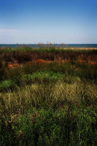
I saw this pattern last week on my trip around Barcelona. Although, I wasn’t sure if I like it, I took the shot. I worked it a little bit, but it still feels a bit “shaggy”. Maybe there are some warmer colors missing, too. What do you think?
Other Information
Please leave your feedback before viewing the blurred information below, once you have replied, click to reveal the text and see if your assessment aligns with the photographer. Remember, this if for their benefit to learn what your unbiased reaction is.
Image Description
Different layers of plants on a Spanish oiibeach.
Technical Details
1/100 s, f/22, ISO 125
Hi Markus, thanks for posting your image. You mention the word “shaggy” and I believe you are referring to the high frequency texture in the grasses and shrubs. I can see why you wanted to include that as a major part of the frame. There is some interesting layers of color there. I don’t think there is enough to keep the eye and viewer engaged and the subject feels a bit ambiguous especially with the sky competing for my attention.
I would recommend isolating parts of the scene with a longer focal length. Perhaps there is a section of grass with good repeating patters and shapes or there is contrast between elements and colors. Looking forward to see what you capture next. Thank you.
Thanks for your honest reply! I tend to give up on this, too 
Markus,
I’m way late on this after being out of pocket for a bit, but I wanted to comment on this one.
I quite like this actually. Yeah, kinda missing an anchor or something, but there are times when just the colors/patterns, etc. are enough. And clearly enough to be motivated to capture an image! I’m struck by the layers and patterns of colors - or “transitions” as you titled it.
Scenes like this can be interpreted differently as well, so when I look at this and see the exposure and contrast as a little dark, that doesn’t mean it’s wrong - just a different point of view. To me the scene is more light and airy than is presented here. So hope you don’t mind but I did a quick edit to see how it might go.
I did raise the exposure slightly, reduce the contrast (-dehaze a little bit). Raise the vibrance, but reduced the saturation a bit.
Then there’s the comp and framing. I too thought there was a bit too much sky. And for the top sky, I didn’t crop, but I did a marque selection of the sky and transformed (scale) and literally compressed the sky. Then I cropped to tighten up the bottom. The idea was to compress and balance the transitional layers.
The last thing, I wanted to mention the banding in the sky. No idea what caused that, and I’m assuming it’s not in the original RAW. So maybe be careful with saturation adjustments in large, single color areas? Definitely would work on that if you’re going to persue this one.
I just really like the layers and color transitions. Less sky helps balance all that out a little better, IMHO.
Thanks for sharing. Oh, here’s my edit:
1 Like
Thanks so much, Lon! Actually, I had already overthrown everything, because I was too ambiguous. My wife actually likes the image  Maybe I’ll keep it …
Hi Markus,
I think that your idea, about the transition, is interesting and may have work if the distant hill was hidden. This straight line, in the middle of an organic, mostly vertical landscape, is in contradiction with the rest of the image and, in this sense, bothers me. I would have loved to see another version taken with the camera placed a little closer to the ground.
1 Like

