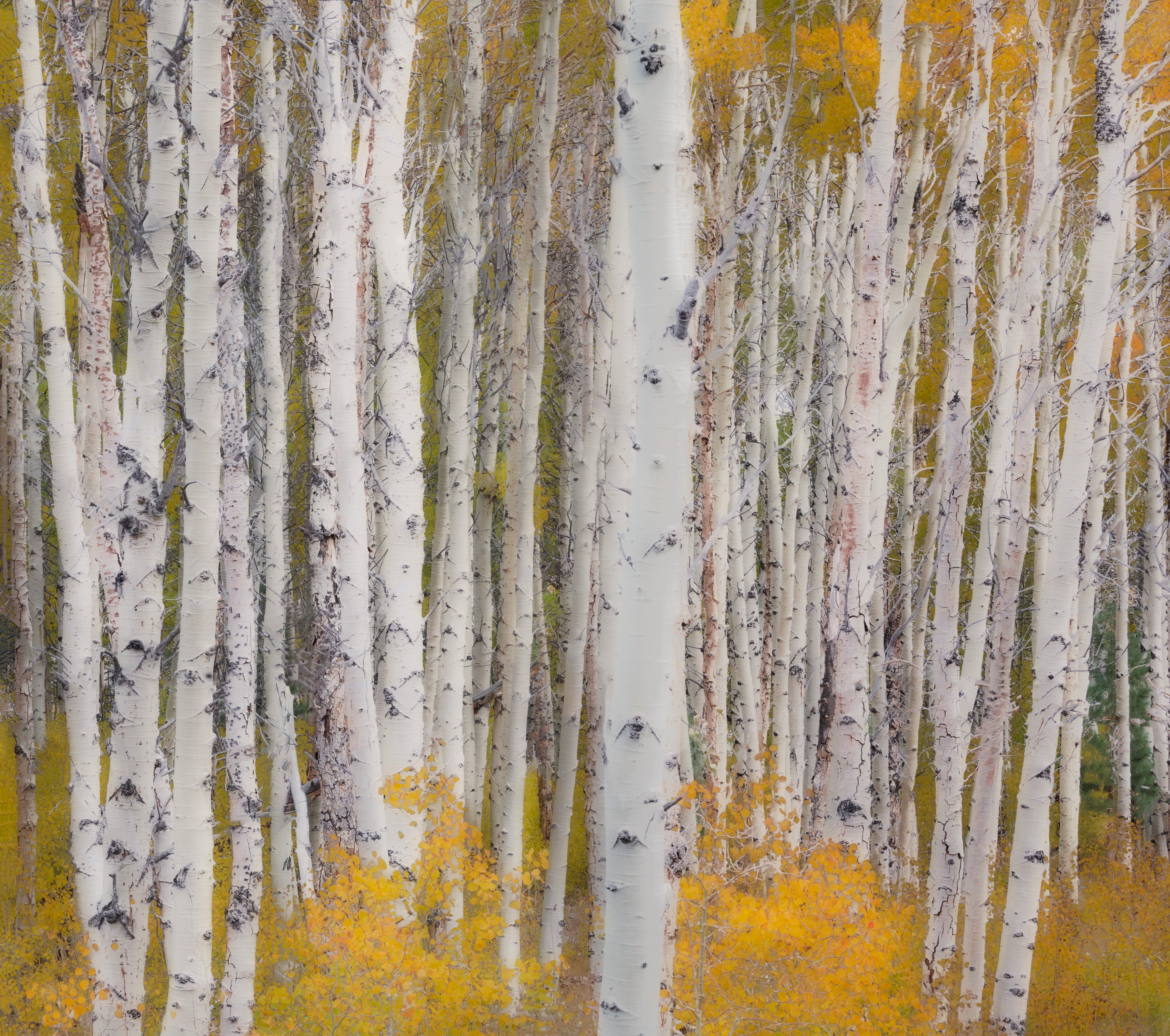
Here are two from the Eastern Sierra. I was pretty heavy handed with the Orten effect on both of them and would love your opinion. Does it work? Is it too much. Thanks!
What technical feedback would you like if any?
What artistic feedback would you like if any?
Any pertinent technical details:
You may only download this image to demonstrate post-processing techniques.
Summary
This text will be hidden
Hi Tony,
I feel the Orton effect on the first one is too heavy for that subject. It works ok on the second, although it is pretty high key. I might back off the whites a bit to bring back jsut a little more contrast and definition in the trunks where the Orton effect can really make a difference.
They’re very different from one another. I like the Orton effect in each of them for a different reason. The first seems like something out of a fairy tale. The second is more artistic. I like that interpretation of a birch forest. I think the composition is a bit weak. Some of the birch tones are so similar that they merge into one another. Given the monotone of the image I would suggest providing some spacing and let color provide separation. I would also warp those trees on the right to straighten them out a bit. But as far as the Orton effect is concerned, it’s a success in my opinion.
Hi Tony,
Too much Orton? I guess that’s all relative because it depends on what you’re trying to accomplish. I like the effect and in both these images I believe this elevates them to Photo Art.
I like the dreamy effect in the first one with the cottonwood although I think the aspen leaves on the right middle have lost too much detail, but then again, the effect works.
I also like the effect in the second one, although the front and center trunk kind disrupts the comp for mel It’s too white/bright and with no ribbing detaiil it’s more of an eyesore and takes away from all the rest of the beautiful trunks. I do like the rest of the impressionistic effect on the rest of the scene, but that front trunk upsets things.
Lon
Tony, I am finding the Orton effect a little heavy for my tastes in both, but especially the first. That said, I do like both. I would agree with Lon about the front tree in the second and that inspired me to try a crop, eliminating the right side to just left of the main front trunk. It works for me, but as always, YMMV.
Interesting ideas here. I like the composition of both, but agree with Harley that the Orton effect is too heavy. I also agree with Harley’s crop suggestion in the second image. I love the tree in the first one.
-P
Thanks for all the feedback. Indeed, interesting ideas. I’m a total Orton effect novice. I was bored one day and worked it into these photos so Ihave a lot to learn.