Critique Style Requested: Initial Reaction
Please share your immediate response to the image before reading the photographer’s intent (obscured text below) or other comments. The photographer seeks a genuinely unbiased first impression.
Questions to guide your feedback
Do images such as this arouse emotions?
Other Information
Please leave your feedback before viewing the blurred information below, once you have replied, click to reveal the text and see if your assessment aligns with the photographer. Remember, this if for their benefit to learn what your unbiased reaction is.
Image Description
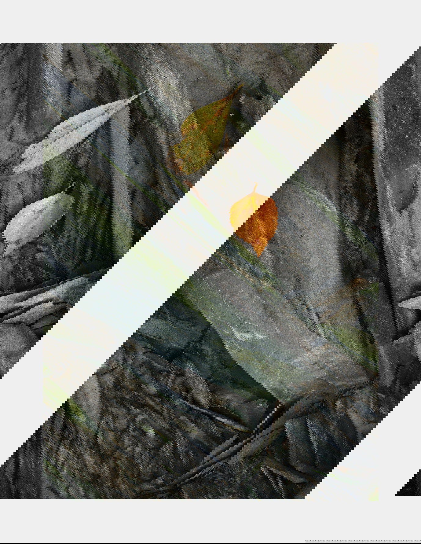
I thought I was done with Alaska images and was thinking of cleaning up when I came across this one. I can’t remember much about taking it. I think I became intrigued with the green rock taken in the previous image and decided to look for compositions with bright leaves on that same green darker rock. To me the leaves look a bit as though they had been placed there. I can’t remember if that was the case but I doubt it.
Technical Details
GFX50R, 120mm, f/11, focus stacked.
Specific Feedback
You’ll notice that this image is not as dark as the previous one. I wonder if I should darken it. At first I really liked the print but now I’m thinking it should be darker.
Critique Template
Use of the template is optional, but it can help spark ideas.
Vision and Purpose:
Conceptual:
Emotional Impact and Mood:
Composition:
Balance and Visual Weight:
Depth and Dimension:
Color:
Lighting:
Processing:
Technical:
1 Like
A peaceful, meditative image full of contrasts in color, temperature, texture; endurance versus impermanence, motion versus stillness, yet harmonious and tranquil. The passage of seasons prompting reflection on the passage of time. The soft, diffuse light along with muted greens and greys enhance the sense of peace. Familiar and tactile - you can almost feel the cool air, papery leaves, slick rock. I feel a connection to it.
1 Like
No words, Igor, just beautiful !! Ben
This was my emotion too, especially the contrast between the leaves and the rocks. Both are changing, but in very different time frames. The image captures those together and leaves me in a reflective and contemplative mood thinking about my own place in the circle of life.
I’m really enjoying this technically too. The layout of the patterns in the rock, and the subtle greens the lichen adds, are a wonderful foundation for the image.
There is a solemnity here, and I do think slightly darkening would add to that.
On a human timescale this speaks of permanence and fleeting existence.
This is very nicely done, Igor. The image presented here does not need to be darker, but a print may need to be depending upon the ink and paper choice. I like how the shards of rock mimic the shapes of the leaves, and vice versa.
I have really enjoyed this series of images!
-p
2 Likes
I’ve been looking at this image now for a couple of days and I wanted to make an observation. See that pointy nose-like thing coming in from the right side of the frame? I really like it. I think it adds a lot to the image. Without it the leaves would be on a background of shards all going diagonally from upper left to lower right. That would have been ok but would start to look ‘formulaic’. But having this break in the general direction provides a counterpoint that gets your attention. It makes it different than expected and draws your attention to it for a longer look. The question is whether I got lucky or was it intentional. I can’t remember honestly but I suspect it was intentional.
1 Like
It’s funny you mention that. My favorite parts of this composition and image are the pointy shards along the bottom edge of the frame just off center and to a lesser degree, the lighter shard that you mention. I think the complexity of the the lower right corner is amazing and adds so much to the composition. The one coming out of the bottom of the frame disrupts the large green rock going horizontally from upper left to lower right. Without that disruption, the composition would not be as strong. There is wonderful tension in that disruption and those shards also mimic the tips of the leaves. There is also tension/contrast in the color variance between the greenish/yellow leaf and the orange leaf that is really beautiful.
You are absolutely killing it with the rock series of yours. I am liking these as much as your Hawaii vegetation series. Maybe even more. This is so well executed. I have no helpful tips on this one. It’s perfect!
To me, leaves always look like they were placed there by the photographer even if they weren’t. And, almost anyone looking at an image with leaves perfectly composed in the composition will always wonder whether it occurred naturally or not. I also say, who cares. It really doesn’t matter. The fact that you can’t remember leads me to believe that they were naturally there and not placed by you. But again, it really doesn’t matter.
Igor, this is a very attractive image. The leaves contrast well both in color and texture with the stone. You’ve also got some great stone textures with the mix of wider areas and smaller bits. It would look “smooth” without the pointy bits coming in from the right, but they make a good counterpoint to the rest of the eye movement. Well seen.
I’m heartbroken about those images. My laptop crashed and I lost about 7 months worth of images because they weren’t backed up. I lost the Death Valley workshop and some Baja ones as well. Never thought I’d get so attached to my images. For a while I didn’t want to shoot anymore.