The photographer is looking for generalized feedback about the aesthetic and technical qualities of their image.
Description
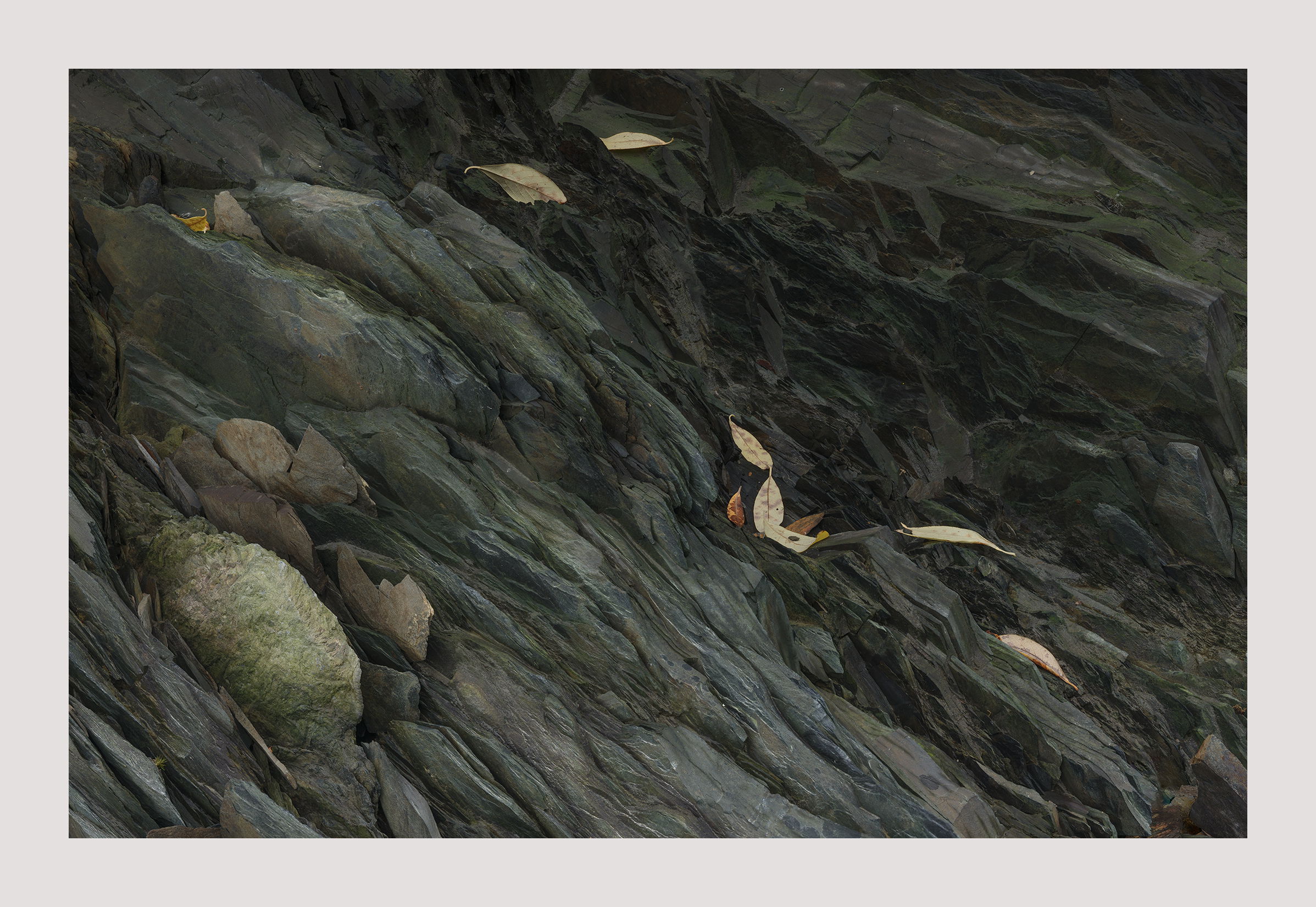
These leaves aren’t really falling but they sort of look like it, don’t they. I liked their arrangement. That’s what prompted me to make this image. Most of my Alaska images this year were like this. So if you don’t like this subject you won’t like the following ones.
Specific Feedback
There is sense that everything is sliding from top left to bottom right. Is this good or bad? I can’t decide. Sometimes I think I’m over analyzing something now that wasn’t apparent in the field. Or I don’t remember it.
Another possible issue is that the leaves are too bright. They do jump out at you but once again I don’t know if that’s good or bad. After darkening them I decided to leave them a you see them.
Technical Details
GFX50R, 120mm, f/11, focus stacked.
I really don’t like to change lenses. I just went with the same lens and moved further back.
Critique Template
Use of the template is optional, but it can help spark ideas.
Vision and Purpose:
Conceptual:
Emotional Impact and Mood:
Composition:
Balance and Visual Weight:
Depth and Dimension:
Color:
Lighting:
Processing:
Technical:
I like the strong diagonal lines in the rocks as well as the bright rock in the FG that is countered by the darker area of rock in the back of the frame, they balance each other well. The leaves do have the appearance of tumbling down the slope, that is a neat effect. The leaves also appear to create a dividing line between the FG and BG of the frame. It is an attractive and contemplative photo.
Igor: This is a marvelous comp and the implied movement is going in the right direction for our classic left to right consciousness. I also very much like how you handled the subtle color palette. Superbly crafted image.>=))>
Hi Igor,
This is a very understated image that has an air of mystery to it. I like the way the lighter tones on in the FG and they gradually get darker as they recede into the BG. I am also enjoying the sense of flow from left to right in the scene as well as the fallen leaves. To answer your question; the leaves are not to bright for my tastes. Very nicely done.
Igor, if you are referring to the small slivers just below the larger brighter stone, then yes, they could be cloned and not upset the balance of the composition. The larger brighter stone in that corner does help balance the comp and adds a little light to what otherwise would be a very dark area.
For me, and somewhat self-surprisingly because I find I’m susceptible to that sort of thing, no. I think it’s because that while they are brighter than the surrounding rock, they are “overwhelmed” by the brighter leaves that the eye leads to.
Here’s another one I never got around to, but I find it wonderful and engaging. All well-said above. Congratulations on the EP!! Whatever the variations you settle on, it is a wonderful capture that deserves the award!
No, those bright “lines” did not even register with me until you pointed it them out. As @Preston_Birdwell said, you could clone them out without really altering the photo at all. Also congratulations on the EP.
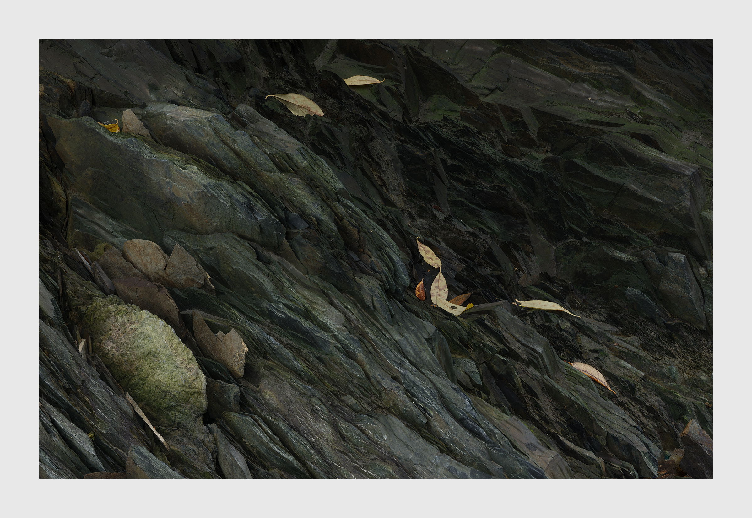
I got rid of the bright stuff in the corner. In the process the image got a bit brighter. I don’t know how that happened but it might be better off that way. I must’ve posted an earlier version to NPN.