The photographer is looking for generalized feedback about the aesthetic and technical qualities of their image.
Description
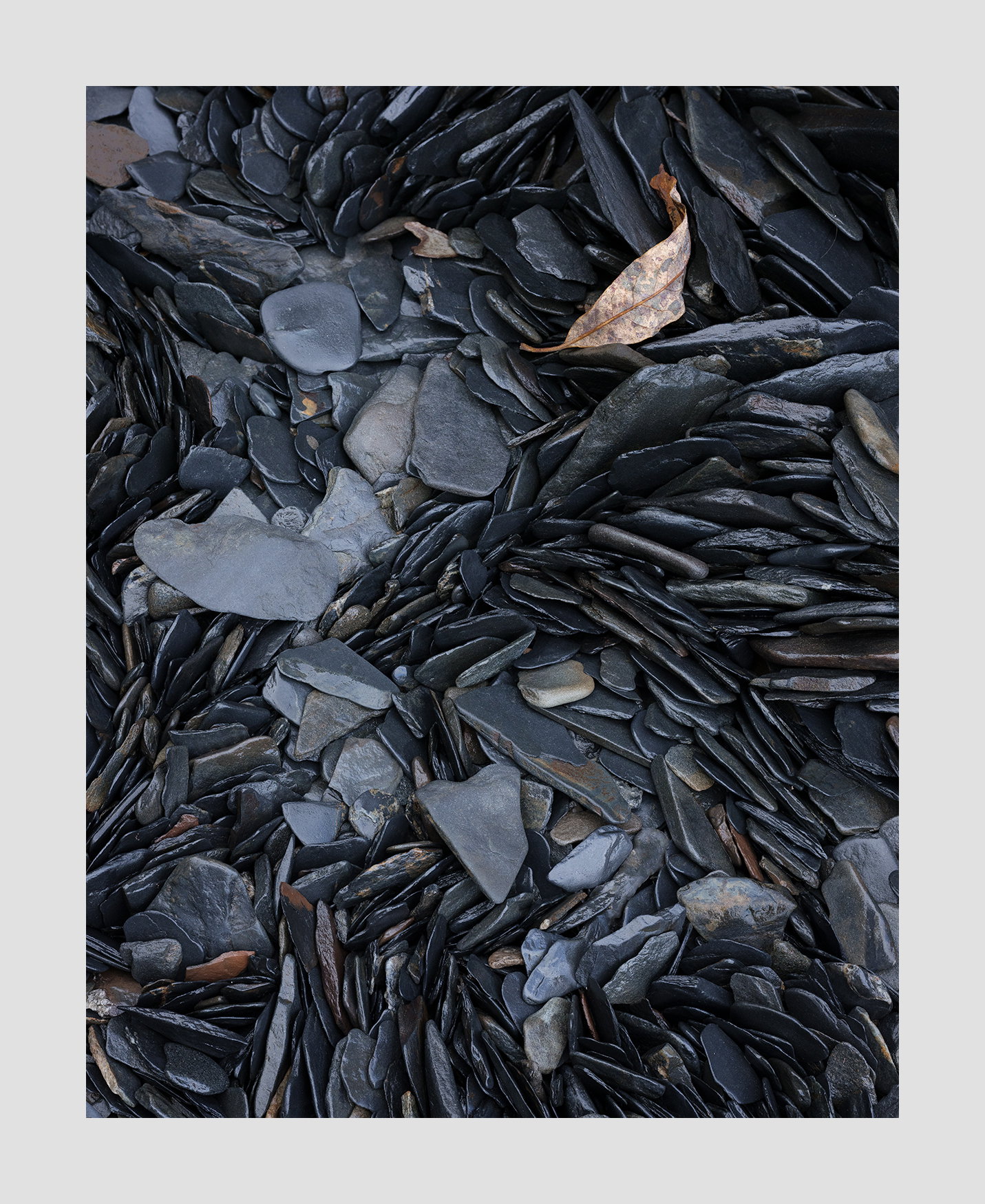
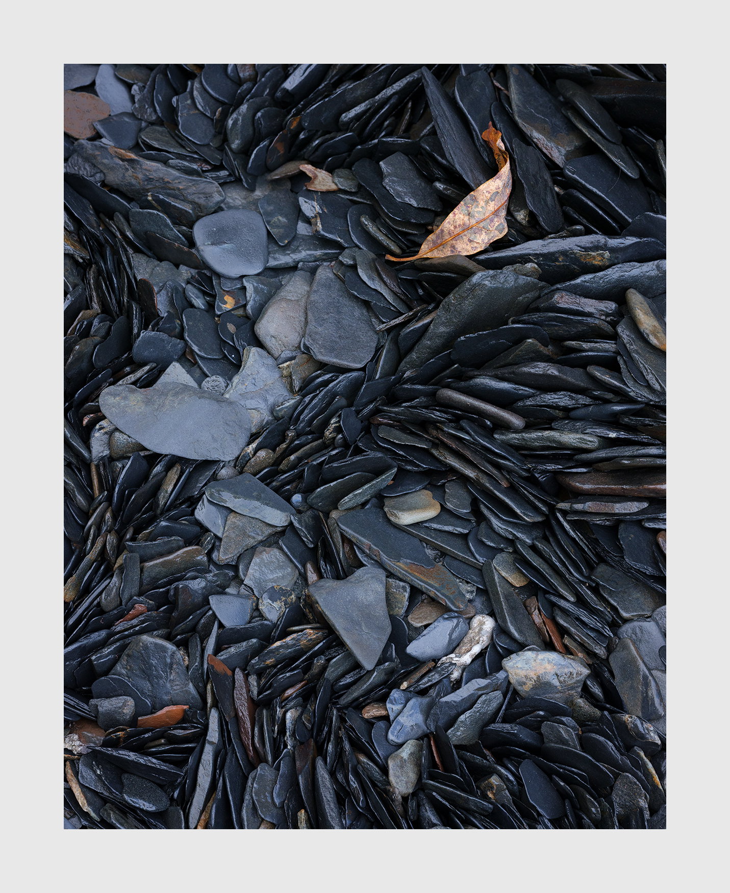
This was taken in Alaska in the Turnagain Arm near Anchorage. Large areas of this inlet is metamorphic rock that in places is highly fragmented into coin size stones that form ‘veins’. I had been attracted to these scenes for a while but didn’t have the lens to do them justice. I left them alone. But my recent purchase of the 120mm made such images possible.
Specific Feedback
I think my biggest concern is color - the lack of it. This is how it really looked but I think I can make it more interesting by changing the color cast and some saturation. What do you think?
Technical Details
GFX50R, 120mm, f/11, focus stacked
Critique Template
Use of the template is optional, but it can help spark ideas.
Vision and Purpose:
Conceptual:
Emotional Impact and Mood:
Composition:
Balance and Visual Weight:
Depth and Dimension:
Color:
Lighting:
Processing:
Technical:
Hi Igor,
This is a very interesting intimate landscape. I particularly like the implied circular motion of the stones in the bottom 3/4 s of the frame. For my own personal tastes I like your restrained processing of the colors as you have some subtle blue and red tones to compliment the blacks of the majority of the stones. The frailty of the solitary leaf makes for a wonderful counterpoint to the hardness of the stones. Very nicely done; no suggestions from me.
What @Ed_Lowe said! I love the way the leaf points to the C shape of the lighter stones, which comes to an end in the LR corner. I wouldn’t change a thing!
Very nice, sir! The stones have a great rhythm to them, and I love that leaf. If I had one suggestion it would be to tone down the brighter stone in the lower right quadrant. It catches my eye. I also like the subdued processing. The color is lovely without being in your face.
-P
Igor, I looked at this one for a long time. I like the composition very much. The colors are fine. I would darken both of the bright stones in the lower right. The contrast in that area keeps drawing my eye away from the remainder of the frame.
I’m always impressed by the care you take in composing a shot. It shows in the result.
Oh, don’t change the color. It is perfect as is. It has enough of a blue cast to be “colorful” to my eye. The imbrication of the stones is very cool. The only (tiny) nit I have is the ULC, with those 2 lighter colored/less saturated stones. They catch my eye a bit.
Well, I just got off the plane at Seattle. I showed my work to my neighbor in the row. She said this was her favorite image of the bunch. So I guess it’s all downhill from here on.
Ed and I camped along Turnagain Arm on one of our trips to Alaska, but all I remember seeing were vast mud flats after the bore tide receded. Alaska is on my bucket list for a return.
I wouldn’t change a thing. I love the composition with the implied motion of the rocks.
My neighbor wanted to know as well. I can tell you exactly where this is. The problem is that these scenes are so minuscule that you don’t recognize them unless you’re stooped over and really looking.
What a great image, Igor. The tones are so luminous and the predominantly cool colors work well to give that warm leaf some extra pop. Someone mentioned toning down the brighter rock in the LRC and I agree that doing so would prevent my eye from wandering over there. Images like this are hard to “see” in the wild but you’ve got a great eye for them.
Love these tidal organised skimming stones my kids would have a field day bouncing those off the surface of a still lochan. Love the way they randomly stack themselves in a vertical plane. for the record I prefer the original version yes the stones below distract from the singular highlight leaf above, but not in an unpleasant way, arguably the stones below encourage you to migrate your vision around the frame, gently directing you elsewhere. Also I think the originl has a touch more colour contrast punch.