The photographer is looking for generalized feedback about the aesthetic and technical qualities of their image.
Description
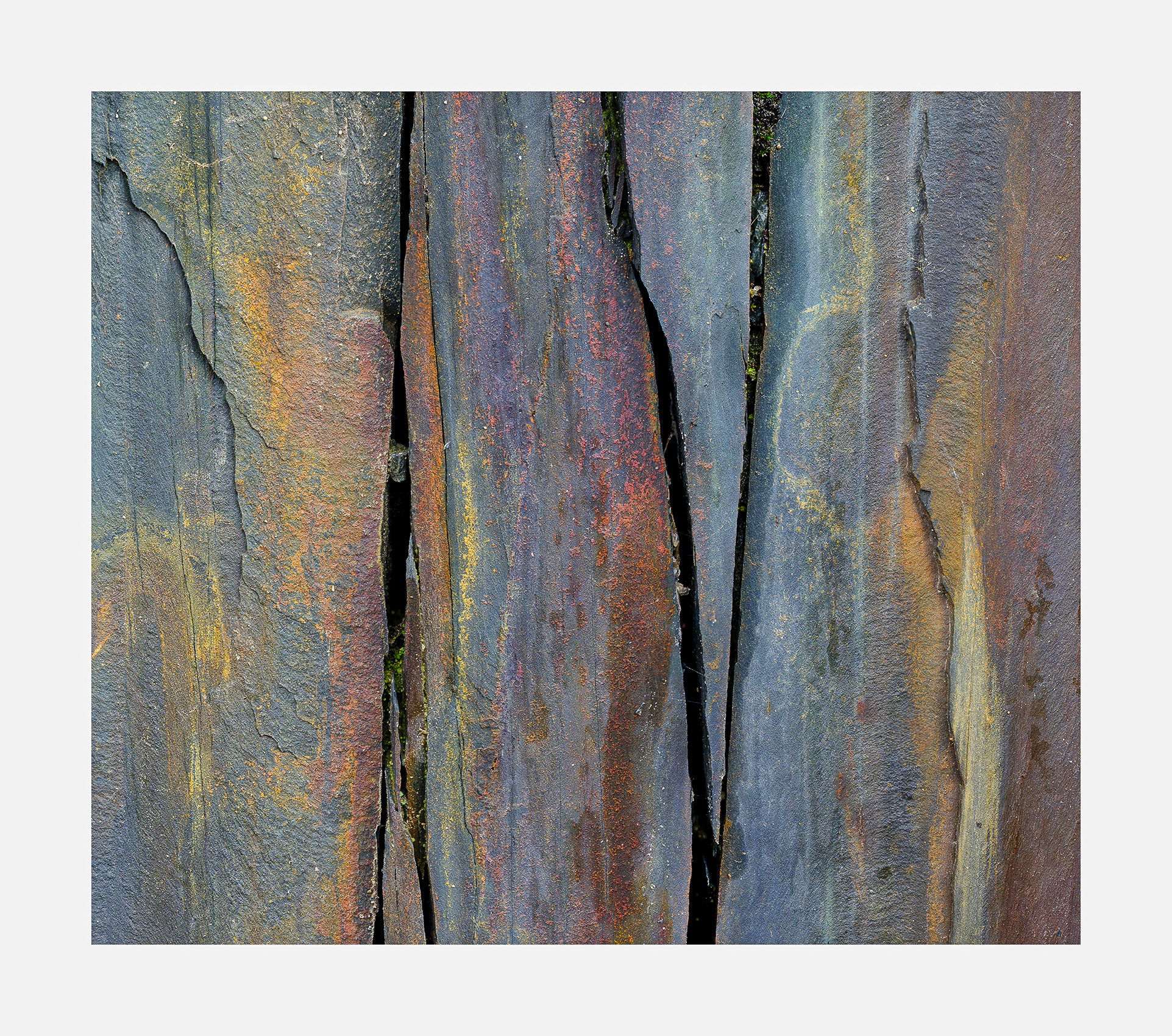
This picture was taken twice. I thought I could improve the composition by going back and I think I did. It was quite difficult to make due to the fixed focal length lens. The tripod needed endless readjusting to get the composition the eye saw. It’s a slow painful process. The zoom lenses are much easier to work with at such close quarters.
Specific Feedback
The biggest question I have in processing has to do with saturation. Does this have the right amount of saturation? There was 2 ways to go with this - make an art abstract with vivid colors or make it look believable for what it was. For this image I went with option 2 but I’m not convinced that was the right decision. What do you think?
Technical Details
GFX50R, 120mm, f/11, focus stacked
Critique Template
Use of the template is optional, but it can help spark ideas.
Vision and Purpose:
Conceptual:
Emotional Impact and Mood:
Composition:
Balance and Visual Weight:
Depth and Dimension:
Color:
Lighting:
Processing:
Technical:
Hi Igor,
This looks pretty darn nice to me as is. The colors look very natural and not overdone; perfect for my tastes and the spacing with the fractures nicely divides this intimate scene into thirds. When I opened the large version I was greeted with some lovely textures and details. No suggestions from me. I think this one might be my favorite so far of your rockscapes.
I thought about that a lot. In the end I decided to keep them. I decided I wanted to keep things imperfect. I have recently been influenced by Japanese aesthetics. I saw those white blotches as an example of Wabi Sabi. Here is an expose on that:
I personally love the colors just as they are. They are completely believable and not overdone at all. The contrast seems just about right. When blown up large, the textures are incredible. My favorite part of the image is that jagged spear like dagger in the right center of the frame along with the smaller spear like dagger poking up from the bottom of the frame left center. It looks like a puzzle created by nature. It’s pieces are not a perfect fit just like nature itself. That brings me to the little white splotches. I’d be ok with the removal of them but this seems like something etched in nature over millions of years and having the rock be perfectly unblemished might take away from that feeling.
As far as making this into an abstract I think people would know what it is and so making the colors and contrast a little bit more on the crazy side might now work. I appreciate that you showed us a more realistic version of this frame. By the way, the composition is just perfect. Nicely seen and rendered.
I think this is a near perfect image, except for (going against your vision here) the white specs. The colors, saturation and composition are excellent. Painters ( I consider this like a 2 dimensional painting) such as the Hudson River School often presented idealized, more perfect visions of nature. To me the spots are kinda distracting, like bird droppings. That’s just my opinion of course and you can tell me to go pound sand.
Actually I think they were bird droppings. Also, if you look at the top left corner you will see dark vertical streaks. That’s from intermittent rain.
The whole subject of imperfection is an interesting one and I’m not entirely clear about it. If imperfections are desirable then when does an image become unacceptable? It seems to me that that opens the door for bad images to be claimed to be good. Clearly there is more to this than just accepting all imperfections. So far I have come up that imperfections that show aging can be desirable since aging is a process where things become imperfect. But that’s not the whole story in my opinion. If you scan a wall such as this it is the little incongruities and surprises that make it interesting. More interesting than a set of colored panels. Am I rationalizing something here? Maybe. I don’t know. What I do know is that initially I found the white blotches and streaks offensive but I grew to like them over time. And yes, I do like your rework without them as well.
Maybe it’s unintended imperfections that need to be removed. But if the imperfections are purposely made or included then it’s the decision of the viewer to go with what the photographer has created or not. It’s like the ‘deformed’ pot in the video. It’s purposely deformed but it’s your right to want a perfectly symmetrical pot. I actually did remove some of the white spots near the borders that I thought led you out of the image. So it’s not as though I wasn’t aware of the impact of these white areas.
I’m not a fan of oversaturated photos and I’d say option 2 was the right choice. This is such a simple image yet the variety of colors add a bit of complexity. Your composition is perfect. The spacing between the cracks and the edge of the frame is spot on. It’s neat that each “section” of rock, i.e. the pieces between the cracks, all have the same colors but in different quantities, saturation and brightness. Very well seen, Igor.
This is very nice and I like this a lot - it almost looks like a spectrograph in rock. The colours look very natural and yet they have strength and presence to them. The black cracks in the rock add another fantastic element and interest to the image.
Igor: You are clearly a master at discovering these marvelous comps. I find it interesting how such small elements as the spots affect my impression of the image. With the spots this looks more literal and I like seeing all the tiny textures. Without the spots it has more appeal as an abstract and I really don’t care about the textures but more the color (which looks great IMO) and flow of the rocks. A wonderful find and a fine presentation. >=))>
I’m not sure anyone is clear on it but more like you know it when you see it. When you see a bad image with junk all over it you instinctively know it’s just not a good image or at least a good concept of an image. I think if the imperfections distract a lot then either the concept is not great or you should remove some of the distractions. I find that the cleaned up version of this image looks like a piece of tile I would buy at Home Depot for a patio ground cover. It’s too perfect, no blemishes. It’s just not real to my eye. You can scroll through Home Depots home page for tile and find a dozen just like this.
Now, I’m not saying it’s wrong to like a perfectly scrubbed and cleaned up version but to me it just doesn’t look NATURAL. Your previous post with the spider webs works well for me and I even said so. Now if that same image had spider webs all over the face of it then the subject doesn’t work and the image would be poor. I guess it’s degrees of imperfection and for each person those degrees are going to be different and that’s perfectly fine. I don’t think there is one answer for this but it’s an interesting subject for sure. I know this subject drives @Kerry_Gordon crazy. Nature is not perfect and I don’t think we should feel the need to unblemish our images to point of being naked. I’m about to post an image of mud tiles in Zion after a torrential rainstorm a couple weeks ago and there are lots of blemishes that I could remove but haven’t. Some will like it and some probably will want it sanitized because it’s so easy to do now.
I wish I knew. I might even reach out to him to see how things are. He would frequently disappear for several months depending on his canoe travels up in Canada but it really has been a while. I’ll let you know if I find anything out.
Another wonderful image, Igor!! So much said above so no need to repeat. And with or without – it’s just a twofer for me – both are wonderful! But, really, if you have your hands around my throat, I’d go for the cleaned up version. It just has an amazing purity!
My take on the wabi sabi thing with imperfections is that for it to be art you want perfect imperfections.
A wonderful image. No need to add something, everything has been written already.
I like both versions, with and without the white sports. W.r.t. the dark vertical streaks in the top left corner: I think they add interest to the image.
I’m going to watch the video.
The colors here are wonderful Igor, but I think the lines you captured really add so much too. This is a wonderful snippet, and well seen.
I definitely think you made the right choice on saturation. I love color, but you have plenty here and taking this to a surreal level would likely detract IMHO.
I find myself leaving imperfections more than I used to, although a common technique I use is to isolate them with a mask and to “dim” them so they don’t snag the eye as much. That would be an option here if you so desired.
This is, for me, a fantastic find. I’m a fan. Composition and color are beautiful.
I do not care for the bird poop. Streaks from rain, yes. The white is distracting, and I think the edit offered above adds a lot. The imperfection is found in the cracks and cravasses, not the detritus.
What I’m missing here is the texture of the rock. The light appears to be fairly flat, and I want to see more of the details without having to pixel peep. A touch of clarity, a touch of texture (in LR) adds a lot of character (to my eye…).