Any
Any
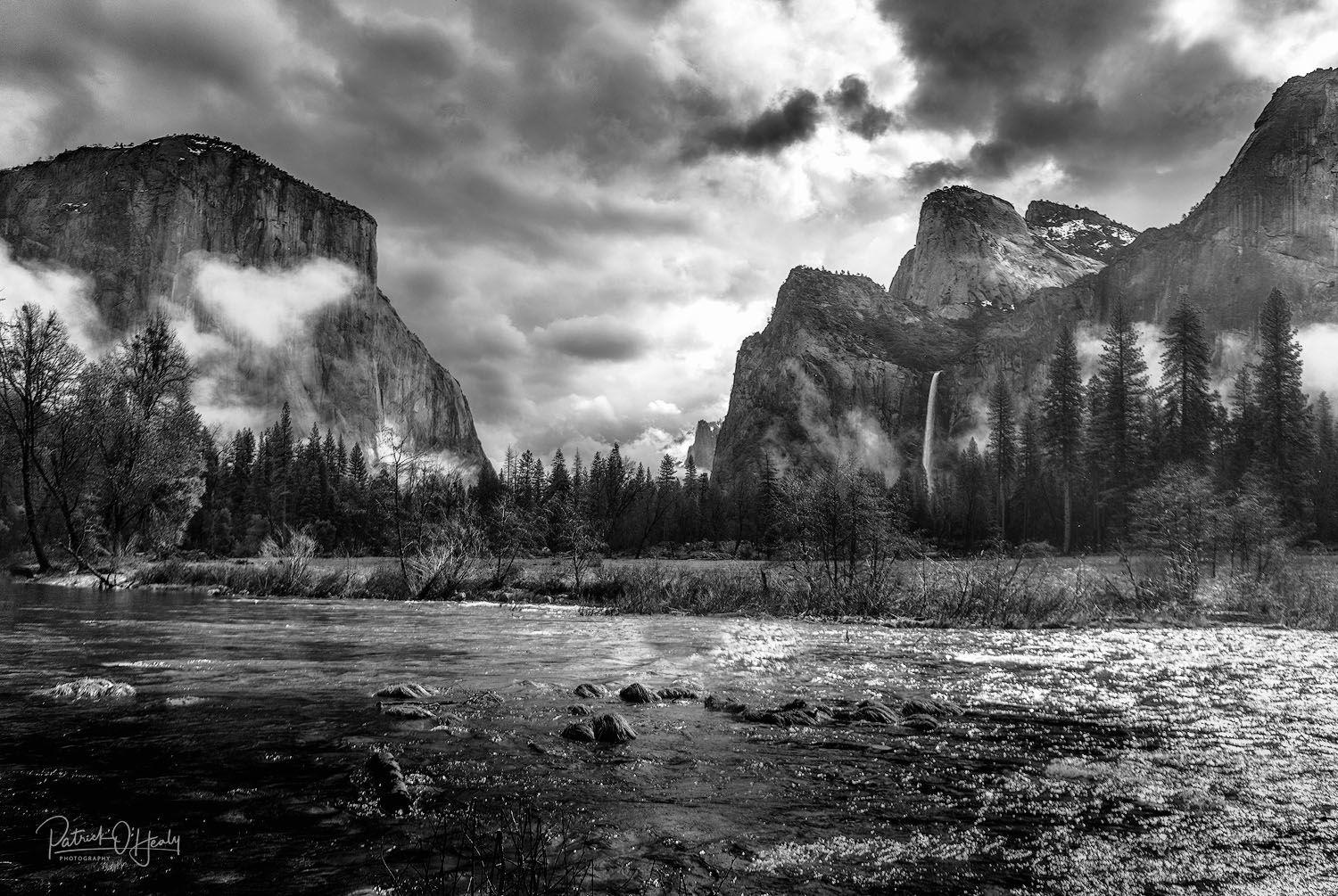
While in Yosemite a month ago we were blessed with weather that challenged other tourists. We loved the stormy skies and were up early every day to shoot our favorite locations.
Nikon D850. Nikon 24-70. 24mm. handheld 1/6400. f/2.8. White Balance Auto ISO200. Processed in Lightroom Classic CC, PhotoShop CC, TK and Luminar Flex.
If you would like your image to be eligible for a feature on the NPN Instagram (@NaturePhotoNet), add the tag ‘ig’ and leave your Instagram username below.
#patrickohealy
You may only download this image to demonstrate post-processing techniques.
1 Like
Hi Patrick. Could you give us an insight as to how you processed this image? I have some thoughts that I think may help but I don’t want to start down the wrong road here.
Cheers,
Eugene
Eugene,
I originally processed this and when a friend asked for a 60x40 print, Keith Bauer and I worked it over to do the best with it. If I had known it might be a large print I would have used different camera settings and a polarizer. My wife and I have been playing with bokeh and I shot this as an experiment thinking water bokeh would be interesting. If you wish for me to take screen shots of my Lightroom and PS history and send them to you, I am happy to do that off line. I think that putting it in this feed is more than I should.
Many thanks for your interest and offer.
Best,
Patrick
Hi Patrick,
I was not after anything that drastic. More just a brief overview of what you did, etc. For example, did you do significant dodging and burning to the sky? Is it an HDR image? or similar.
I had wondered why you had shot at 2.8 and now I know why. Likewise I was going to suggest using a polariser for the water and maybe add a touch of contrast to the sky. But you have answered these for me.
So, my thoughts on the processing. To me it looks a bit unnatural and maybe a bit over processed. Especially in the sky. From the look of things (and correct me if I’m wrong) you have brought the highlights down significantly especially om the sky. That can often result in inky black clouds like you have here. I would suggest building up some selective dodging/burning to get the contrast and the depth spot on.
The rest of the scene comes across across as a bit ‘harsh’. The clouds in the valley appear to contrast very harshly with El Cap and the other faces in the valley. I would consider toning the contrast levels down a bit to make that it all a bit more subtle.
There is a bush in the immediate foreground that I would consider cloning out as it distracts my eye from what I assume is brown tufts of grass in the river.
Hope this all helps.
Cheers,
Eugene
Patrick, i really like the composition that you have here, and the clouds and mist are very dramatic elements. Unfortunately I have to agree with @Eugene_Theron that in general this looks over processed and harsh from a contrast standpoint. As a general philosophy, many here at NPN would say it’s okay to push contrast for creative effect, but while still trying to keep it natural looking. To my subjective taste this verges too far away from natural, especially in the land and water.
You can get away with stronger contrast effects if the image is converted from color to B&W. Just for fun I did a very basic B&W conversion of your image, without any contrast or exposure adjustments, and I think it works better in B&W than color IMO.
Thank you for your feedback Ed. Since Keith Bauer and I did the final version of this desk top sharing, I suspect that the translation to internet posting has somewhat altered the image. Your black and white rendition is very dramatic.