Wallace Falls, Washington State

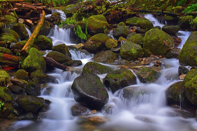
I was hiking in Wallace Falls State Park in late January last year on a cold cloudy day.
Perfect for waterfalls. I took a number of angles but this one turned out the best. I used my Nikon 5600 with my Legacy Lens Nikkor 50MM 1.2 with a Neutral Density filter and a long exposure.

Type of Critique Requested

  • Aesthetic: Feedback on the overall visual appeal of the image, including its color, lighting, cropping, and composition.

Specific Feedback and Self-Critique

I am always drawn to running water and waterfalls, especially showing the blurred movement of water.

Technical Details

The picture was processed in Lightroom, but I only did some light dodging and added some saturation.

1 Like

Hi Mike,
and welcome to NPN! I hope you will enjoy this community as much as I do.

Just like you, I can hardly resist photographing running water.
And that’s a beautiful first image. There are many nice little cascades to explore, I can literally hear the water.

If I had to change something about the image, it would be two things:

  1. Some colors are in my opinion slightly too much saturated. And due to the chosen white balance, there is some magenta cast in the water.
  2. There is a bright spot in the water that distracts my eye. It seems to me that the highlights are blown out in this area.

I downloaded your image and played around with it a bit. Here is the result:

  1. First I tried to change the White Balance to remove the cast
    image
  2. In the color mixer I lowered the saturation a bit, especially in the reds and oranges, because of the trunks and branches in the upper left of the image
    image
  3. I cropped the image slightly to remove some distractions at the edges
  4. Finally I used the clone stamp in PS to take care of the bright spot in the water (lowering the highlights here wasn’t enough because the area is really blown out).

Again, this is a really nice scene. I could spend hours photographing stuff like that.

1 Like

Thanks for the feedback on my image. I have been taking nature pictures for many years and am somewhat of a traditionalist when it comes to processing images since I started with my Nikon FE many years ago. I am getting more into Lightroom now to get more out of my pictures.

Hi Mike, welcome to NPN. I hope you’ll get a lot out of this community. This is a wonderful image. Flowing water is always fun to shoot. The composition is terrific. You mentioned being a bit of a traditionalist. My first reaction to the image was that it reminded me of Velvia film, very saturated greens/yellows/reds. I like what @Jens_Ober did with the saturation and color cast. Of course, if your intention was to have it more saturated, that’s entirely your call.

I look forward to seeing more of your work here.

Regards,
David

Hi Mike and welcome to NPN. I love little cascades and waterfalls. They’re so much fun to shoot and I really like the small frame you’ve put together here. I especially like the branch on the left as well as how low you got to the water itself. That said, I definitely see a color cast going on - the water looks bluish purple and that can’t be right. I think a white balance shift could take care of that (Jens’s version addresses some of this, but not all on my monitor). Also the greens are a little hot, an easy thing to do and also an easy thing to fix.

Lightroom has two ways you can address this - the Calibration panel lets you change the saturation and hue of the three colors that make up every pixel in your image. By moving the blue or green slider saturation down, this can be the only fix you need. Bear in mind it’s changing the value of the color in the pixel itself and therefore will change every single one of them even if none is displaying blue to our eyes.

The HSL panel can also adjust color, but it does it as color values are displayed, not at the pixel level. So by moving the blue or purple slider there, you won’t affect the green foliage much at all, only the blue/purple water. Does that make sense? Hope that helps. I’ve been using Lr since 2009 and am still discovering things about it.

Anyway…hope to see more of your work and your comments on others’ work. If you have any questions about the site, please feel free to reach out via PM or use the Chat feature by clicking the little speech balloon in the top menu bar.

Mike,

Welcome to NPN! Beautiful first post here. I too love the soft water like this - in fact I even love it when it goes complete silk, like here. (Of coure I’m glad to have water with all forms of texture and detail…)

Speaking of water, the colors are certainly not off by any significant amount - well within the personal choice realm. But I do really like and appreciate the edit by Jens. Sometimes, color, WB and saturation can be so subtle and nuanced.

Speaking also of colors, it’s interesting to me that I find the mosses to be lovely and vibrant, but not over the top. But the same greens in what little vegetation (pine bow and ferns) do seem a little over, IMHO - again, personal choices. I would also agree with Jens on the oranges/reds in the logs. And again, not off too much - we all know that colors/sat really stand out in overcast and/or diffused lighting.

The only other non-color/sat comment is just about a little edge cleanup. I call it the photo border patrol. For example, bright green leaves LL - lower left edge and some general tidy things along the top edge. Not a big deal in the overall scheme of things, but for me at least, when deciding to print, publish or otherwise share, it’s those little things that can either elevate an image, or detract. I think a very small crop and/or cloning doesn’t do anything to the impact or presentation, just removes some minor distracing elements.

This is a beautiful and intimate scene. Some small tweaks take it up a notch. thanks for posting and we look forward to more and your participation.

I cropped, cloned the LL and selectively adjusted saturation in the green vegetation and the water. Oh, knocked down the red/oranges a skosh

Mike, totally appreciate and understand this comment. I shot film, including 4x5 up until 2015. Myself and many spent so much time getting most out capturing images “in the field” that processing these at most, was enough to make a good print. And I don’t want to assume too much, and I again I know where you’re coming from… this is what I captured and this is what I’ll present - flaws and all. Nothing wrong with that. What changed for me? When I decided I was a photograpic artist and NOT just a documentarian. Yes, we make compositional, lighting and filter choices in the field… but I have long since brought those choices back to the computer. And while I greatly prefer being outdoors! (duh,) I’ve come to really enjoy making my images “the best they can be.” and if that means cloning an errant branch, adjusting colors because Velvia turns magenta and block shadows, etc., then I’m open to creating what I SAW and felt, not what the camera did. That’s just me and my .02.
1 Like

Welcome to NPN Mike! Wonderful composition and and I really like the silky water.

Welcome to NPN. I can see why some think the color is too strong. It’s not natural but I find it still acceptable. Color is pretty subjective. However, I find the composition to be a bit awkward. I feel as though the central rock and the silky water are the main subjects. The log on the left draws attention away from it. The other rocks are a continuation so they work well. I would not have included that log.

Also, all are round shapes and you have the orange line going diagonally across. Competing subjects.

Hi Mike and welcome to NPN :slight_smile:

I can see why you were attracted to this scene, it has serenity even though it is somewhat chaotic.

I can remember many scenes like this that I felt were too chaotic to photograph but they were still peaceful.
My views on chaotic scenes have changed over time. Now I don’t mind visual chaos in images because they remind me of scenes very similar to this that I have thoroughly enjoyed in the past.
Many of those memories were from forest adventures without a camera, they were mostly just to enjoy exploring nature.

Saturated colors are pretty subjective in my opinion, some like subdued colors while others like colors to be dreamlike, almost glowing.

My personal view on this image is that it is a bit oversaturated but again, that is just my view.
My attention is held by the flowing water because of the memories of the sound of flowing water deep in the woods (along with the sounds of birds, gentle breezes, and other pleasant forest sounds… and scents).

Welcome aboard, Mike :slight_smile:

Welcome Mike! Boy this does a nice job of capturing a classic Washington stream. I find the broken limbs and wood often annoy me in my images, but you’ve done a great job of using them to frame the scene. Great suggestions for tweaks above; I like what the edits do for the image and think they are worth playing with.