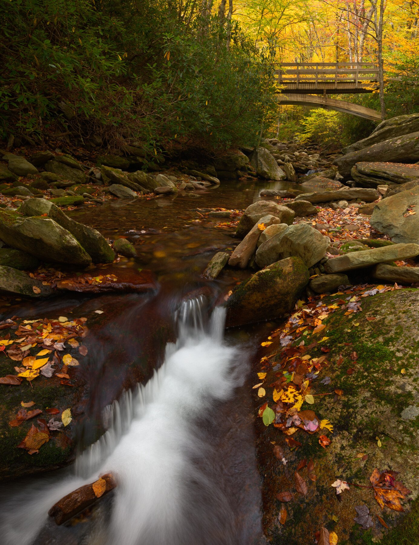
I have always loved the combination of white water and light…especially as they feed off one another as elements in an image. The two elements have different but related meanings for me and I tend to somehow derive much satisfaction/pleasure/enjoyment(?) from their interaction.
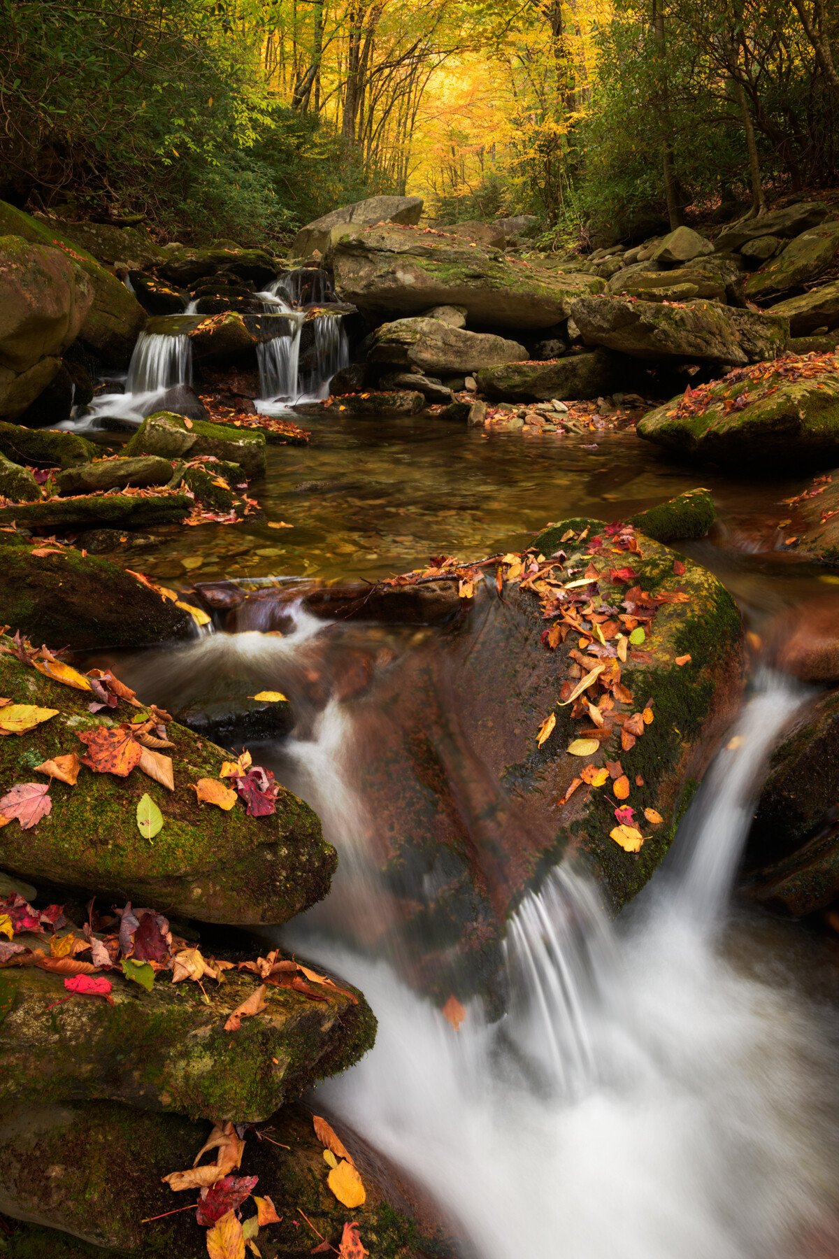
These two images take advantage of the interplay of cascades and light that I recently captured on a Blue Ridge Parkway trip near Grandfather Mtn.
Specific Feedback Requested
I’m interested in whether you prefer one or the other, or if either are “successful” in their interplay of rushing water and light in the background.
Technical Details
Is this a composite: No
Focus stacked images, two each, one for foreground and one background. f/11, ~0.5sec each. D850, polarizer
Jim, these are both very nice. Light is often referred to as liquid looking, so I can appreciate your love of the combination of water and light. I think the processing and colors in both images are very well done. I also think the luminosity of the background yellow leaves is well handled in both images, you have achieved that golden soft glow look without it being overdone. Strong compositions in both images too.
It’s really hard to pick a favorite between these two, they both are so good. If forced, I would go with the second. I’ve spent enough time in hip waders standing in the middle of streams to shoot waterfalls, to appreciate the in-your-face look of the second image.
Jim, I must say that they are both quite nice images - especially the processing. I think you have handled them quite nicely.
I think to get that interplay ypu are talking about you need to have more continuous interest from the front to back of the scene. In the first image you have that lovely cascade at the front (red box) and the light trees stuck in the back right corner (cyan cirlce). Foscussing on the interplay, I think this would have worked better, and told a more cohesive story, if that was was more prominent. Could have used a wide lens to elongate it and/or got lower closer to it so you are bringing rge two key elements closer to each other and thus forcing the interplay. I also feel that the large bush on the right is overwhelming the top half of the image, acting as a visual block to the light area.
Similar story for the second shot. I feel that the first cascade is stuck in the lower right corner and doesnt get enough breathing room. I would have considered making it more of a feature (lower and more prominent). This would have brought the light closer to the water and improved the interplay.
If I had to pick one that displayed the interplay between light and water better, Id say it was the second one as there is more of a continuous flow from from to back. I still feel that in this image the first subject is too close to the edge of the frame to provide depth.
What lovely images. You have rendered these images very well, in my opinion. Colors come out very nicely and the tonality is very well controlled. If there is anything, I would consider burning the rocks on the lower left side of the second image but it’s a minor point.
My preference is the second one and simply because of the bridge in the first one. If there is an option, I prefer not to have manmade structures in an image. I am not too concerned about Eugene’s point about the discontinuity in the FG and BG elements of the first image. Yes, it is a little more partitioned but I think it’s cohesive.
Both of these convey concurrent energy and soothing. I appreciate your handling of light in the water and leaves.
I prefer the first image, as the line of leaves on rocks on the right convey me nicely from foreground to background. The trees in the BG lack the definition of the second image, so I added some contrast there. The rhododendrons on the left are a a bit massive, so I tried to increase their texture.
The second image seems more dramatic, and the V-shaped area of distant arching trees is a strong feature. For me the bright water at the bottom is the eye magnet, and my eye bounces back and forth from there to the distant bright area. If the bottom were cropped to eliminate the lowest rock and its leaves, the image would seem more harmonious to me.
Thanks @Ed_McGuirk…the in-your-face water puts off my wife and she feels it pushes the viewer away from the image. I guess I just love the energy it conveys.
@Eva_McDermott…thanks for your comments! I wanted to like the first one more, but I just don’t and like the 2nd one as well.
This is an excellent point @Eugene_Theron. I was already shooting at 14 on my 14-24, so didn’t have much wider I could have gone, but your point is well taken…thanks so much for your time & perspective (pun intended).
@Adhika_Lie…thanks for your comments of lite and color…that means a lot to me coming from you!
Thanks @Dick_Knudson for taking the time to comment. The LRC is definitely an eye magnet…perhaps too strong of one. As I look at the image again, I may de-emphasize the brightness of the water a bit, but to crop the lower rocks and leaves is to lose the pool of the cascade which to me will make the image less complete.
I prefer the second image. It has a more pure nature element to it. And it seems more balanced (colors, shapes, textures and sizes) and shows more of the path of the river.