The photographer is looking for generalized feedback about the aesthetic and technical qualities of their image.
Description
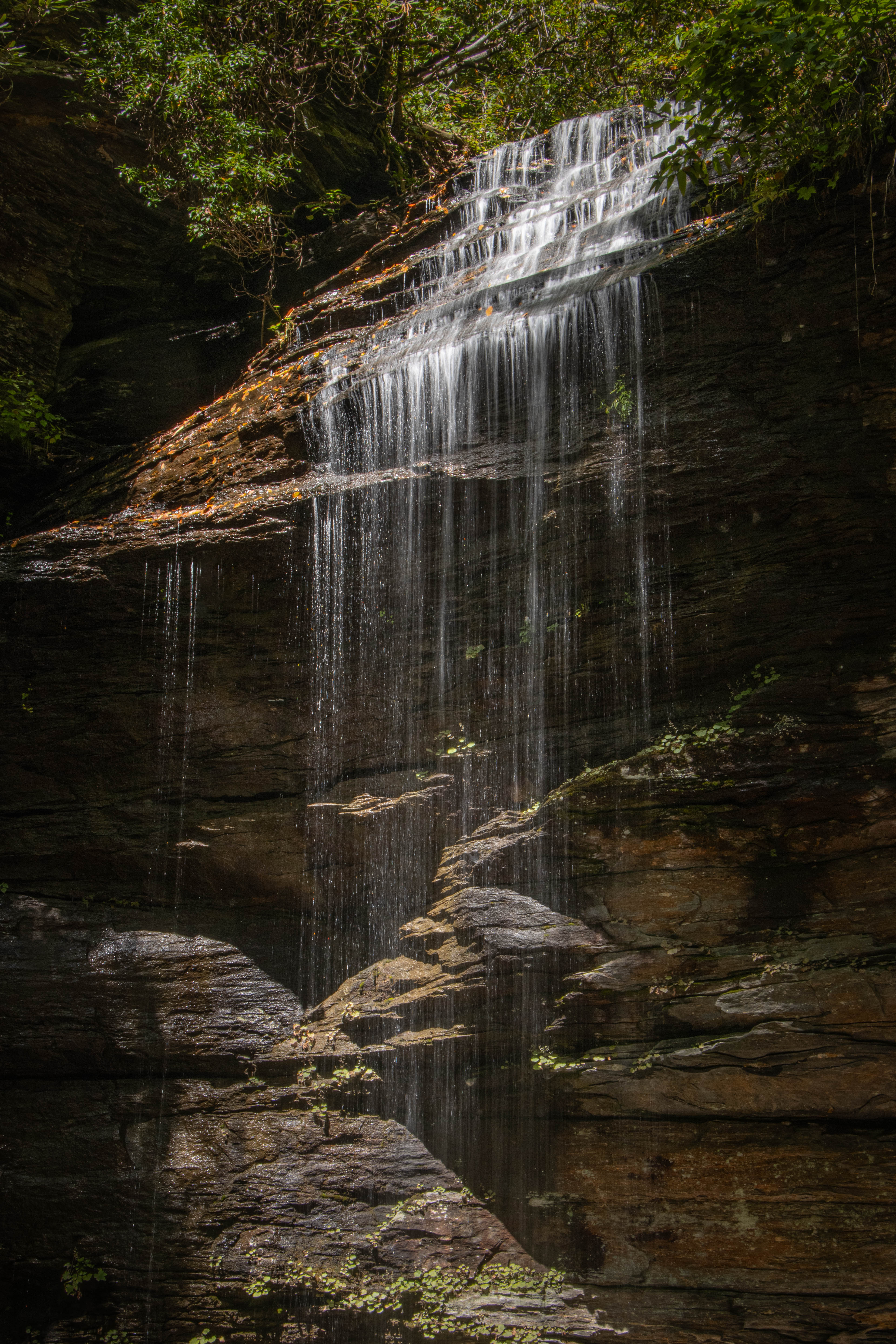
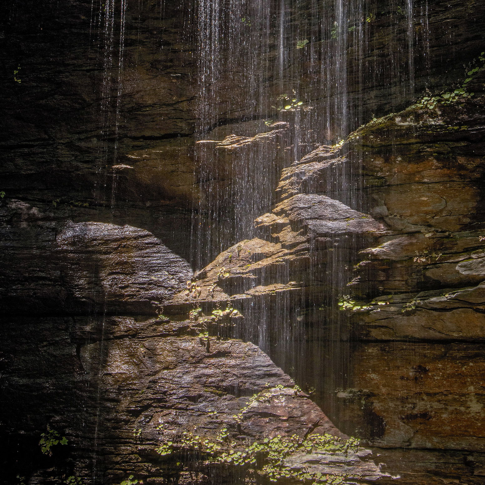
Getting to and from this waterfall tuckered me out.
Specific Feedback
I don’t have any specific doubts about this one but I seldom get to photograph waterfalls, so any critiques would be welcome.
Technical Details
ISO 100, 35mm, f/16, 1/4 sec.
Critique Template
Use of the template is optional, but it can help spark ideas.
Vision and Purpose:
Conceptual:
Emotional Impact and Mood:
Composition:
Balance and Visual Weight:
Depth and Dimension:
Color:
Lighting:
Processing:
Technical:
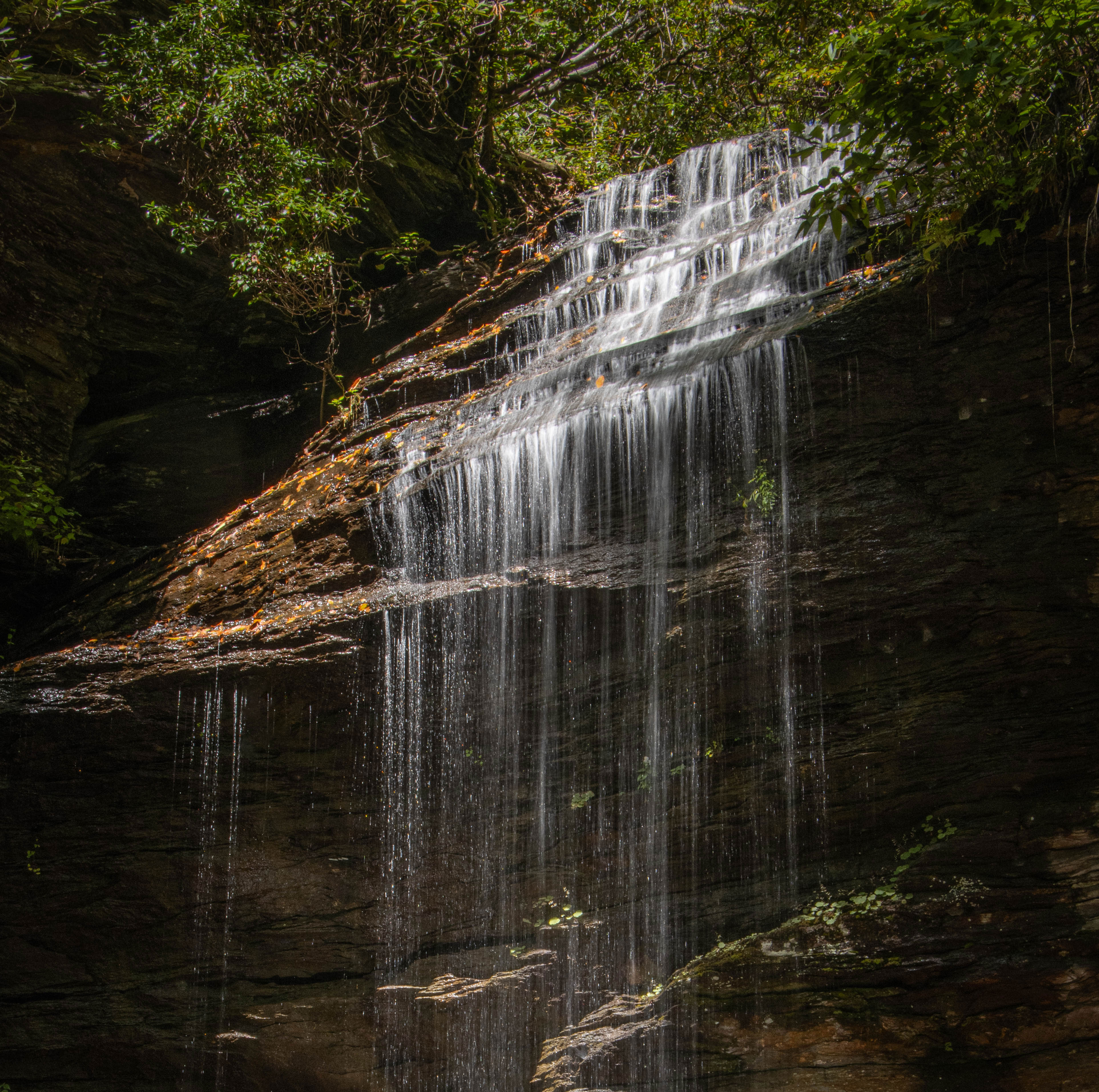
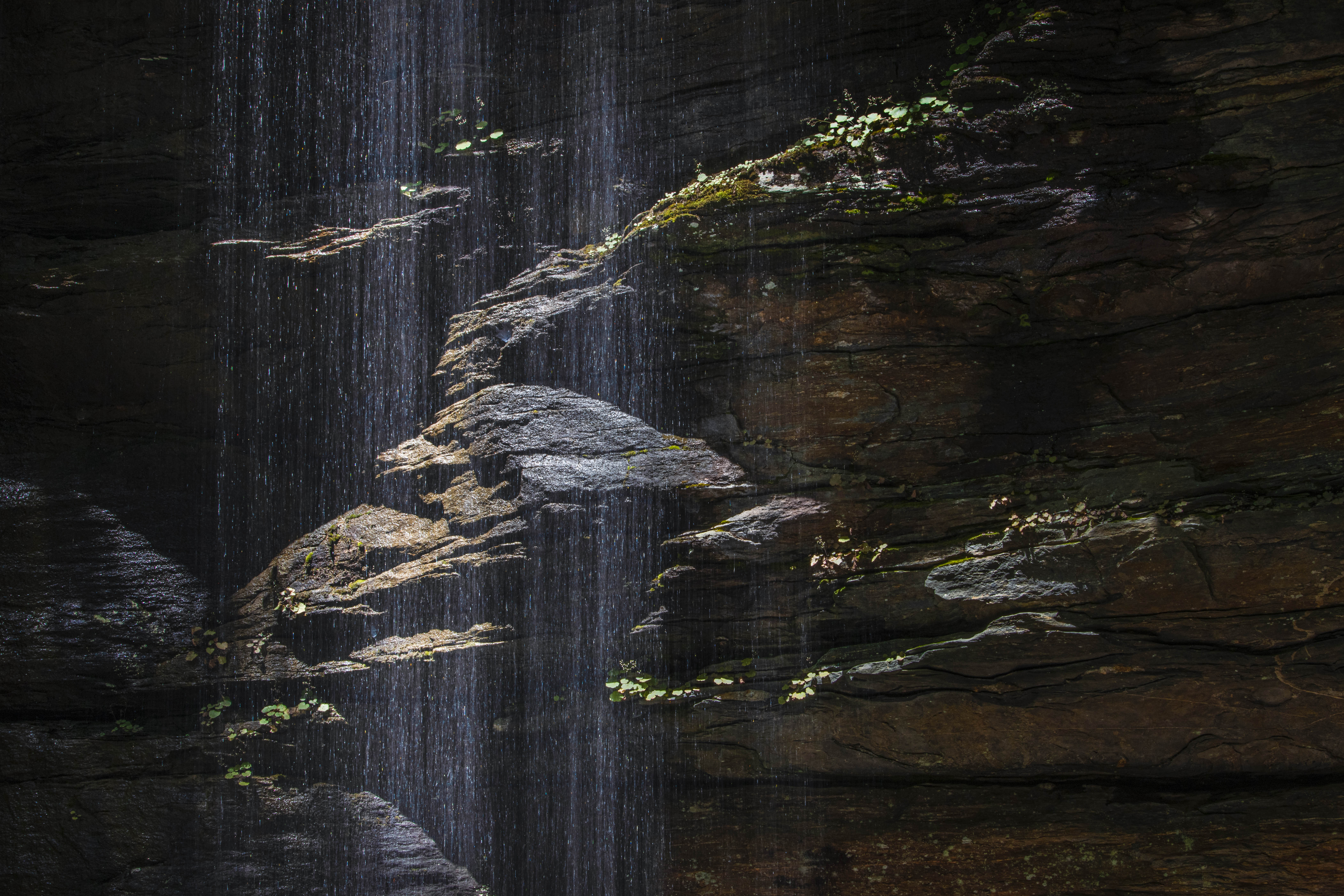
My knees hurt thinking about the hike down and back up. Vertical is the distinctive feature in this well-composed image that shows the environment of the falls well. My only question is whether the falls seem too high up in the image. Showing the full drop of the falls is effective, but I wonder if a bottom crop might be more balanced. That’s up to your vision. Here’s a sample crop just for interest sake.
A lovely capture and I like that the water is not a huge flow. The ribbons are very nice. I could see a little off the bottom, or some burning of the prominent diagonal rock.
Overall this photo is accentuated by the lighting giving it a very fantasy-like feel. That is furthered by the ribbons of water rather than a full flow. The lighting on the bottom rocks kind of steal some attention but also help lead the eye back to the ribbons of water and up into the falls. No matter, it is a very well crafted photo, worth the effort put into getting it.
Hi Don,
I am loving your take on this beautiful waterfall as the light is magical; particularly on the rocks below the falls. The ribbons of water also work quite well; rather than a full flow. For my own personal tastes that enhances the mood you captured. My only suggestion would be just a slice off the bottom as @Diane_Miller has already mentioned. This is beautifully done and well worth the effort you put into getting there. BTW, what is the name of this waterfall?
For someone who doesn’t photograph waterfalls often, I think you nailed this one @Don_Peters. The intersecting lines/layers at the bottom of the image hold a lot of interest for me, and the veil of water in front of them adds some cool contrast. Colors and processing look good. Bravo!
Don, I always feel narrow waterfalls should always be vertical format, so prefer your original over @Larry_Greenbaum’s crop. I would crop a tiny bit off the bottom though, just above the bright green foliage. I like the ribbons of the low flow. I would open up the shadows just a tad and drop the highlights of the falls a tiny bit.
Michael, thanks. After considering the various comments, I came to about the same conclusion. After lowering the highlights on the falls, though, I went back and lowered them a little less.