The photographer is looking for generalized feedback about the aesthetic and technical qualities of their image.
Description
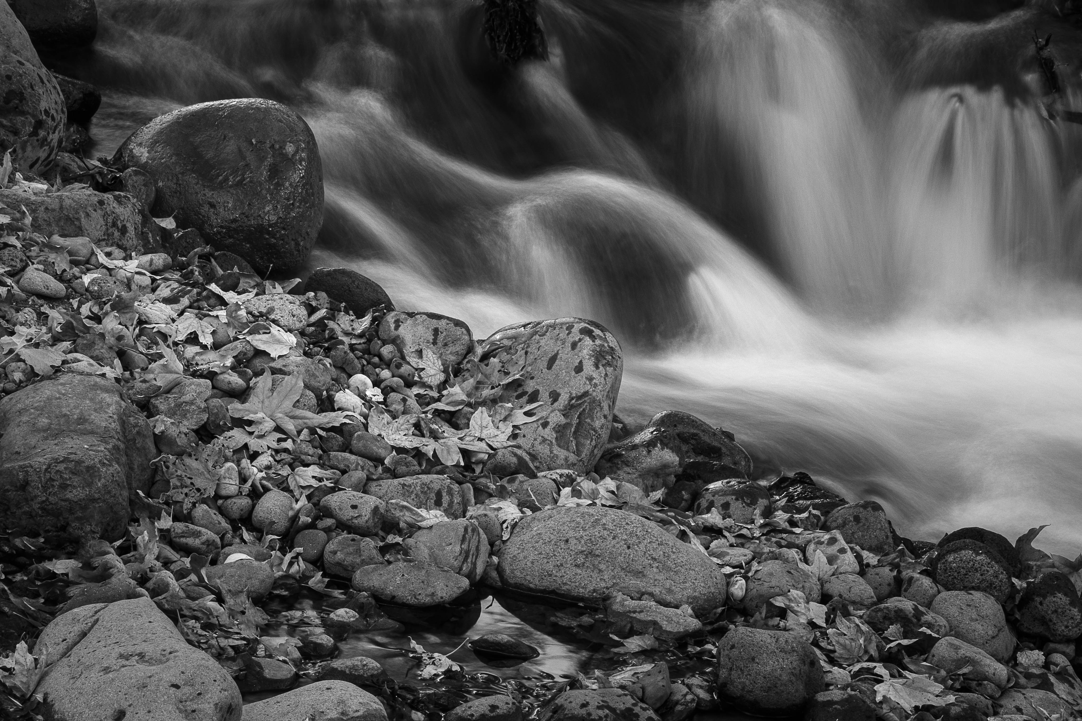
I was hiking along a creek and saw this. It appealed to me.
Specific Feedback
All comments are welcome.
Technical Details
ISO 100, 70mm, f/16, 1.6 sec.
Critique Template
Use of the template is optional, but it can help spark ideas.
Vision and Purpose:
Conceptual:
Emotional Impact and Mood:
Composition:
Balance and Visual Weight:
Depth and Dimension:
Color:
Lighting:
Processing:
Technical:
While one may not call this a stunning waterfall scene, it has for me a lot of interesting qualities. For one it is reality , rocks, dead leaves, moving water; what you would if your were finding if your were wandering along the banks. I like the separation between the foreground and background ware, B&W was a good choice. Cheers.
I love the tone of the rocks in the FG. The movement in the water is really good and I think this is a really great capture for an image. Perfect in B&W Don. Really Nice !!!
I love this, Don! There’s a really nice luminosity to the highlights in the foreground, great texture in the flowing water and I like that the compositioin is split almost evenly at a diagonal between the rocks/leaves and waterfall. It’s a simple scene but evidence that a successful photo doesn’t always have to scream loudly.
I love the shiny dark rock. I’m not kidding. For me, looking at this, it’s a little slice of a scene, but the singular, dark, shiny rounded rock has a kind of personality to it. Because it differs in tone and reflectivity from the others, and because it’s closer to the water, it’s like seeing a figure from behind as it beholds a scene. To me, that one rock makes the image.
ML
Thanks for sharing this interesting image. There is a strong diagonal from the upper left corner to the lower right corner. To my eyes, this diagonal divides the scene into two halves, and this impression is reinforced by the contrast of sharpness between the leaves in the lower part versus the floating water in the upper part. It is as if the two parts of the image are competing with each other, making it difficult to decide where to look. Suggestions for cropping: Let the foreground fill up most of the frame and use the blurred water as a background, or vice versa. I notice that the impact of the image changes according to its size: When looked at as a thumbnail, the luminosity of the water draws my eyes out to the left; when looked at in full size on a monitor, this is not an issue.
I had this same impression. Both halves are great images, but there is competition between the two.
I find that foreground very interesting. I probably would have been waterfall focused, but did you play with any shots of just the rocks and leaves. I especially like the area with the standing water, and as noted the shiny black rock.
I share Leo’s assessment to a degree. But it’s not the diagonal line splitting the image in two. It’s not the composition so much. It’s that the two halves are so different. It gives the appearance that one was placed on top of the other. That two separate and unrelated images were merged.
I see what you mean, Igor. It’s a single image, not a composite. I dampened the detail in the background to keep the attention on the foreground. That may have contributed to the appearance that it’s a combination of dissimilar images. I don’t have that reaction but it’s helpful to know that some people do.
Hi Don,
I quite like this intimate landscape. Your choice to go with a B&W was a great call as this has some lovely tones; particularly in the rocks. The diagonal placement of the rocks works well and give them equal billing with those wonderful cascades in the BG. I also think your chosen SS works well here as the silky water movement compliments the hardness of the stones. Very nicely done; no suggestions from me.
I like how you framed the movement from left to right of the rocks in unison with the rushing water. The shine on the rocks contrasts well with the softer water tones which helps call attention to this movement.