The photographer is looking for deeper feedback connected to their intent, creative direction, and specific questions.
Feedback Focus: Artistic + Technical
About This Image
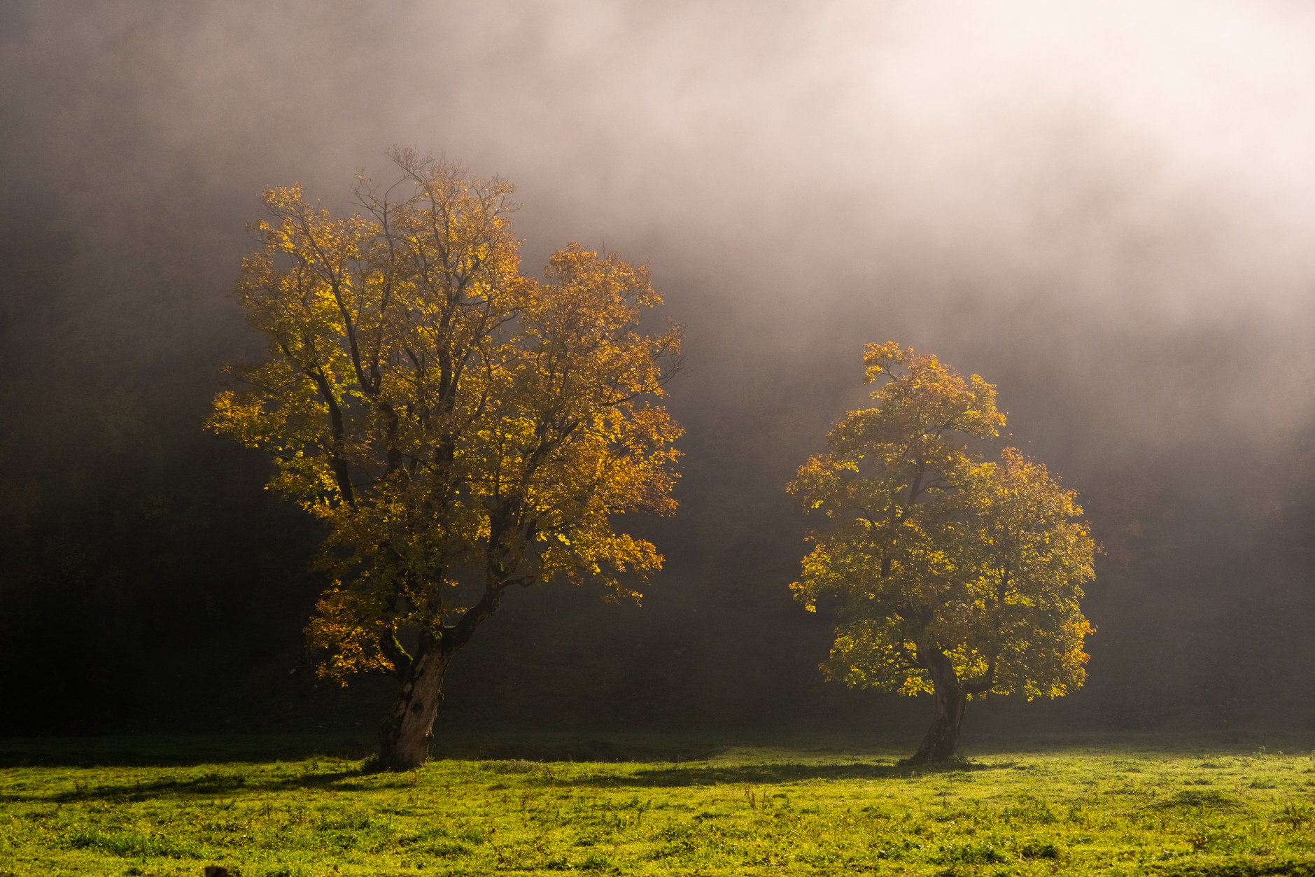
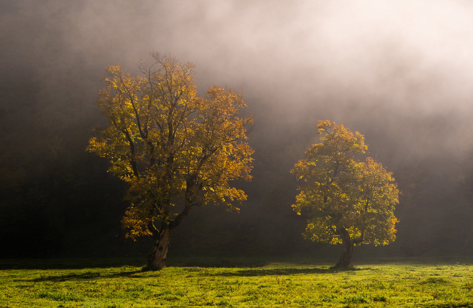
Großer Ahornboden, Eng, Tyrol, Austria. Oct 11th, 2025. The morning started very foggy, but the fog gradually lifted and sunlight began to break through.
Why This Image?
I was attracted by the two trees emerging from the fog and the contrast between the warm autumn colors and the dark, misty background. The light changed very quickly, and this was one of those brief moments when everything seemed to come together.
What I’m Trying to Express or Explore
I wanted to capture the quiet atmosphere of the morning and, above all, the changing light as the fog began to lift. I tried to keep the image simple and let the two trees and the light carry the composition.
Where Feedback Would Help Most
I would especially appreciate feedback on the composition and processing. Do the two trees work well together, and does the balance between the bright foreground and the darker, misty background feel natural?
I’m also very interested in your overall impression and anything you would have done differently.
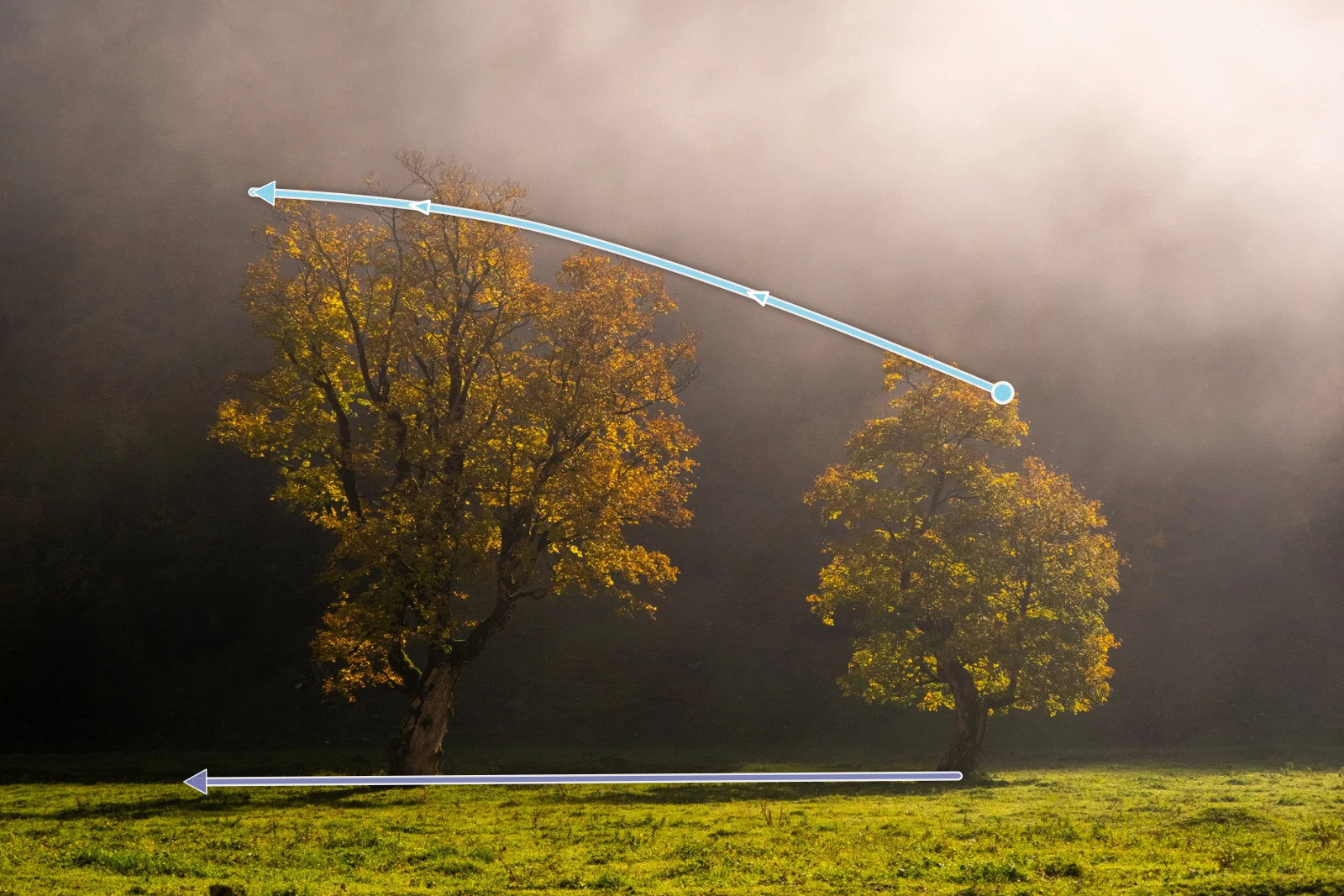
I love the light in this image, Horst and for me the two trees and the light carry the composition pretty well. The one thing that I can see that might be useful is to move the trees a bit to the right in the frame. The slightly curved tips of the trees and the direction of the shadows both lead my eye to the left which makes my eye want relatively more canvas on that side of the image. You don’t mention cropping, so if this is full frame there’s not much you can do about the left hand side. but you could play with pulling in the right side and maybe coming up just a bit from the bottom
Horst, I do agree with Dennis about the placement of the trees. I felt they were a bit central, and showing more of the left side, if possible, could also extend that interesting gradation from bright to darker in the fog, as well as giving a bit more space for the left tree’s shadow. Some more of that grass along the bottom would please my eye, and, if that’s not possible, I’d remove the dark clump on the lower left edge, but that’s very minor. Overall, I love the atmosphere you have caught. The colors, tones and graded shadows give a fine feeling of the morning waking up.
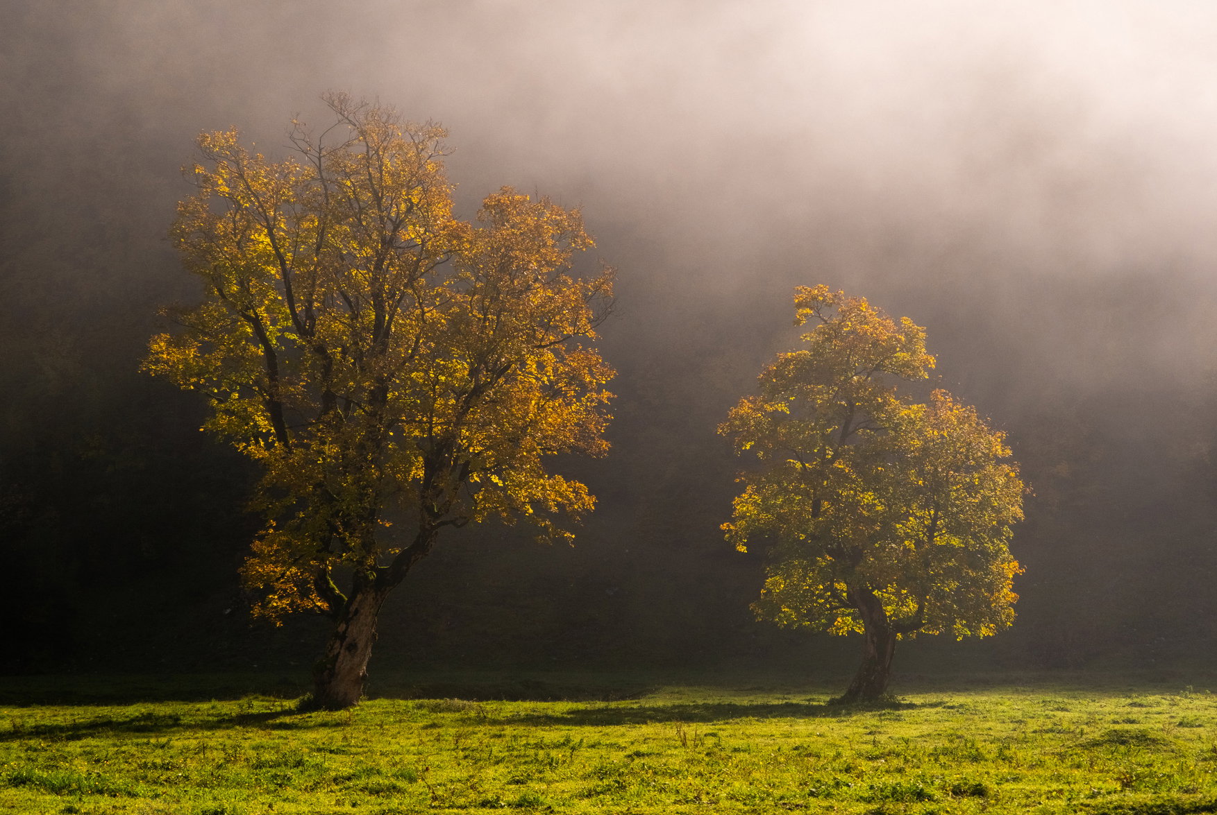
First off welcome to NPN! The sidelight in this image is simply gorgeous as is the atmospherics with the clearing fog. I am also loving the character of the two trees with all of their twists and turns. You most definitely succeeded in simplifying the scene and making the two trees the star of the show as they stand out nicely from the darker fog shrouded BG. This is wonderful as is, but I could also see a slightly tighter crop to place even more presence on the trees. I hope you do not mind, but here is a rework with what I was thinking. Just my opinion of course. I also removed that dark clump of grass along the bottom edge towards the LLC.
Thank you all very much for the warm welcome and for taking the time to give me such thoughtful and detailed feedback. I really appreciate it — especially as this is one of my first images here.
@Dennis_Plank and @Mike_Friel, your comments about giving the trees more room made me go back to the image and think about the composition again. Unfortunately, there wasn’t actually more usable space around the scene when I took it — moving the frame much farther in either direction would have brought other trees, people and distractions into the image.
I also realized that I still prefer the rather central placement of the two trees. I know it is less conventional, but for me their position emphasizes something that attracted me to the scene in the first place: the transition from darkness on the left to light on the right. I like having the trees almost standing between those two worlds rather than moving them strongly toward one side of the frame.
@Ed_Lowe, your tighter crop was very interesting to see, and it certainly gives the trees more presence. It also made me realize something about my own preferences: I tend to like a little more breathing room around a subject and enjoy seeing it as part of its surroundings rather than isolating it too strongly.
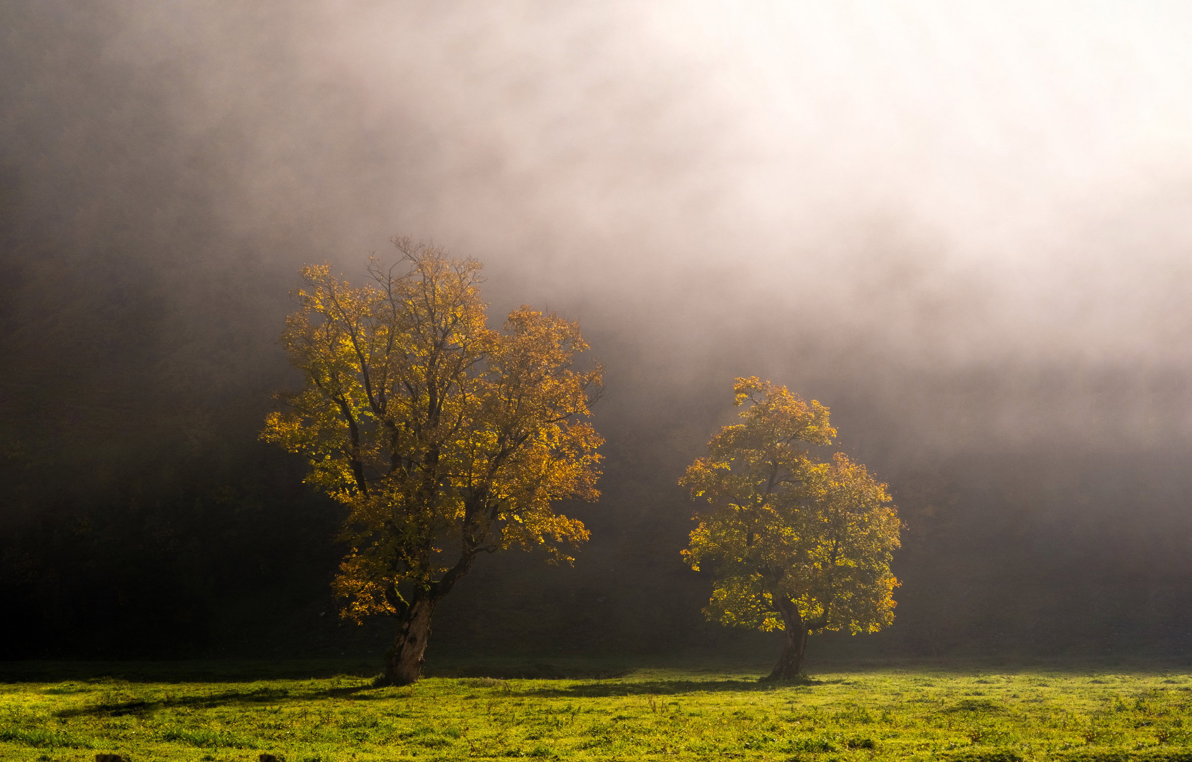
However, I completely agree that the original could use more space, especially around the trees. Since I don’t have that space in the original capture, I experimented with extending the canvas in Photoshop using Content-Aware Fill rather than generative AI. I prefer that here because I don’t want Photoshop inventing significant new elements of the scene.
Here is the result. To my eye, the additional space lets the atmosphere and the light-to-dark transition breathe a little more while keeping the composition I originally intended.
Thanks again — this is exactly the kind of thoughtful discussion and constructive critique I was hoping to find at NPN.
Horst, one needs to be careful using Content-Aware Fill, as it will repeat the more noticeable features of the area you’re applying it to. The dark clump at the bottom left of your rework is an example as are some of the features of the grass and the repeating pattern of a tree in the fog to the right. I’d fix these with the Spot Healing Brush or the Clone tool.
@Mike_Friel you’re right - I had eliminated some more obvious duplications, but these at the bottom left I overlooked. Nice catch. thanks. There is more as well which would need to be removed e.g. near the bottom right. I only did that roughly to show how the extended composition would change the pic.
I’m a little late here, but first things first - Welcome to NPN! You’re starting off with a bang and some beautiful work! We look forward to more images - and you’re already contributing comments and engaging! Glad to have you here.
What a wonderful moment of light and circumstance here. The drifting fog, the backlighting and the field of greens all combine for a very engaging image.
I think this is a great self analysis. The other convention I might add that you’re challenging is the odd-even concept. So many times in compositions, we look for odd numbers of things - like 3 trees instead of 2. Just the 2 trees almost creates a ping-pong effect where the viewer doesn’t know which one to focus on. But I said “almost” because clearly to 2 trees are different; of different size of course, but also a bit in their structure and leaves. The “curve” that I think Dennis mentioned really pairs these 2 together, rather than competing with one another.
While I personally think the amount of space on both sides is appropriate and I like your central placement, for the exercise of it, I thought I would suggest a transformation rather than CA cloning (for reasons Mike brought up.) It’s not always an option, but when appropriate this works pretty well. So, first, I extended the canvas. The using the rectangular "M"arquee tool I selected about a 50px wide section and then used the Tranform tool to stretch it out a bit. Your image is set up pretty well for this to work. Now it also stretched the shadow, which I then stamp-cloned the end of the shadow for grass. I also cloned out the bigger dark clump at the bottom. A small stretch like this (unless one is pixel peeping) can sometimes provide just enough space… but not always.
Thanks for sharing and we look forward to your images and participation!
@Lon_Overacker@Mike_Friel thanks for your additional comments. I also like the work done on the image. With one exception - the larger tree has the smaller shadow now. I saw this in my own rework as well - which I do not like any more. I would now keep the shadow leading out of the picture at the bottom left corner.