What do you think - should I brighten the shadowed branches on the left? Thanks for taking a look and all comments are appreciated.
D500 70-200mm 2.8 @ 70mm, f 8 on tripod
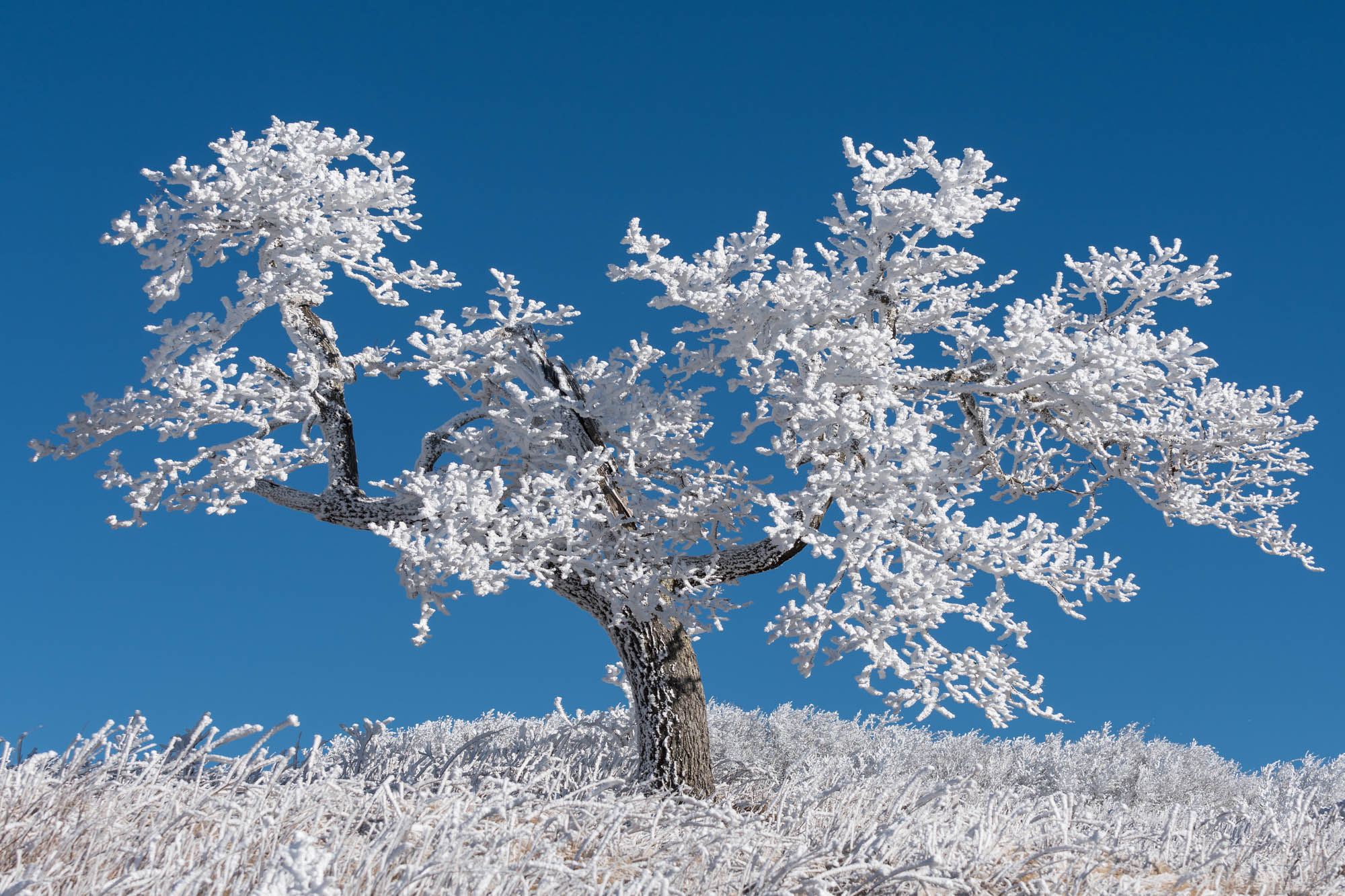
Jay, I like this image a lot, I love snow covered trees against a blue sky. The exposure and contrast look spot on to me, I think the shadows look natural and don’t need lifting. The saturation level of the sky looks good. There is a balance to the shape of this tree that fills the frame nicely. My only nitpick is that the tree could have a little more breathing room space both on the left and right sides. In PS add canvas and do some Content Aware Fill, it should work nicely with this image. That is a nit, overall I like this image.
This is nicely done, Jay. The horizontal format works beautifully as does the blue and white color combination. I agree with Ed about adding a little more canvas to the right and left sides, but that is minor and an easy fix. BTW, the shadowed branches look fine to me.
Cool tree and image of it. I would agree with Ed’s comments and suggestions. Processing looks good, but minor, could use some more space top and sides.
Thanks everyone for your thoughts and suggestions. I’ll double check to make sure I don’t have a shot with more room.
Jay, you don’t even necessarily need to to see if you have another shot with more room. If you use photoshop you can “Add Canvas” to the width, which creates blank space on both sides. I then used the rectangular marquee tool to select the blank areas, and went “Edit Fill - Content Aware Fill” and Photoshop fills in the selection automatically. Because 90% of what you are filling is blank sky, it works great on this image, although the aspect ratio does change.
Hi Jay,
Love the image. I am a sucker for these type of lone tree shots.
Normally I don’t like blue bird sky photos but in this case with the color contrast I actually love the look.
This is snow and not infared camera correct?
To me the white has that infared kind of look, not sure what exactly I would do differently but would try and adjust the snow color so it looks a little more natural (sorry I cannot tell if it is just the white snow is too white/bright or something else but something to me has that slightly unnatural look). It is borderline though so I think easily corrected with an adjustment.
I agree that just a little more blank space would make this tree image stand out even more. Should be easy with content aware fill since the sky has no texture and the ground random enough to be repeated.
I would not touch the shadows they look good as is.
Snow looks good. Can’t help but wonder if monochrome might make an even strong image. A dark sky would make the snow even more prominent than the blue sky.
1 Like
Jay, I bet this tree could tell some stories with all the seasons it’s gone through. Love the snowy tree against the bluebird sky. We often complain about blank skies, but here it’s used beautifully with the tree.
Agree with others about some extra room for the tree. But to you question, I don’t think you need to do anything with the darker shadow areas of the tree; they’re pretty small relative to the scene and not an issue for me.
Lon
Stunning image. I agree it might work well as a b/w. For my taste, I like the close cropping and don’t think more space would add much to the impact.
Awesome image! No nits here. Perfect as is.