Wind-worn Cypress +repost

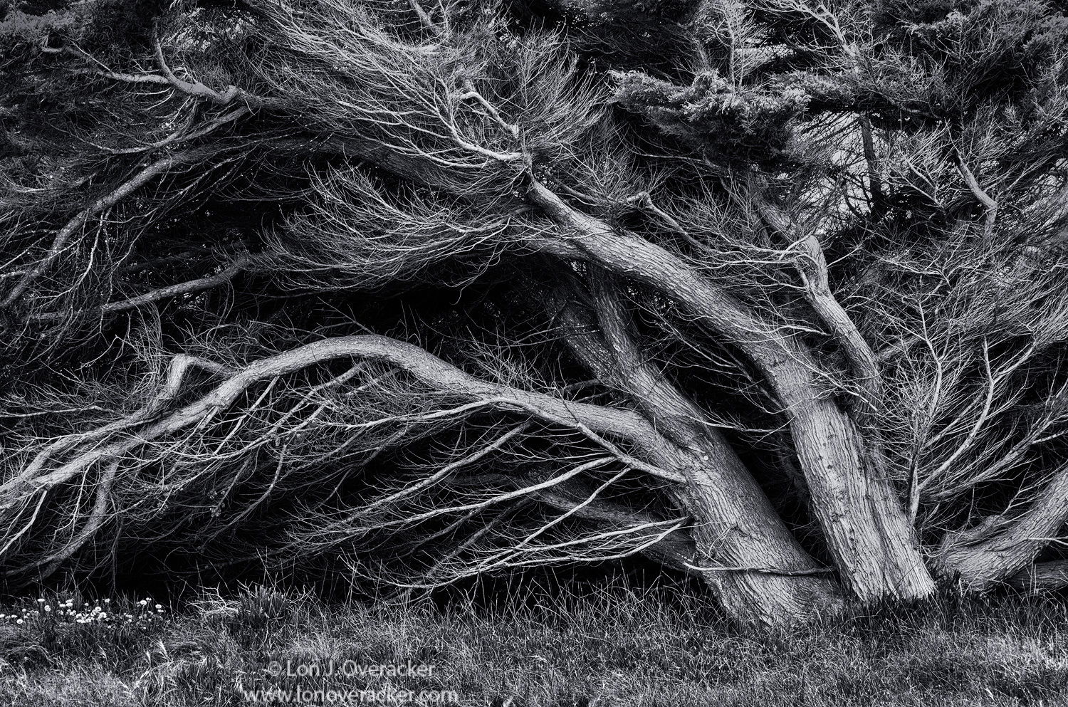
Edit: I really like Bonnie’s rendition. But now my struggles continue and I think I’ve lost my way with this particular image. The good news is that I’m glad to hear this image is worth persuing. Right now, I think I’m in processing purgatory… so I’m gonna post what I have and take a break from this one.

For the repost, I used mulitiple various layers with masking and painting to basically darken the surround parts of tree, while lightening/dodging the main flowing trunks. I mitigated as best I could the bright patches in the UR quadrant. Healing brush over the flowers in the LL. Cropped all edges; on top mostly for edge clean up and the bottom to reduce the amount of grass.

In looking at these, I think I prefer the main tree in my original post - and should take that and apply some darkening in the non-flowing part of the tree…

Thanks so much everyone for your comments, observations and help on this one.

Lon


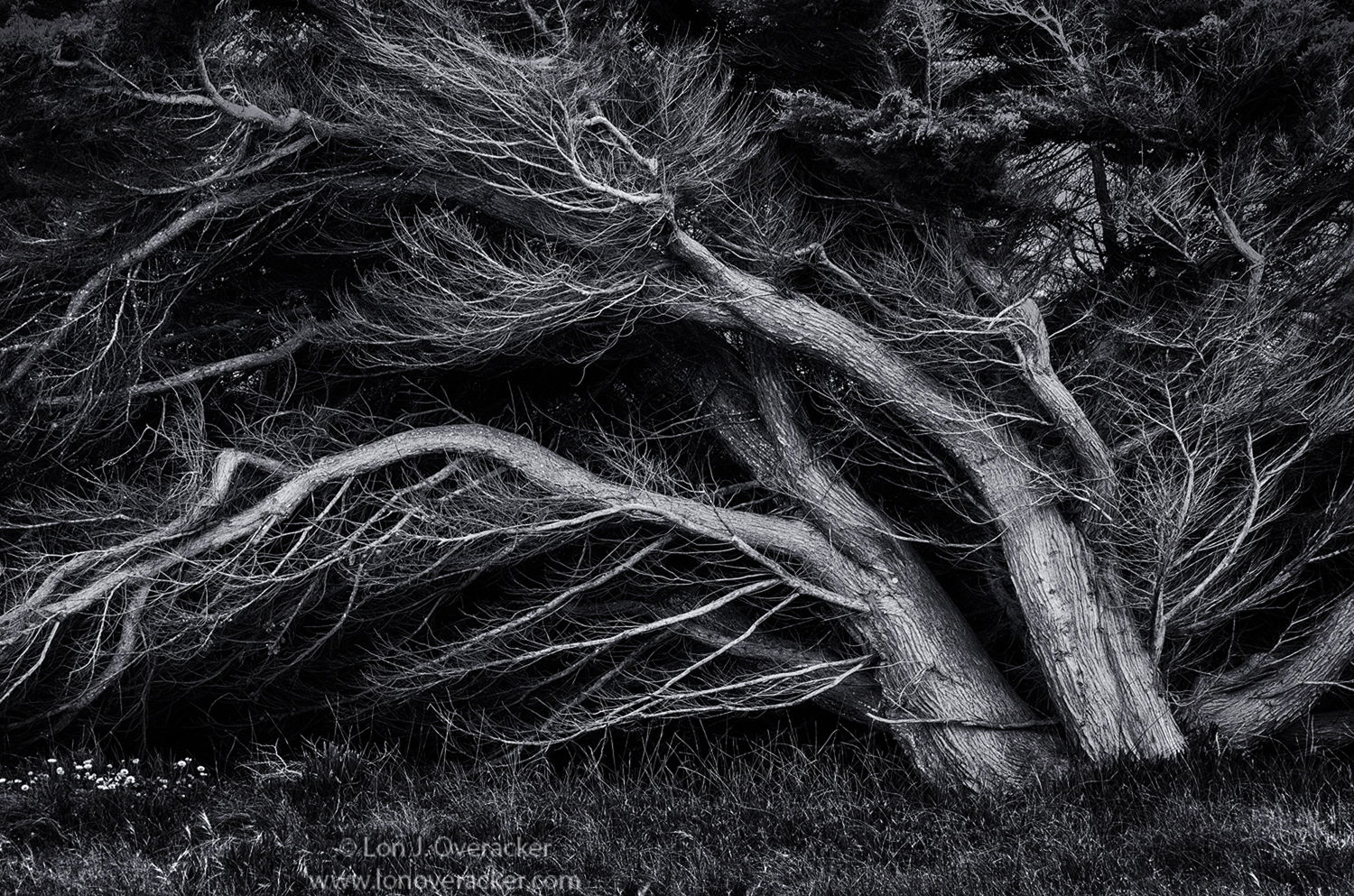
Struggling with this one - wondering whether or not it’s worth persuing further. One of those times when I was excited about the subject matter. In fact I’d driven by these trees numerous times on Pacific Grove’s Sunset Drive and finally I decided to stop. It’s a roadside image - in fact along someone’s driveway photographed from the road. I just loved the shape and flow of the trees knowing they had been shaped by decades of wind and salt air. I thought this would make for a great b&w image.

That is, until I got home, viewed the images and tried processing. I finally gave up. Then just a couple days ago I gave it another try. I’m not clear on what I did differently. I just know there’s a number of layers… although I can say this is a single frame, the only cloning is for some little spots coming through the trees in various spots (there’s more and just not sure if worth continuing.)

Anyway, I got something enough to post, but am wondering if the base image and concept are worth pursuing. Any and all comments, critiques and suggestions welcome.

You may only download this image to demonstrate post-processing techniques.

What technical feedback would you like if any?

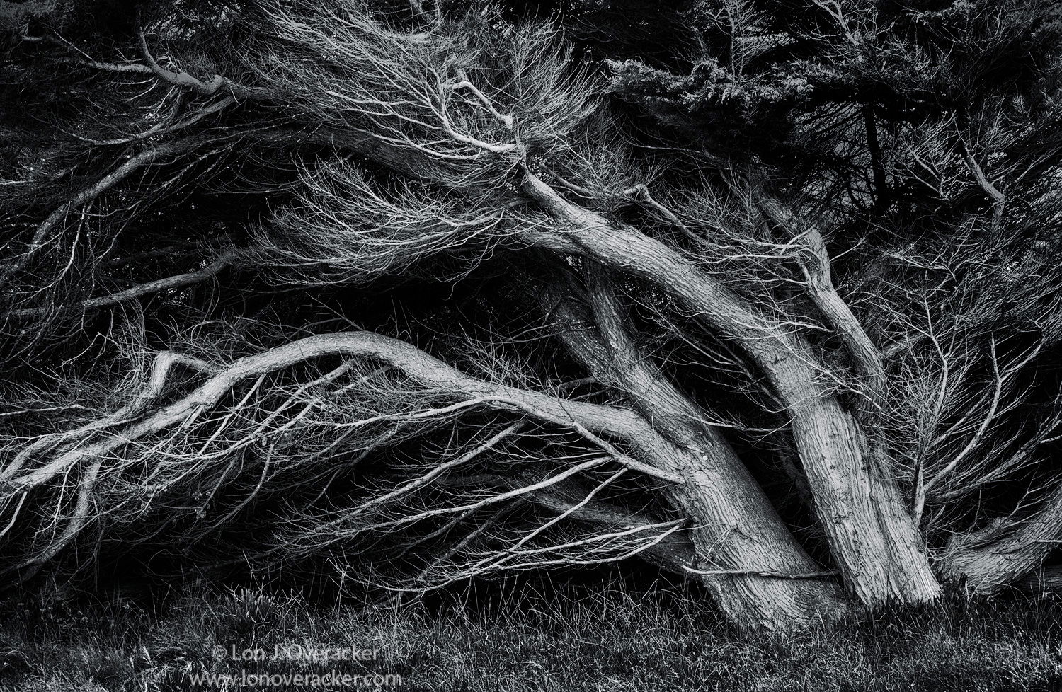
B&W processing of course. I used Nik’s Silver EFex Pro2. Also, and this may be the first I’ve done this, I tinted the b&w with a very, very slight hint of blue to cool to the tones. Probably could only tell if you compared side by side.

What artistic feedback would you like if any?

Not sure if the shape and flow of the cypress tree is enough to mitigate the little flaws throughout.

Pertinent technical details or techniques:

(If this is a composite, etc. please be honest with your techniques to help others learn)

Nikon D7100, 16-85mm @85mm (127mm effective) f/14 1/13th iso 200, tripod

3 Likes

Lon, I can certainly see why this attracted you. Your B&W processing looks great from here, almost looks metallic. I love the luminance and higher contrast. Needless to say, this is well worth your spending time.

WOW. You nailed the processing as far as I’m concerned, at least on this crappy work monitor. Can’t wait to see it tonight on my “real” monitor. I have no real suggestions for improvement, Lon. I think the composition is quite strong as is and I really enjoy the small grouping of flowers at the bottom left. You left just the right amount of room at the bottom and any cropping done was spot on. Contrast and tones look great (again, on this monitor).

This made my heart beat a little faster when I first opened it because it reminded me of some images a friend, boss, and mentor shot when he was the Military Governor of an island in the Pacific after WWII. His shots were more stark and more windswept because of stronger winds but the comps were very similar. He was an outstanding photographer and a true scientist when it came to all of the different processing possibilities for both B&W and color. He was my boss in the Color Lab in the photo dept. at the newspaper I worked at back in the late 70’s. He probably forgot more in one minute than I could ever learn in a lifetime. He had also been a bomber pilot over Germany during the war, flying in several of the 1,000 plane raids. He said those were the most terrifying experiences of his life. I can only imagine. His name was Randall Farris and he was easily one of the most interesting people I’ve ever met - kind, gentle, very humble, a great boss and mentor, and just fun as hell to be around. They just don’t make 'em like that anymore. Anyway, your image brought back great memories of him.

What a beautiful tree. The shape and flow are super. What are the little flaws throughout that you see? (I’m not seeing any.)

Perhaps more targeted illumination of the flowing trunks? Here’s an example. I made a curve layer, pulled it down, then brushed off the effect on the trunk and branches.

1 Like

Lon, this is a cool capture and I can see why you took it. I feel that you will get the most out of the image by isolating the silvery sections against the darker background. The issue you have here, in my eyes, is the really bright section above the trunks in the upper right quadrant of the image. If it were dark, like the left side of the image it would stand out more and add more punch as a whole. This is not taking away from your image and your vision as the rest of the shot is well processed and appealing.

Eugene

I like this a whole lot, Lon. What came to mind immediately on the processing is along the lines of what Bonnie proposed, kind of a vignette around the tree, especially the branches leaving the frame on the left. Maybe clone the bright flowers lower left too? For my tastes, this is a beauty.

Lon, This is a very much worth pursuing further IMO. I like what @Bonnie_Lampley did with the repost and for me it emphasizes those flowing trunks. I also agree with @Eugene_Theron and his take on the upper right quadrant of the scene. I would consider cropping from the right and burning the lighter areas in that quadrant. One other thought, that may be a little radical, is to crop from the bottom and clone out the little group of flowers at the bottom to create a bit of a pano that emphasizes the sweeping effect of the trees. Those flowers are interesting but a bit of a magnet for my eyes.
Just my two cents.
This was Definitely worth the stop and effort!

Lon, I agree that this is definitely worth playing. Even though I don’t know how it looks like the original color but I think black and white seems to be an appropriate choice. The tonal contrast is quite pleasing and the flow of the image makes sense. I am not sure if I have any suggestions to improve but I can definitely see this printed.

Wow, very graphic image, Lon. I’m really liking the direction @Bonnie_Lampley has taken the file. Two thoughts: firstly I would crop a slice off the bottom about halfway through your watermark. It isn’t much but I think it further refines the focus on this incredible cypress. Second, I would add a bit of vignette around the edges. Fine image, definitely worth the effort!

This is a really good image. I immediately thought of Weston’s cypress work at Pt Lobos.I think Bonnie improved the image by making it more emotionally powerful. There is something light appearing through the branches on the right. I would burn that to total blackness. I see this as a mostly dark image with some light features. I would not strive for tonal balance, a graphic design.

This redo is right on I feel. I was contemplating what it was that caught my eye and realized it was the trunks, and there was a lot of competing texture. Bonnie has brought the focus there. And now the crop is right on.

Beautiful image.

Lon fantastic composition, and a great chocie for black and white conversion! I really like how the contrasty black and white look really brings out all the lines and details in those trees.

My only suggestions is along the lines of what @Eugene_Theron and @Alan_Kreyger suggest. The upper right corner doesn’t blend in as well with the rest of the image, and that section of the image could benefit from additional dodging to the tree branches and burning of the non-tree background. In particular, I think, if possible, really dodging any parts of the tree that move diagonally from lower left to upper right to create more flow through that part of the image.

Lon, I can feel that wind blowing . What I only should do is take away the grass at the bottom because there is no movement in it. While the old tree tells me about all the wind,maybe even storms that have been playing with his branches.

Lon, this is absolutely worth pursuing, the "lean’ is this tree is marvelous. The comment on this looking metallic is right on, that blue toning worked great for you. I think @Bonnie_Lampley rework has taken this in a very good direction, the deeper shadows and edge burning help a lot. @Eugene_Theron has identified the biggest problem for me in the original post, the bright patch in the URC. I think Bonnies rework has effectively dealt with that area. i would start with Bonnies concept, and maybe selectively increase the luminosity of some of the highlights in some of the smaller branches in the ULC.

Great material to work from, there are probably multiple interpretations that would succeed.

Wow, thank you all for your response, comments and suggestions. Too many folks to list going thru the “@” process… :roll_eyes:

@Bill_Chambers - thank you for sharing your story. If our images can invoke these kind of memories, then I guess we’re doing good…

@Bonnie_Lampley, Thank you! I love your rendition! I’ll get a bit more in to this in a moment, but let’s just say I’m having a difficult time reaching your result. I like where you took this and most others agree separating the flow of the trunks/tree and darkening the surrounding elements of the scene are a big improvement. Oh, and to answer your question about the flaws - I was referring to the bright area UR, the numerous bright spots poking through as well as the flowers LL and the brighter patch of grass in the LRC

@Eugene_Theron and others who have mentioned the bright area in the UR. I’ve tried to address that in the repost. This was the biggest “flaw” I thought - which gave me pause even processing the original in the first place.

Thanks @Harley_Goldman. Agree about the bright flowers LLC. I’ve removed/covered them up…

Thanks Ben. Excellent observation. I’m mixed on the presence of the grass. On the positive side the grass is providing a base/anchor… But now you’ve got me thinking above the movement. Interesting in that the movement flow of the tree - is “implied” from decades of living in the environment - which of course includes coastal winds. At the time of capture, the air was fairly still, so no physical movement in the grass. Interesting concept though - perceived/implied vs. reality.

Thanks again. Apologize if I missed some of the valuable comments. My comments on the rework I’ll put in the original post.

Lon, I actually enjoyed the originol as posted. But when I saw your tweaks and Bonnie’s I think it kicked it up another notch.
:vulcan_salute::vulcan_salute::vulcan_salute::vulcan_salute:

1 Like

I agree with Mike, Lon. The repost takes the image from good to very good! I really like the darkening on the corners and the shadows. I think this is taking shape really nicely!

I still like the original comp better, but the other reworking is fantastic and greatly improves the image IMHO.

1 Like

Lon, I really like the repost and prefer it to the original. The changes are all positive IMO.

1 Like

Lon,
I think your tweaks with the repost have taken an already wonderful image up another notch. I like the dark processing as it adds an air of mystery and drama to the tree. It was already dripping with character with the wind swept flow created over the years. This kind of reminds me of a few trees along the coastline of Acadia which I have tried unsuccessfully to photograph. You addressed my main concern with the darkening of that light patch toward the URC. Anyway, great image.