This project is the result of three weeks of work in Petrified Forest National Park. I took many kinds of photos while there on a residency, but this is a collection of similar themed images as for as camera angle and a concentration on textures/shapes found within the park.
Self Critique
I like all the images individually I’m looking to see what goes together and what in your opinion are the strongest images.
Creative Direction
My creative direction would be a final collection of 6-10 images that vary from each other, but are of high interest as individuals and together represent the place.
Specific Feedback
I’m looking right now for aesthetic feedback, specifically what are the strongest images in your opinion and what might work well together in a collection of 6-10
I don’t know if rankings are done here, but maybe a ranking of the images from strongest to weakest?
Intent of the project
Additional Details: NLPA project submission, and personal use.
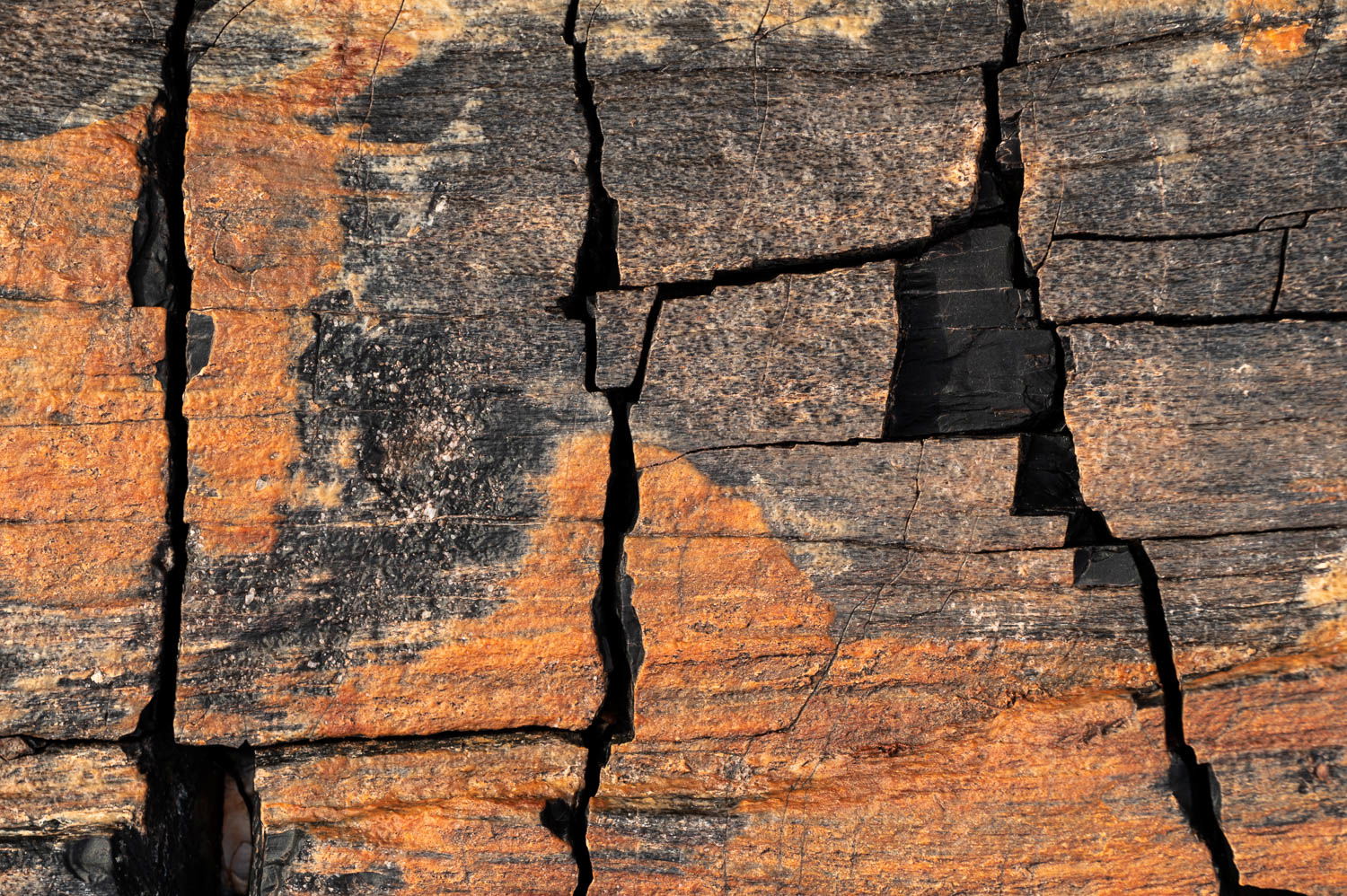
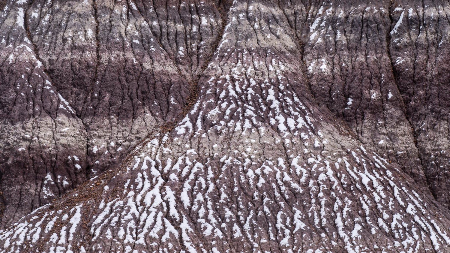
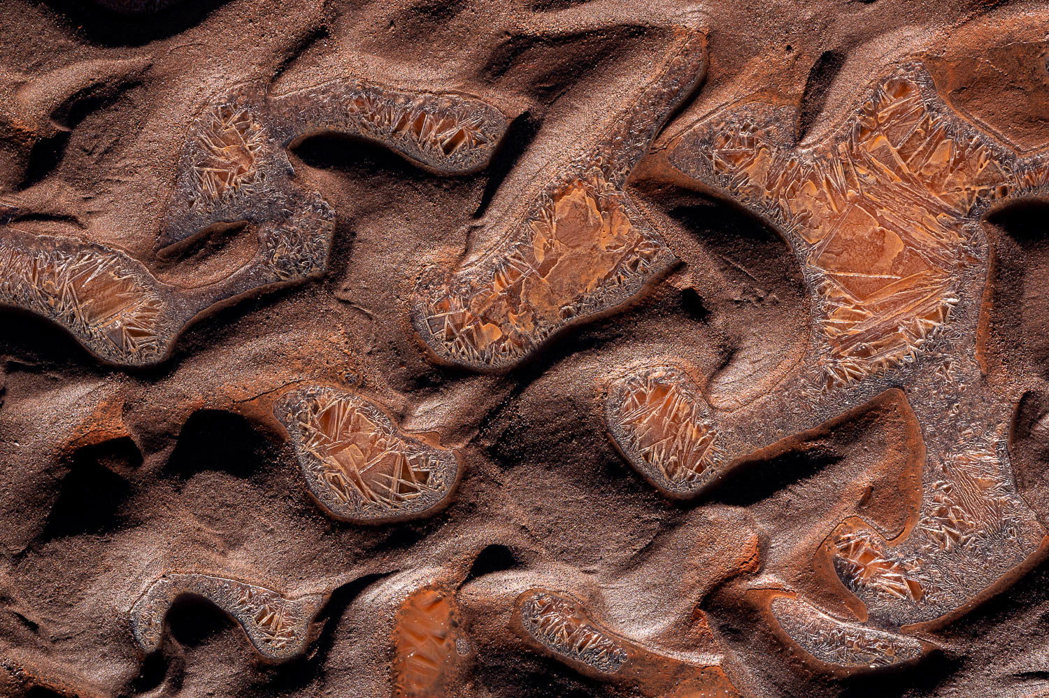
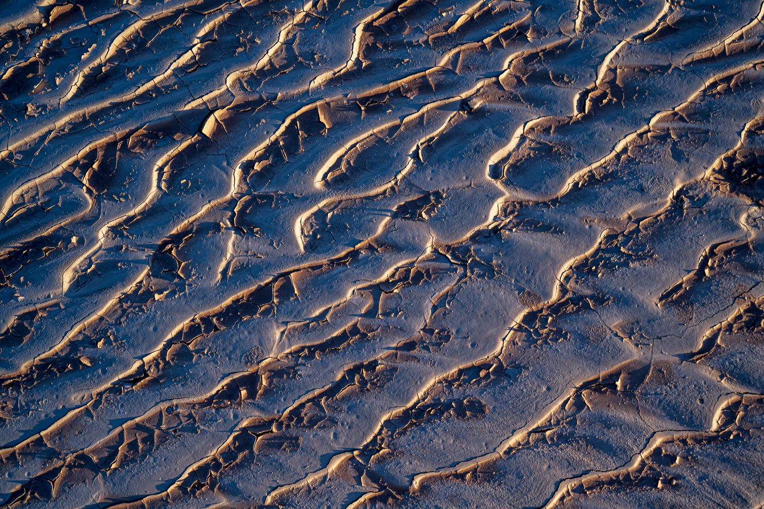
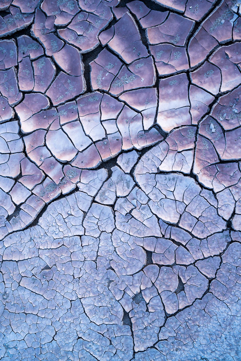
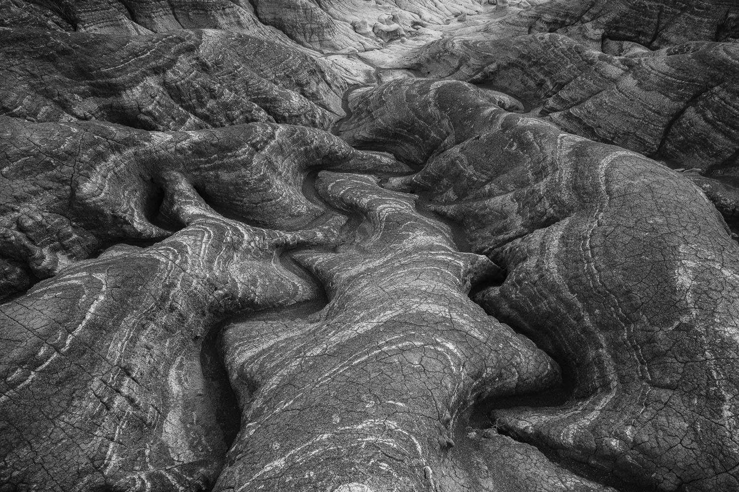
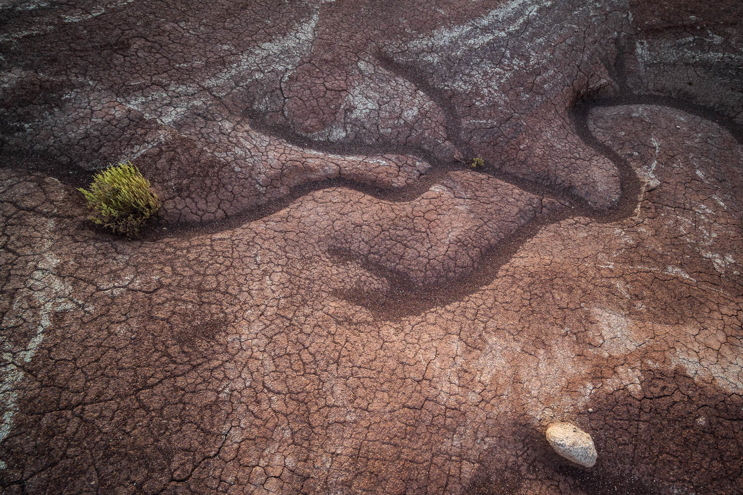
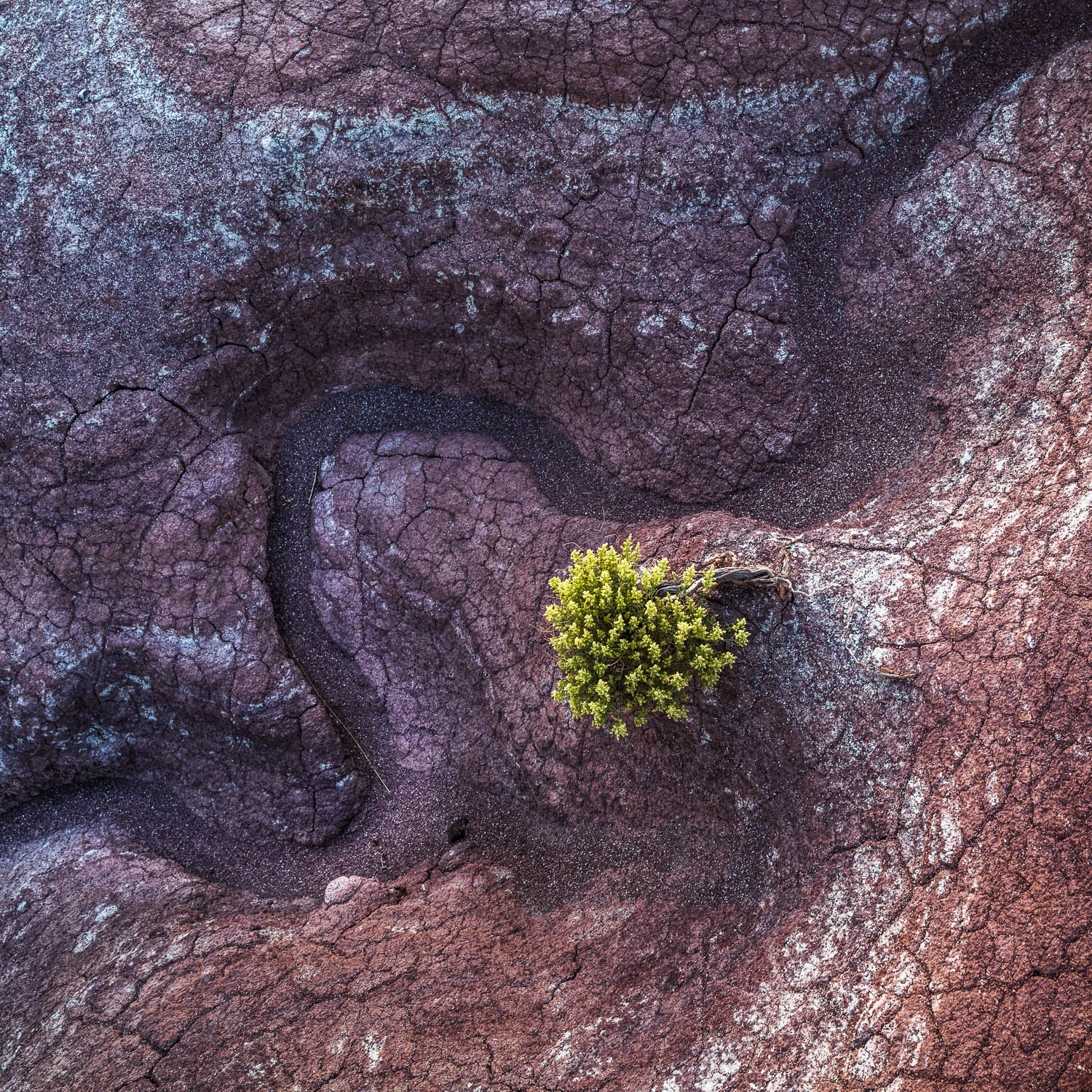
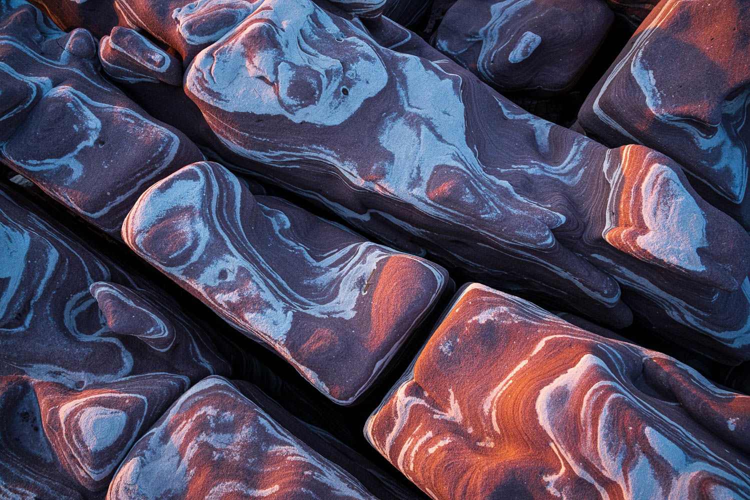
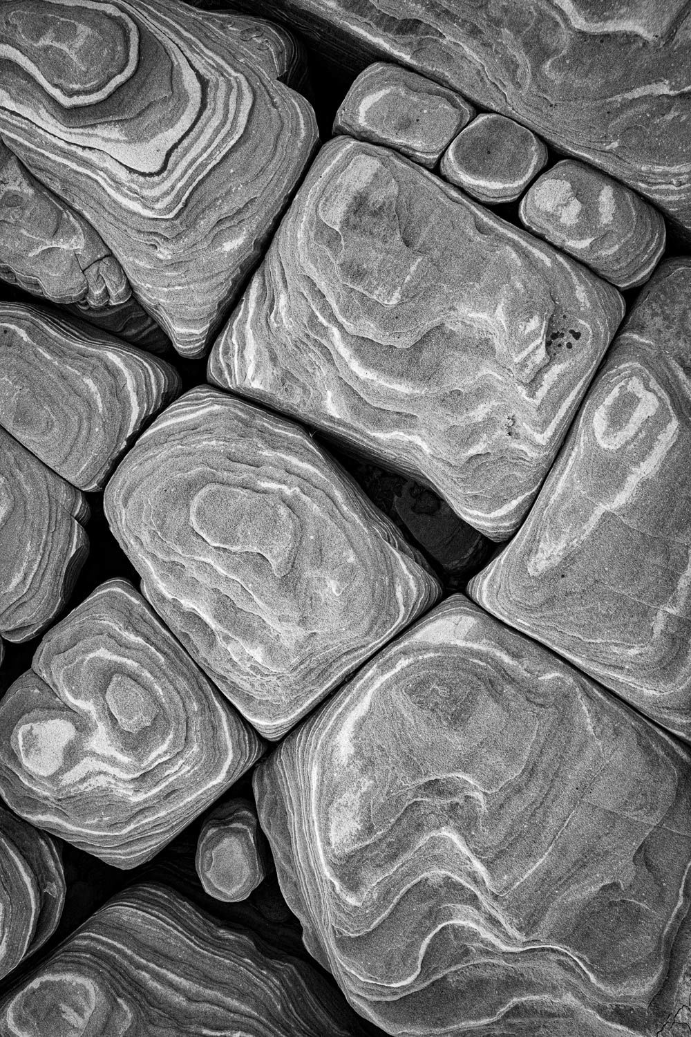
1,4,11, and 12 work well together despite the fact that one is b&w. #7 is the weakest image. Snow on mudstone is a really beautiful image. Mud cracks is also beautiful. Actually any of these work well together except 7 and that one might work if cropping off the bottom.
The whole collection is very striking, David, but if I were to pick six images that work together, it would be 1, 3, 4, 5, 8, and 11. That provides both enough variety and enough coherency. Personally, I feel strongly about keeping to the same aspect ratio in a collection this size. That also gives the collection coherency. I love the (working) title Grounded, by the way!
I really like this collection. #s 1, 2, 4, 8, and 11 really stand out to me. I also want to like #3 as it is unique and dramatic, but it’s almost too overpowering to my eye.
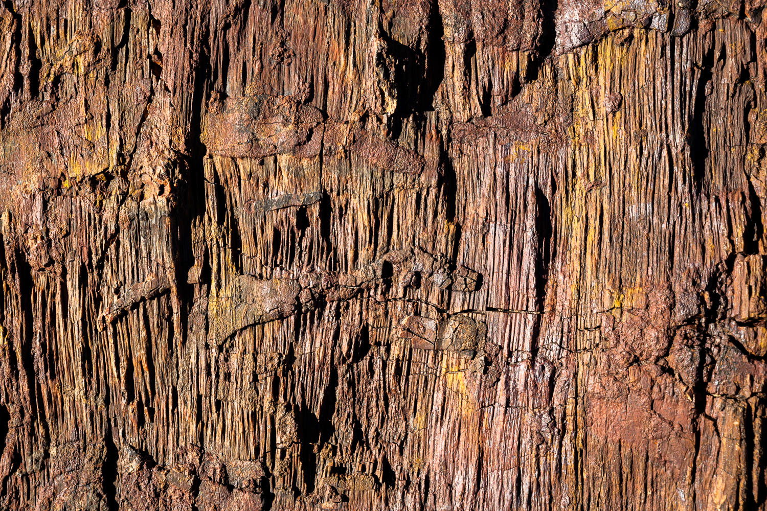
Wonderful set of images David. #4 is my fav. Enjoy exploring all it shapes and textures. 1, 4 and 11 work well together since they share similar crops, orientations and pattern sizes. I find that my sets tend to have more cohesion when I stick to a single aspect ratio and orientation.
#6 would be my next pick with a switch to landscape mode. Again, keeping with similar pattern shapes and sizes.
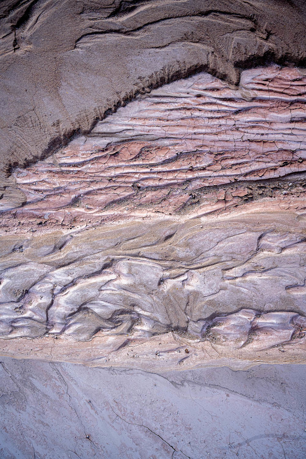
To round out your set of 6 I would add 5 and 11 (crop the bottom and switch to landscape orientation).
Hope this gives you some new ideas to play with. Looking forward to seeing your next project.
Wonderful and outstanding collection of images. All of them excellent in their own right.
Now the difficulty - what makes them gel together as a Project? I’m still struggling to determin what constitutes a Project - beyond just a “theme”. I mean, if each message supports the “theme,” then does it matter if they’re all the same orientation, format ratio, color or b&w? You certainly have a mix of all of the above, yet I believe they all support the theme - for the most part. I guess there are no set rules per se, but for example, #8 is a wonderful image, but stands out as just 1 of 2 b&w images; also it seems more of a broader landscape view than an intimate like most of the rest of the collection. (then again with nothing to reference for scale, this could be an intimate…)
I don’t want to discount it as a b&w, but give the rest, I’m wondering what the original color version looks like?
Faves and strongest images for me are 4, 5,6, 10, 11 and 1. The weakest for me, #3 due to the hard light and contrast and #9 - which I think is a great image, but the larger version is a bit muddy - so I think just a check on processing and this one should certainly be included. But then again, that little green bush is a little repetitive between #9 and #10, although I realize it’s not the same plant.
#12, the 2nd b&w is also an excellent image, but I think repetitive being next to #11. For a “final” Project it would be one or the other - probably #11, if it were me.
Lastly, #7 could be elevated from maybe a weak one, to a much stronger one with a crop - crop out the rather plain bottom 20% and maybe shave some off the top. I think you have room to exploit the colors here too. This one would certainly belong in the final count with some changes.
As well as looking at the images individually, I like to look at the composite. Top shots: 1, 3, 4, 5, 6 & 11. Bold and clear. Middling: 2, 7 and the 2 B and W’s, Nos 8 and 12 (though 12 in colour might be great). Images 9 and 10 I’d omit because of the bushes. Just my take, I don’t know the place; you’re the one who has the key to this environment.