Please share your immediate response to the image before reading the photographer’s intent (obscured text below) or other comments. The photographer seeks a genuinely unbiased first impression.
Questions to guide your feedback
What first catches your eye?
What thoughts come to mind when viewing this image?
Other Information
Please leave your feedback before viewing the blurred information below, once you have replied, click to reveal the text and see if your assessment aligns with the photographer. Remember, this if for their benefit to learn what your unbiased reaction is.
Specific Feedback
Does B&W work with this image
Critique Template
Use of the template is optional, but it can help spark ideas.
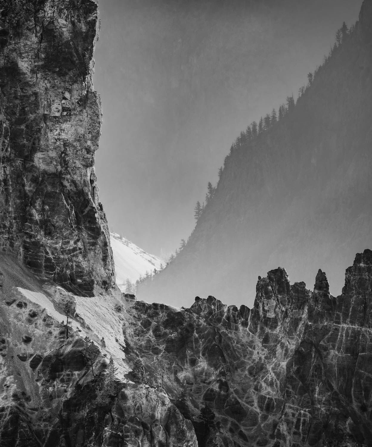
My initial reaction is: Great Lines! I especially like the intersecting diagonal at the right angles of the foreground, and that distant snowy section adds just the right amount of apposing diagonal.
My only wish is for less posterization. It might be worth selecting that sky and adding a blur to it.
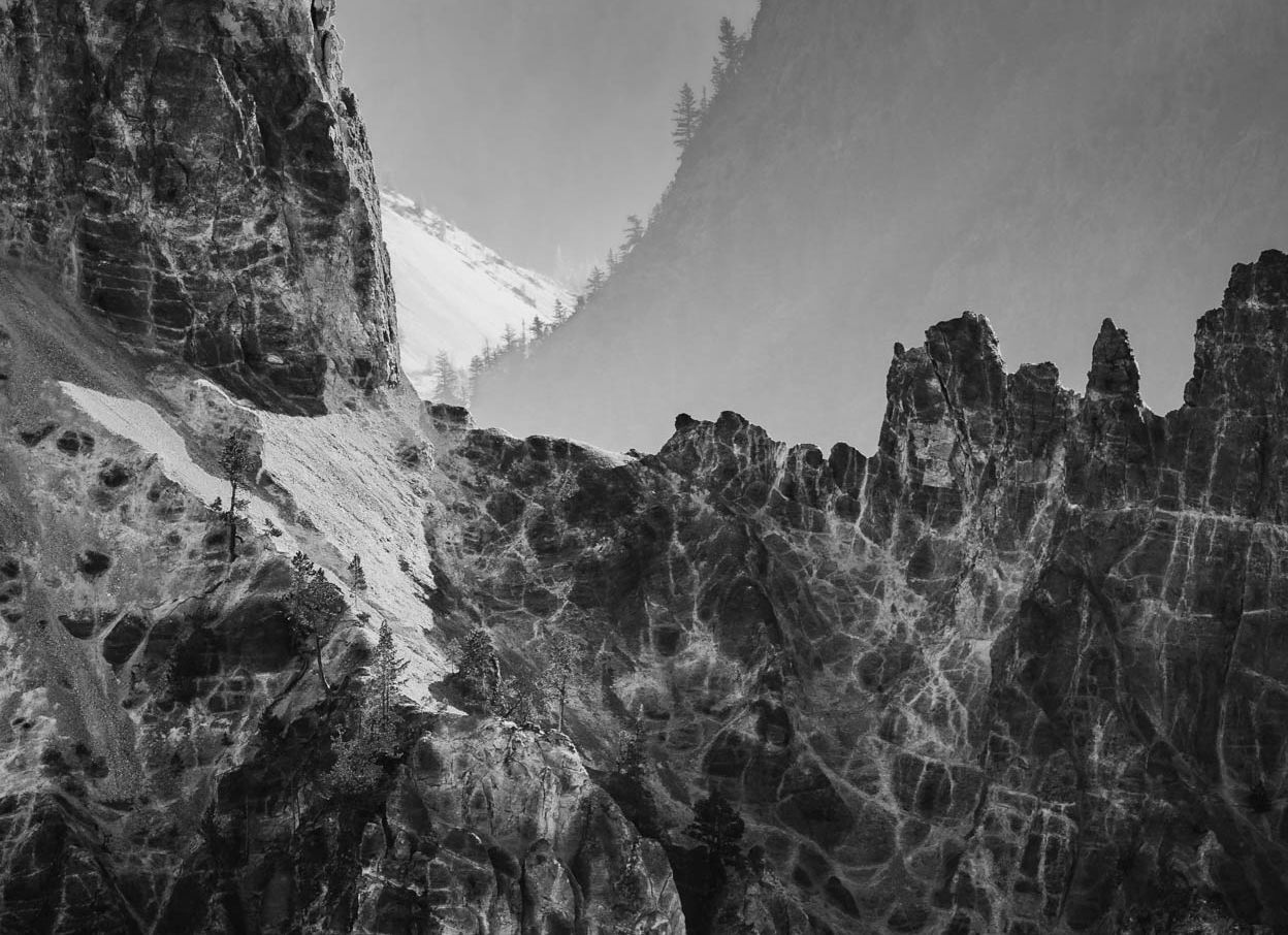
Hello Ted. Seems like this is your first post over here. I like the B&W conversion. Amazing lines and patterns in the FG cliffs. I will agree with @John_Williams about the sky or maybe it’s an opposing hillside? This is just my personal opinion but I feel the vertical aspect ratio is a little too tall. You were probably trying to show the verticalnessof the cliff but it seems a little unbalanced. I would go for a 1x1 or even a 4x3 to draw attention to the FG which is where all the action is.
I kinda like your crop and all the lines and curves and textures are fun and dramatic. And the BW really adds to it. Yes, the sky and the area to the right need to be cleaned up. I guess since I work with numbers all day, this makes me think of some lines on a data chart. Nice seeing.
Hi Ted,
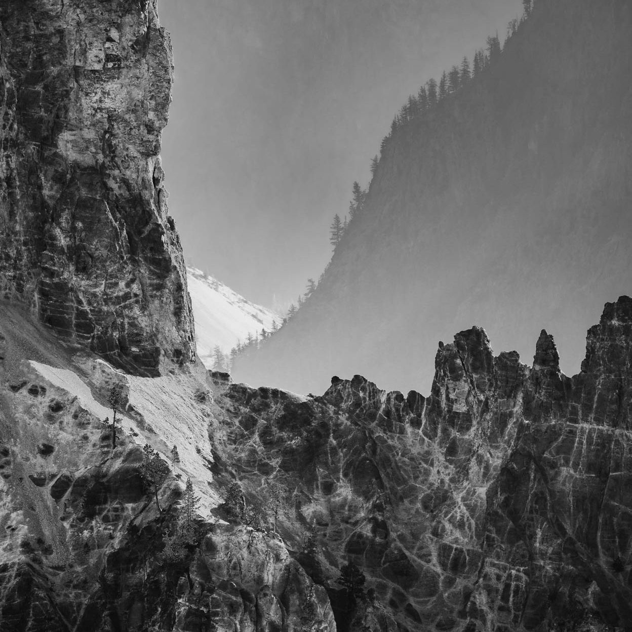
This is so cool looking. The first thing I notice is all those intersecting diagonals and I am loving the way they direct the eye into this scene. The FG rock formation has all these wonderful lines and textures for the viewer to enjoy. The two triangular areas of snow are another wonderful element in this image as they appear to form an hourglass. The B&W conversion also works well here. I am not trying to muddy the waters, but I have a couple of suggestions; just my opinions of course. I could see a little more contrast added and a small crop from the top; not quite as much as @Michael_Lowe suggested; although his crops work beautifully as well. I think the added contrast brightens up the snow just a little more so it is not so grey. I hope you do not mind, but here is a rework with what I was thinking. Great eye to spot this.
Thanks John - The lines and triangles are what prompted me to go B&W. Still trying to balance the contrast of black - white and other mid-tones since I don’t do much B&W. There is no snow nor sky in this shot - the background is a far distant mountain side viewed through thick atmosphere.
Hope to post more for insights on how to hone my B&W techniques
Michael - Great comments on crop/aspect ratio. I will explore a few approaches to gain a better balance in the image - as well as work on tonal range and contrast.
Cheers
This is one of those images that can be explored in many different ways as shown by the various reworks.
When I do B&W conversions from color images, I use a combination of a B&W adjustment layer and TK’s Luminosity Masks in Photo Shop. This gives very great flexibility.
I do think this is a very interesting image with a unique point of view. Looking forward to seeing more of your work.
-P