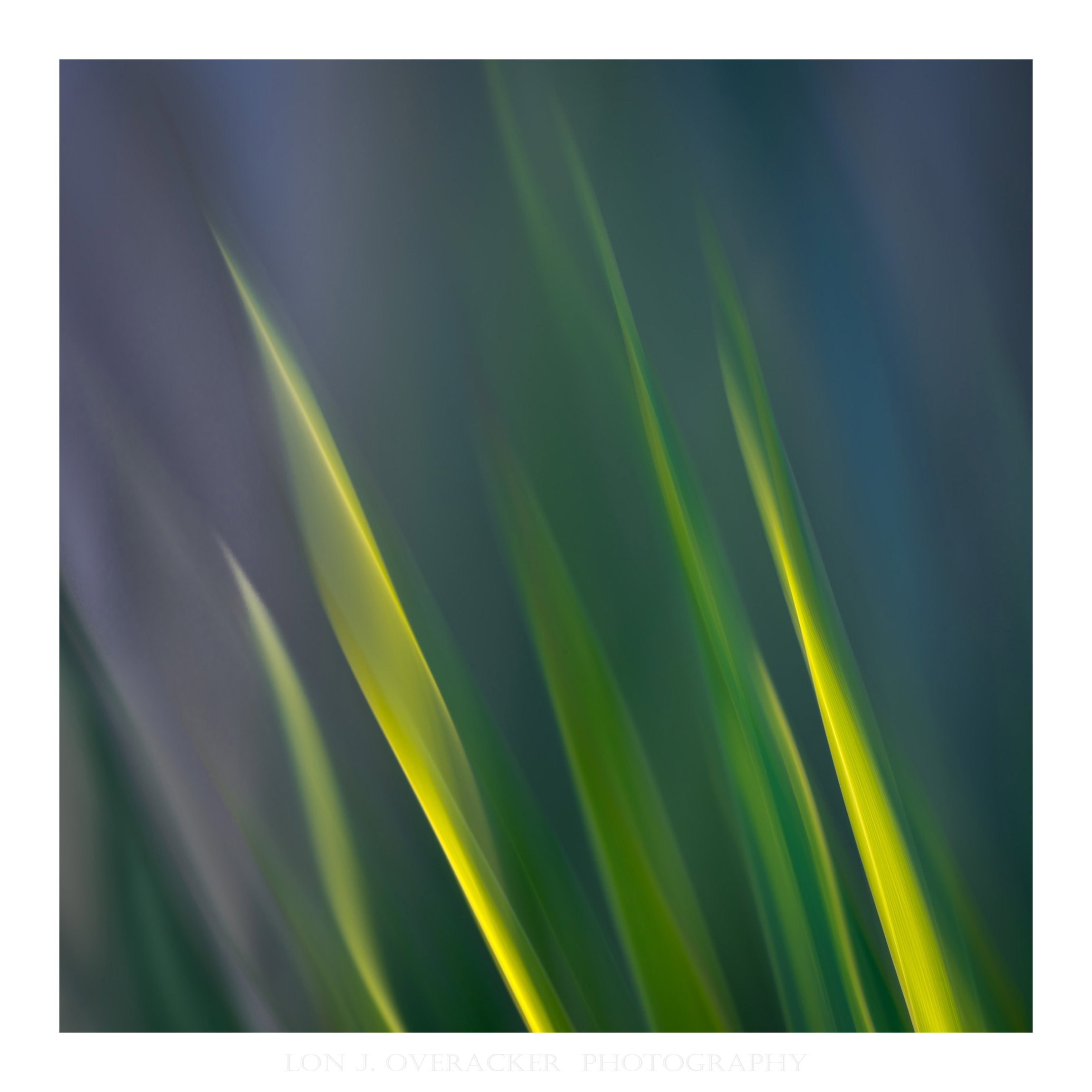
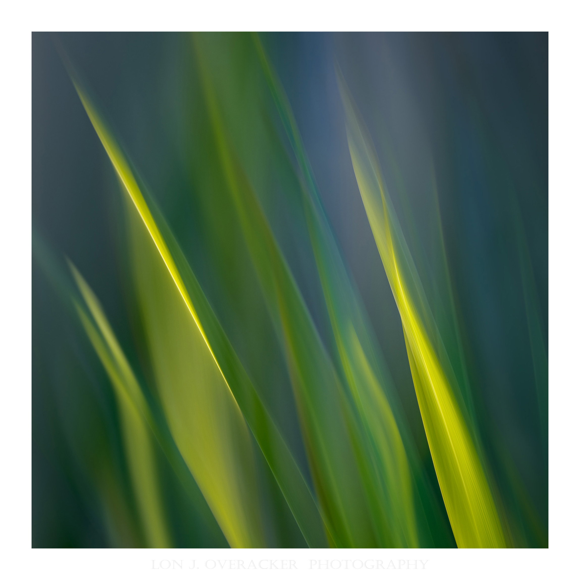
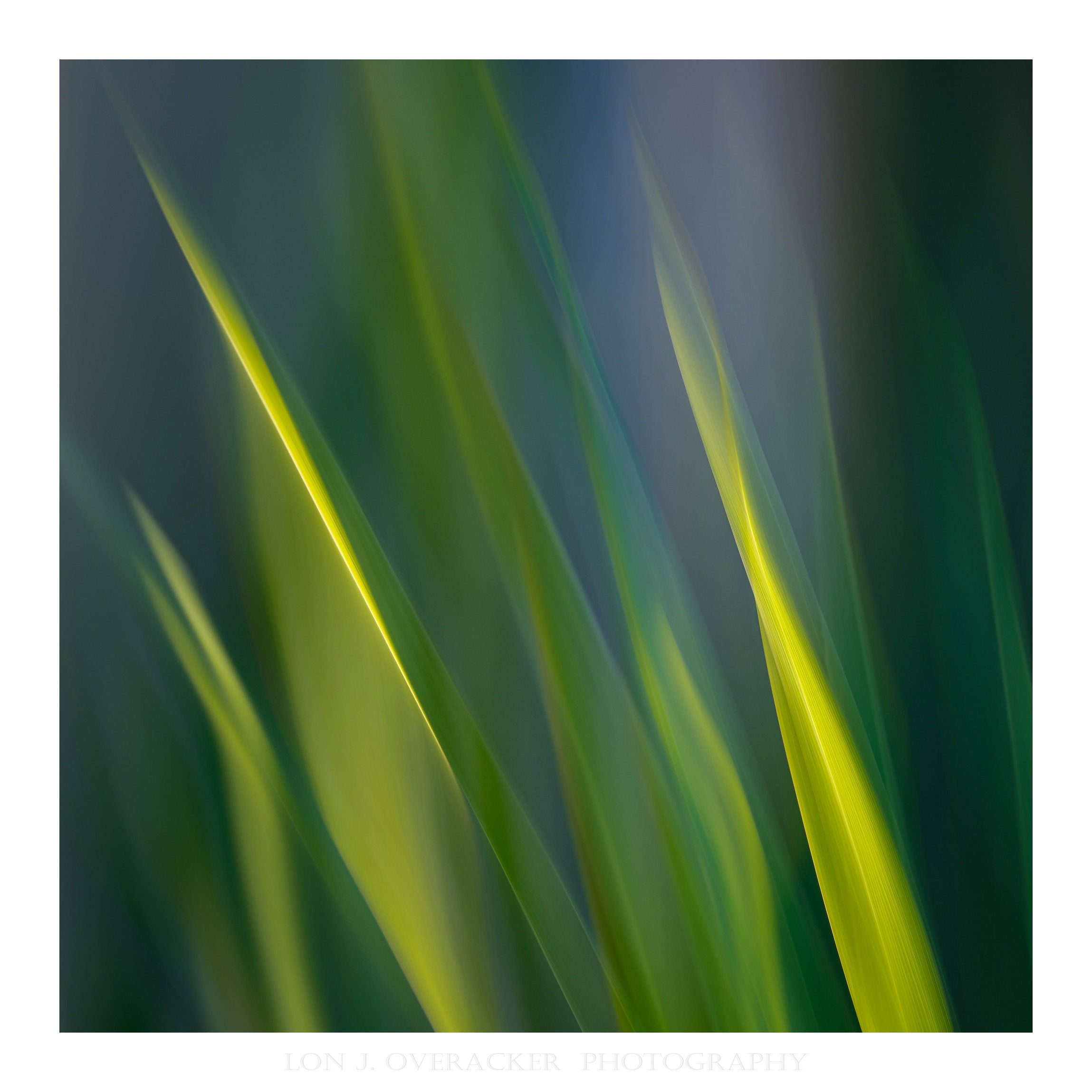
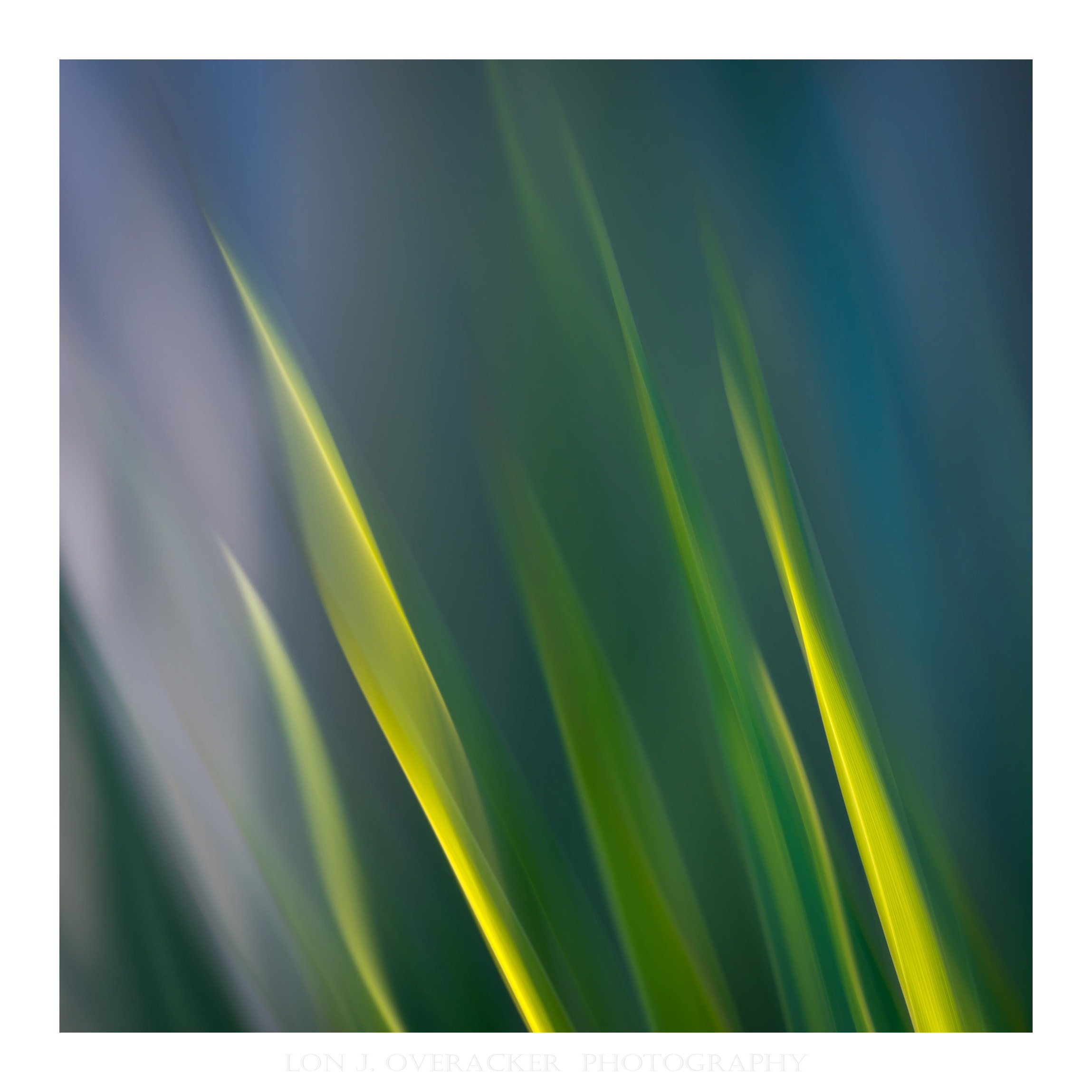
What changed: Back in ACR, did a color range selection of the area noted, played with hue/sat and other adjustments, including luminosity and some dodging and burning
The photographer is looking for thoughtful feedback on the image as a whole, especially around the areas noted below.
Feedback Focus: Artistic + Technical
About This Image
Here are a couple of additional frames I captured the other day exploring the plants in the backyard. These two are very similar.
Simple vertical swipes on a yucca plant with some filtered light through the fence.
Feedback Requested
As always, your thoughts and feedback are welcomed and appreciated?
I’m curious if you have a preference between the two? I’m sure these are as engaging or dynamic as the previous two, but I liked the lines and the diversity of colors that can be brought out.
Would love to hear your thoughts on these. Thank You!
Technical Details
Image 1
Camera: NIKON Z 8
Lens: TAMRON 150-500mm F/5-6.7 Di III VC VXD A057Z
Focal length: 220mm
Shutter speed: 1/4s
Aperture: f/18
ISO: 32
Image 2
Camera: NIKON Z 8
Lens: TAMRON 150-500mm F/5-6.7 Di III VC VXD A057Z
Focal length: 220mm
Shutter speed: 1/4s
Aperture: f/18
ISO: 32
These are good, Lon. The first shot fills the frame with leaves better, and I don’t care for the bright patch on the left in the second one. The filtered light works very well.
I prefer the second image, Lon. I like the transition of the “background” from the blue on the right to the gray on the left, though I could see toning down the lightest grays just a tiny bit. In the first image the tips of the yucca feel crowded against the top of the frame and I keep wanting more room for them to grow.
I mostly agree with Don here, preferring the first one, but I think a third option, with the blue triangle on the right side of the second shot replacing the very dark part in that same position in the first shot could look good too. The bright patch is too bright for my eye in 2.But I love the mix of greens and yellows overall in both shots, Lon.
Lon, another two nicely attractive, flowing looks at your Yucca. I prefer #1 with the green/yellow “flames” filling more of the frame. I do think that #2 would be better with the bright grey/magenta bit on the left burned-in. The darker blues in #2 are a good bonus.
I like the first image over the second. The light patch in the second does grab my eye. The little bit of blue and yellow green in the first photo’s comp provides some nice color pop…Jim
Thank you @Don_Peters , @dennis, @Mike_Friel , @Mark_Seaver and @Jim_Zablotny for your comments and suggestions. I’ve taken that feedback and reworked both images. Thanks for the comments and ideas! Much appreciated!
Lon: It won’t take much more and I’m going to start thinking you know what you’re doing. Superb results working this subject and coming up with so many pleasing and unique variations. Many >=))>