The photographer is looking for generalized feedback about the aesthetic and technical qualities of their image.
Description
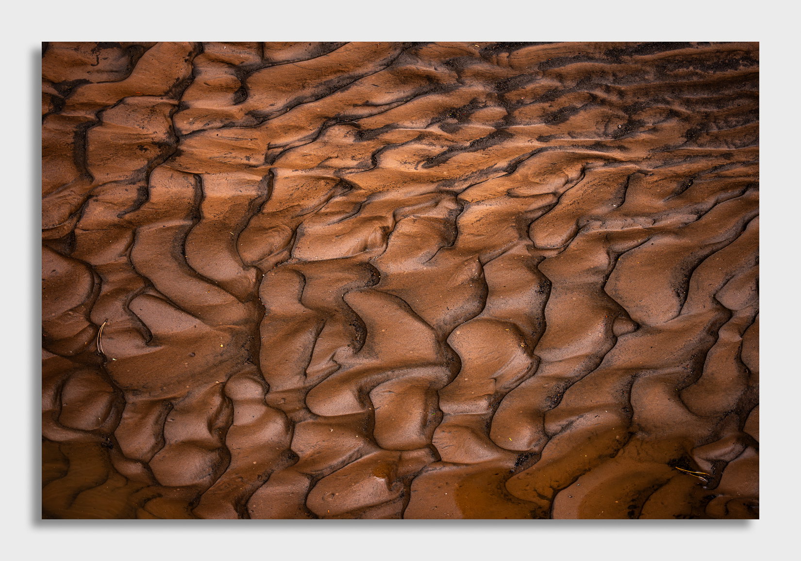
This is another image from Zion in Fall after a storm moved through while I was there a few months ago. There were mud formations, the likes of which I have never seen before, all around me. I find it interesting how these form and how the patterns are so random and yet so wildly weird. It was like Willy Wonka’s Chocolate factory the day after that storm.
Specific Feedback
Again, like my last mud image, I have not removed most of the debris from this one. Let me know if it works or if I should at least remove the pine needles.
I see lots of available crops from this so I’m wondering if this works well full frame or if you see something more interesting? After looking at all these swirls, my eyes start to go a little bit haywire and I can’t focus anymore.
This image is less intimate than my last one and I’m wondering if it works as well?
Let me know if there are other things you see that need my attention. List them all!
Technical Details
Z8, 24-120mm lens @ 46mm, f/16, ISO 500, 1/30 hand held, manual exposure
Critique Template
Use of the template is optional, but it can help spark ideas.
Vision and Purpose:
Conceptual:
Emotional Impact and Mood:
Composition:
Balance and Visual Weight:
Depth and Dimension:
Color:
Lighting:
Processing:
Technical:
David, the warm browns and their pattern do have my taste buds excited. The pattern is awesome with all of it’s swirls and ripples. The two pine needles do stand out a bit, with the one on the left getting more attention. I would say that leaving those or keeping those is about what you want the image to show. If you want to push the abstraction, they should go along with a number of other bright spots. I’m inclined to like them because that add a touch of reality, although I’d burn in the brighter needle on the left to reduce it’s visual impact. It looks like you’ve added a vignette which seems a bit strong to me. In the “old days” folks would do what was called “edge burning” to help keep the viewer’s eyes in the frame. That would work well here without calling attention to itself.
I think it’s better than the last one. And I liked the last one. I like it more because it’s less obvious. The point being made is less obvious. It’s more open for interpretation, even though it’s obviously mud. But it’s not the mud itself that is exciting. It’s the tonal arrangement and shapes in the mud. No, I would not remove the pine needles but it matters little if you do or you don’t. Nice image. The lack of perspective is nice. You can’t tell whether this is an aerial shot of badlands or a closeup. All this ambiguity enhances the image imo.
Here’s my case for the pine needles: I think they add a bit of an unexpected surprise, and because you have a break in the pattern in the upper right corner (where the mud almost “flows” into the frame), to me even something as small as those needles provides an additional break in the pattern in locations that play off that upper right flow well. In other words, the elements that sort of throw off the perfection of the scene are actually balanced with each other, which keeps it all glued together for me visually.
David: I love what you have here and where I think the needles help is in providing a sense of scale. If you remove them then the image is more abstract with no evident scale and a bit more “what is this?” effect. I do like the play of light on the scene and would not make many changes there. Very well seen and superbly captured and presented. >=))>
Hi David,
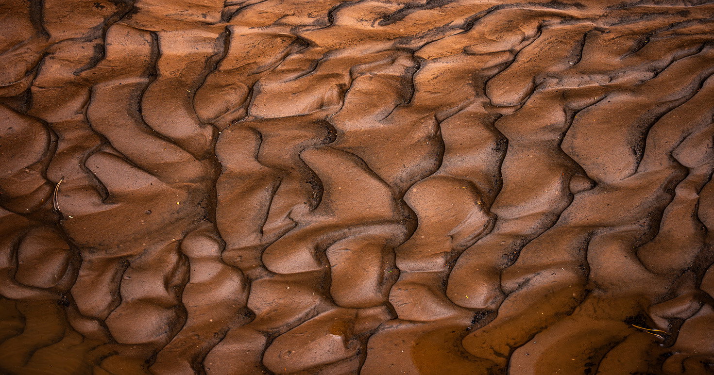
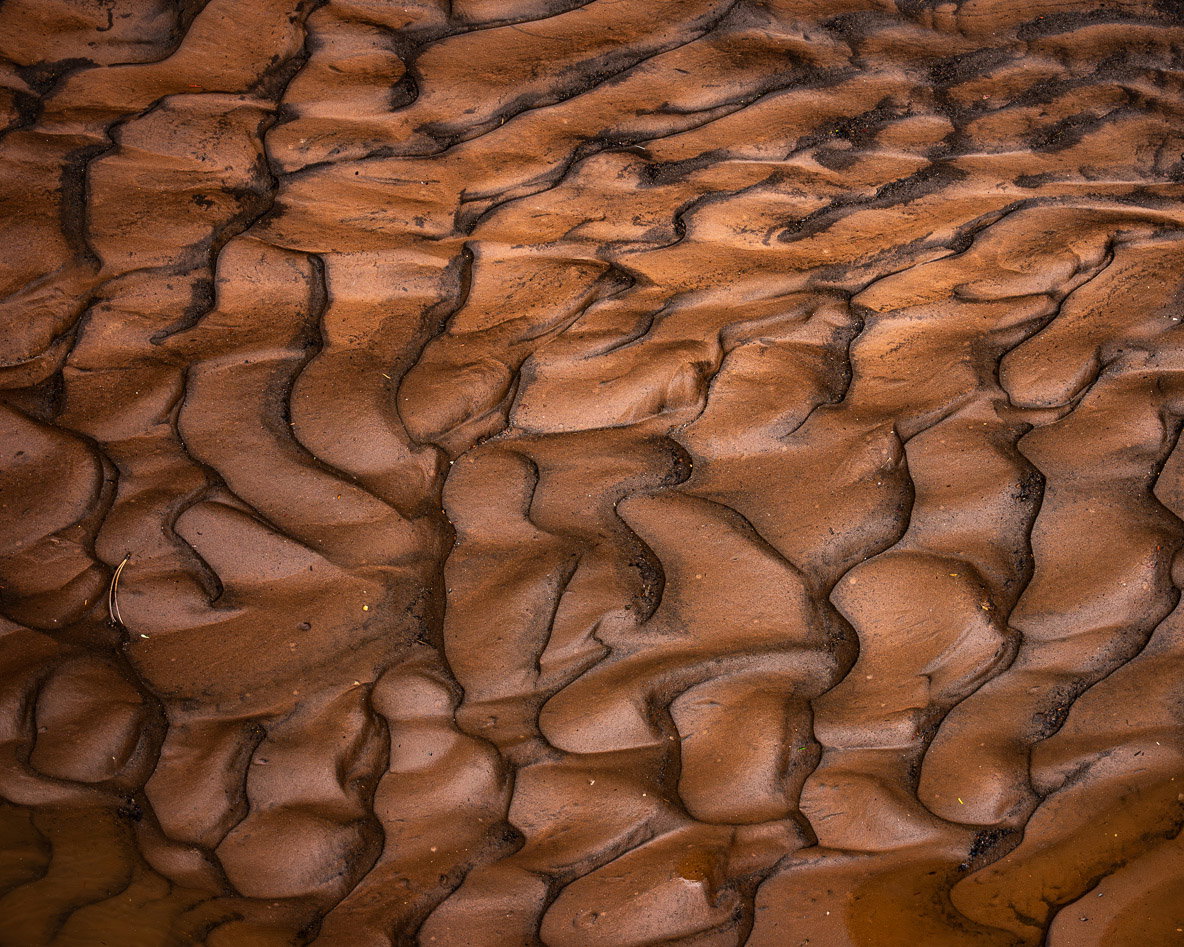
Another wonderful river of chocolate. This one also works quite well with all the shapes and graceful lines creating this lovely mosaic. The soft light also works nicely for this intimate landscape and the pine needles to not bother me at all; in fact I like them for the sense of scale they provide. I am thinking you could find some crops in here as well. I am not sure about the URC as the patterns there seem to clash with the rest of the image. One crop I see is this pano. I have enjoyed these first two and I hope you have some more to share.
I very much like this, David. Not quite as much as the last one, but it’s still top notch. I agree with @Ed_Lowe about the URC. I would probably crop most of it off to a 5x4. My feelings about the debris are opposite from the last image. In this image, since there’s no leaf subject matter, I would treat this as more of an abstract. Without the debris, there’s no sense of scale and a viewer might ponder just what they’re looking at and just enjoy the colors, tones and swirling patterns.
This ones moves a step abstract from your prior, and is again a lovely image. I prefer the prior, but that doesn’t mean I’m not enjoying this one. Both are excellent.
I enjoy the way the debris grounds the image, so I’d definitely leave it. My only thought would be to reduce the vignette slightly.
This is an intimate almost abstract subject that I would so love to come across in Scotland but alas never have. Very jealous I like all of the pictured compositional crops, but if I had to choose I would probably go for the bottom one that looks to me like it would fit a medium format 6x7cm transparency and would probably work stunningly well on film, as well as in black and white.