to be compared to
Critique Style Requested: In-depth
The photographer has shared comprehensive information about their intent and creative vision for this image. Please examine the details and offer feedback on how they can most effectively realize their vision.
Self Critique
After the photoshoot I decided that the second image was clearly superior and never bothered to show the first. But today I saw the first image with new appreciation. I suspect that the 2nd image is still superior but I don’t think it should have been an all or nothing comparison. In fact the first image may have been processed better.
Creative direction
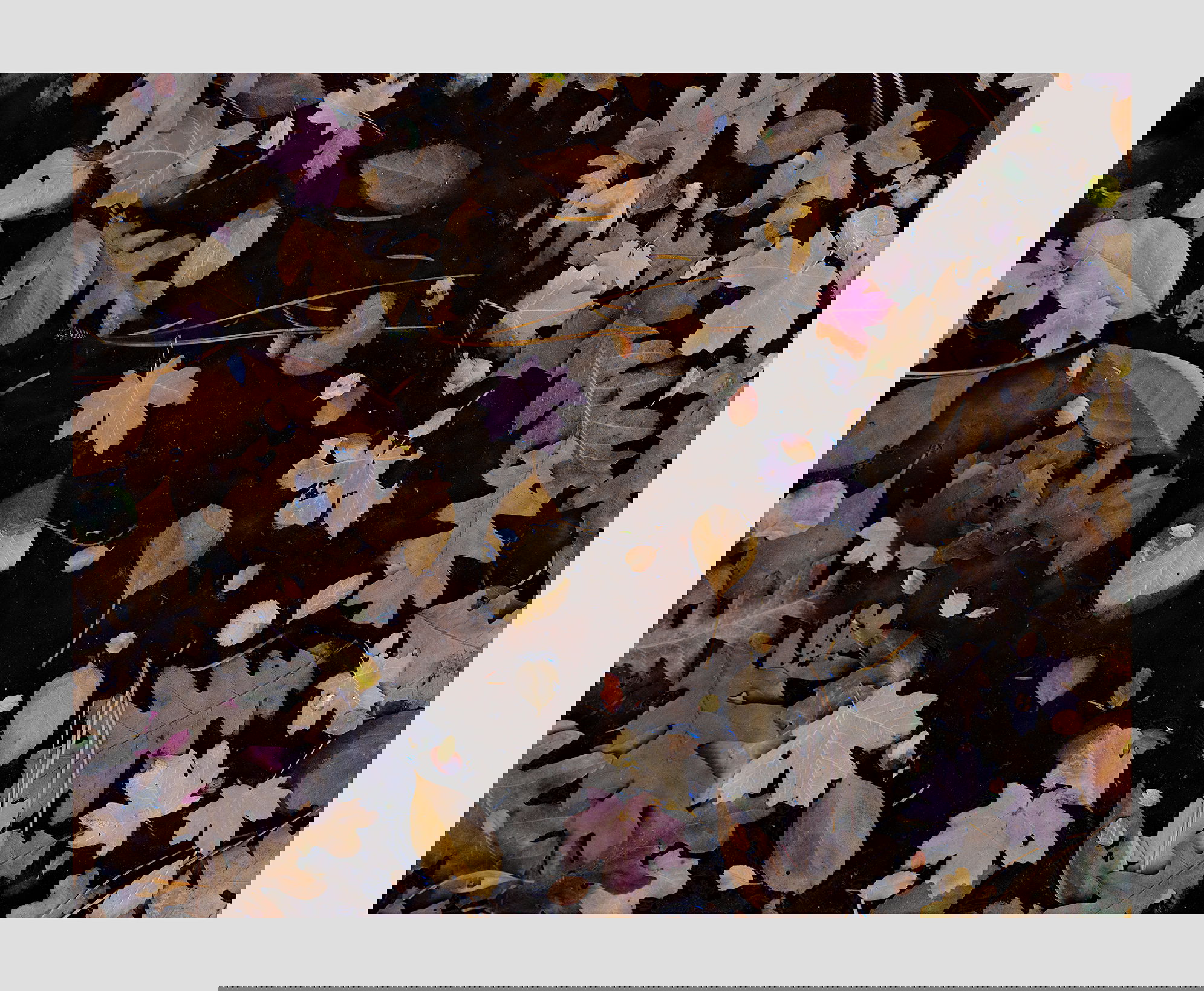
My vision was different for the two images. The first is one of the boundary between a rock wall and floating leaves. The texture and color of the wall was important. The second is an abstract of brightly colored shapes on a dark surface.
Specific Feedback
I am interested to see which image you prefer and why.
Technical Details
These image were photo stacked, which shows how little the water had been moving.
Description
This is a pool of stagnant water with leaves at Zion in the fall.
I like both the images, as presented I think I prefer the second, close up version, just for the simplicity and clarity of the subject. On the first image, if it were mine, I would try cloning out the twigs on the rocks. To me they were distracting and muddled the division between the rocks and everything in the water. I think having the absence of any twigs, or maybe even any leaves, on the rocks creates a nice contrast between the two areas. Well done regardless!
Igor, I like both, but the extra abstraction in #2 give makes it my choice. In #1, I’d like to see a bit more detail in the dark section in the upper left. In #2, I found with delight the small floating insect, that looks like it may be a hoverfly. Yes, the water was very still as the moving water artifacts are rare and don’t effect the overall view.
I actually like those twigs. Go figure.
1 Like
Hi Igor,
I like both. The first has a sense of place, and the second is nicely abstract. What I love most about both of them is the diversity of leaf shapes and the murky color of the water, which gives it both a very natural feeling and a sense of specimens floating in an agar filled petri dish. Sorry of that’s all kind of weird, but I like to free associate a little bit when critiquing abstract images. I think it tells us something about what captivates us in such images, what’s expected, what’s not, what creates curiosity.
ML
1 Like