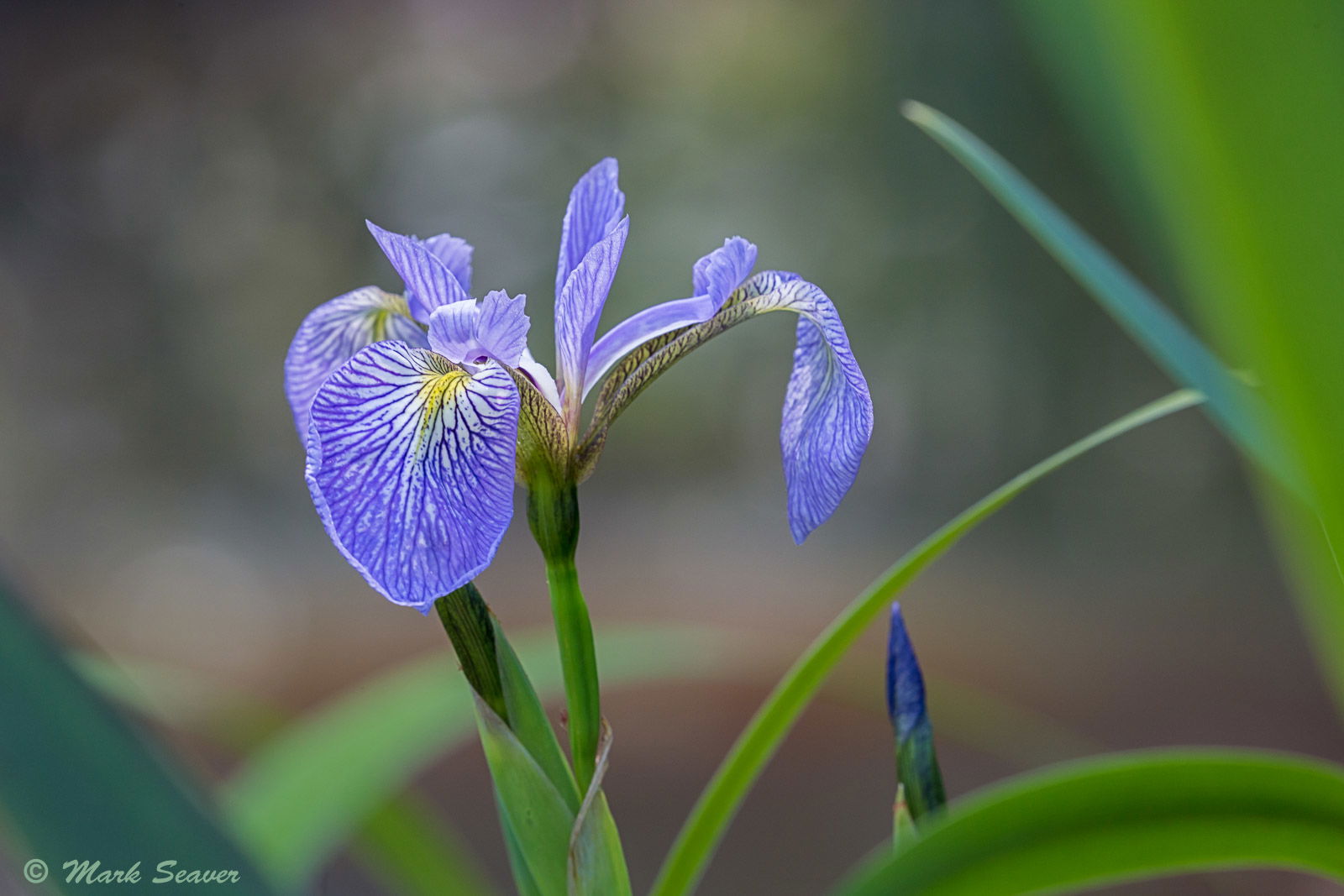
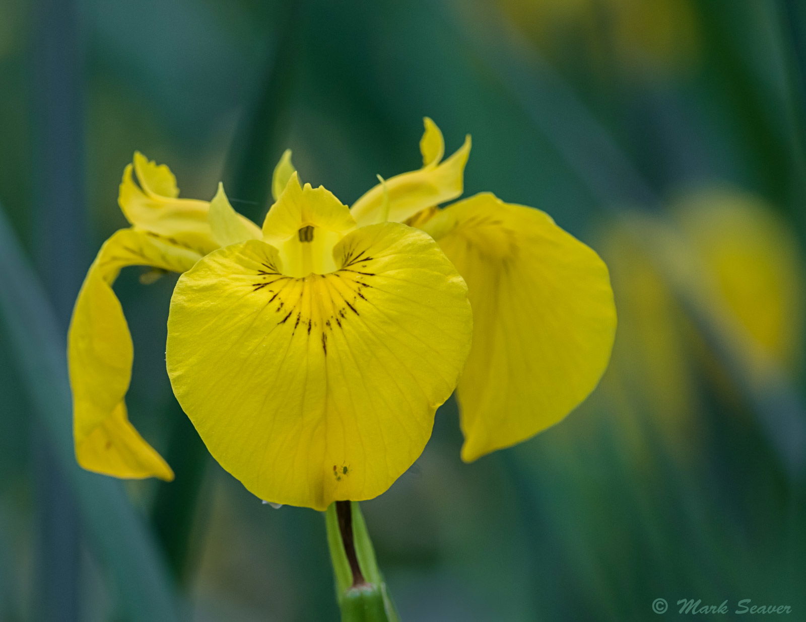
A photographer friend invited me to join him for a visit to a local, built wetland where two types of iris have migrated in during high water events over the years. All of the good looking flowers were well out into the water, so without waders, I couldn’t get in for the kind of tight looks that are my usual approach. Instead I opted for views with more background, which is something that I’ve begun experimenting with this spring…must be a COVID repsonse… Any way, here are two that I like because they feel quietly inviting. I’m curious to see what others think.
I find the blue/green tones quite restful. (7D2, 100-400 @ 400)
Mark, I like your “social distancing” with these Iris. Very nicely done. Both are beautiful. I never heard of Iris being transferred to a new location through flooding. Very interesting.
Lovely, Mark. I like the feel of the movement of the background in both images and the space not only allows the flowers room to breath but also helps to make them the focal point. Nicely seen and captured.
Like them both, Mark,especially the Iris captured at the max telephoto length. The fine line details of the petals are nicely presented and shown throughout, the arcing leafs add a soft wildness and subtle energy to the image.
The second image (with the macro) has a nice soft background and beautifully sharp at the center of the flower but overall it might sit better with more space throughout the frame.
Mark: I like both versions but generally like the first better with the exception of the intruding OOF leaf on the right side. I made it go away with a quick and dirty CA adjustment. Back to you. >=))>
Both are gorgeous, with lovely settings! The telephoto macro approach is challenging but often rewarding, (Why are the best flowers always just out of reach?)
I like @Bill_Fach’s simplification. I was wondering about a subtle darkening of that OOF leaf on the right but can’t decide – it is a lovely color but sort of jumps out at me.
Mark, I like the first one better than the second, mainly because of the colors. Blue goes very well with greens and inclusion of more background makes it more interesting. I don’t mind the background. Bills clean up leaves more breathing room for the flower.
Great photos Mark. I enjoy the sharp focus with the soft background. I also agree with Bills update as well. I think being on the same plane as the flower helped very nicely.
The Iris versicolor ( harlequin blue flag iris) is A-1. Beautiful!
The surrounding out-of-focus vegetation adds to the narrative and gives the image a sense of authenticity. I should note that I’m a botanist by training and absorb floral images with that jaundiced gaze. However, my right-brained photographic neurons let me enjoy great images without feeling guilty.
In that vein, the Iris pseudocorus (yellow iris) is invasive and doing extensive damage to natural ecosystems.
But back to I. versicolor, photographically, I would pull back on the blue luminosity slider to bring out the blue of the petals, which will sharpen the veins. But that’s an opinion.