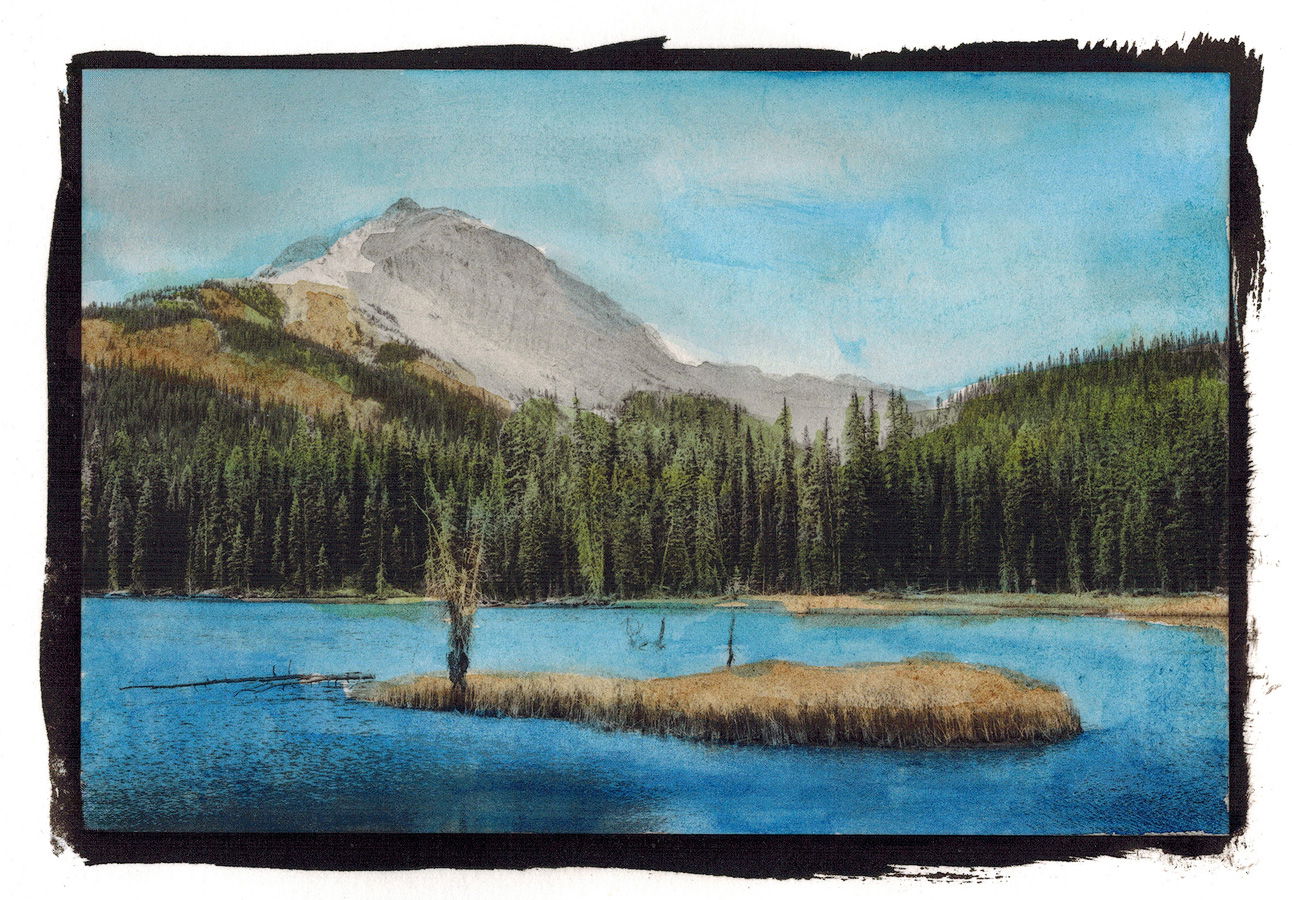
Here is an alternate version from a failed print that was much too light. I decided to experiment a little and hand painted it with my watercolour paints:
The photographer is looking for generalized feedback about the aesthetic and technical qualities of their image.
Description
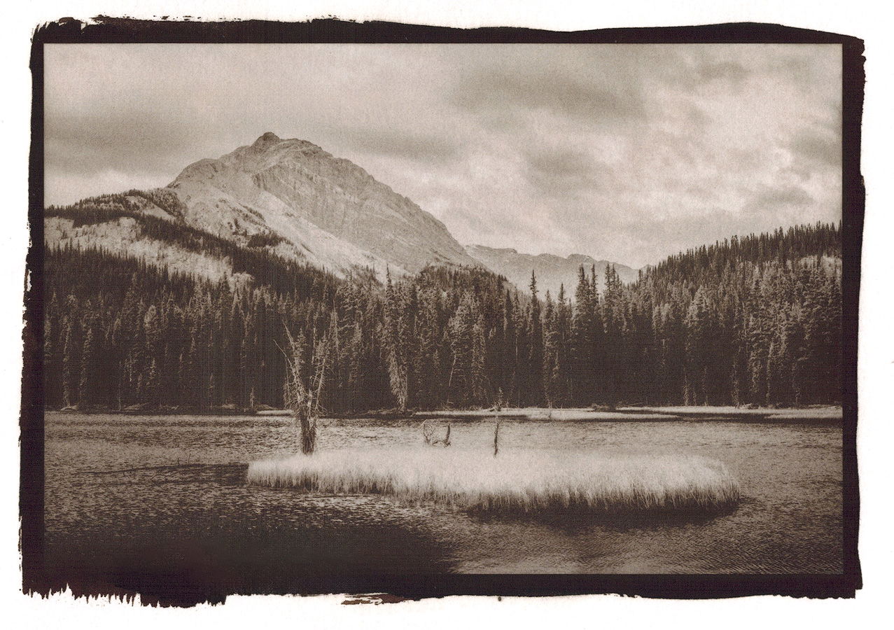
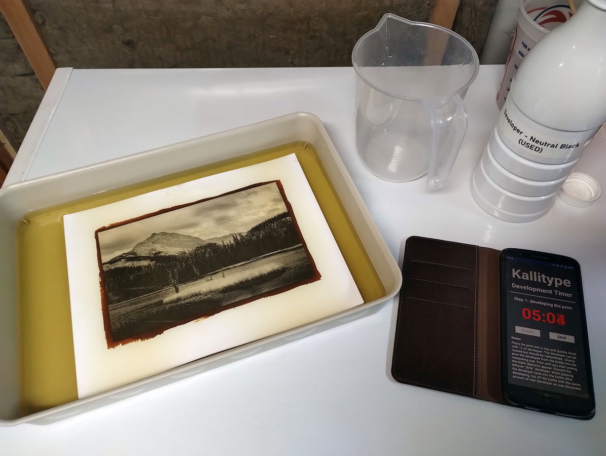
I’ve been playing around with making Kallitype prints for the past 6 months or so. It’s been very challenging but I really love the look of the prints so I keep at it. It took me 8 tries to to get this print to look halfway decent and each print takes me about an hour to make. It’s truly a labour of love.
I posted the original colour (digital) version of this image here back in December 2021. This is it here for comparison:
I’m curious, does this work for you? Or do you prefer the original more traditional image?
Technical Details
Shot on the Canon 5D4 with a 45mm tilt-shift lens at f/13 for 1/10th sec, ISO-100.
Then converted to a black and white digital negative which was then contact printed and developed. Finally the print was scanned again to allow me to show it here. I have a very poor scanner so the scan isn’t the best - I apologize for that.
Critique Template
Use of the template is optional, but it can help spark ideas.
Interesting, Tom. I’ve never heard of this process and I’ll have to look it up. I like both the brown tone and the hand colored version. I also compared them with the original photograph you posted. They all have different feels and the composition is, of course, the same, though somewhat affected by the border created in the Kallitype process. Which is preferred is strictly taste. I think I like the monochrome the best because it has a bit of an aura of mystery to me. The hand painted one looks like just that-a nicely done watercolor of the scene.
I’m not sure why you chose to post this in Everything Else. It’s still a landscape photograph no matter how it was made and I think it would get more attention in that forum if you want it put there. You’re welcome to transfer it yourself, or I can do so , if you prefer, or you can leave it here.
Rather than linking your previous post, it might be easier for people to compare if you just insert it in this post-it shouldn’t be confusing since you’ve explained it already.
Hey Dennis, thanks for taking the time to comment and for your comments themselves.
I will move the post to the Landscape forum a you suggest. I only posted it in the everything else category because it’s kind of experimental but now that I think about it I agree with you that it’s still a landscape.
Not so crazy about the painted colour version but I absolutely love the the black and white. It has the feel of an old sepia print and gives the image a truly timeless quality. I can’t wait to see where you go with this. From an artistic point of view, a perfect example of the relationship between creativity and courage.
Tom, this is great. Please continue with these alternate processes. When I was at Brooks Institute in the early 1970s, alternate processes were part of the curriculum. Learning the history of photography through doing builds a connection to what we do.
When I saw this post, I remembered a visit to Henery Fox Talbot’s home in England, near Stone Hinge. He was the inventor of the negative-positive photo process.
It is pretty complicated because I’m still learning and I struggled with it quite a bit. I made 7 prints of this image prior to this one that were all failures before I got this half decent result and each one took me about an hour to make. And I’ve almost used up all of my paper
To be honest, I’m not a fan of the watercolour one myself. It was mainly just an experiment to see what it would look like and also to try to salvage a failed print. It was fun to paint but that’s about it.
Tom,
The B&W is pretty cool and has a nostalgic look to it; kind of like an old sepia print. It does sound like quite a bit of work to get to the end result so your persistence paid off rather nicely. FWIW my favorite is the original image as I find it very relaxing and soothing to view. Either way you can’t go wrong.
I really like your photo, lots of detail, plenty to look at. Do you think it would look better in both colour and Kallitype if the central island was a bit darker? It seems a bit blown out to me.
I actually prefer the Kallitype, although your watercolour reminds me of some of the old hand coloured prints passed down to me. It has merit too.
Tom, in these times where everything is rushed I am delighted to see this. Reading how much effort you put into this, I applaud your effort and the results. Please keep showing these images (and anything else you have of course) and let us know a bit more about this interesting technique. Thanks for sharing.