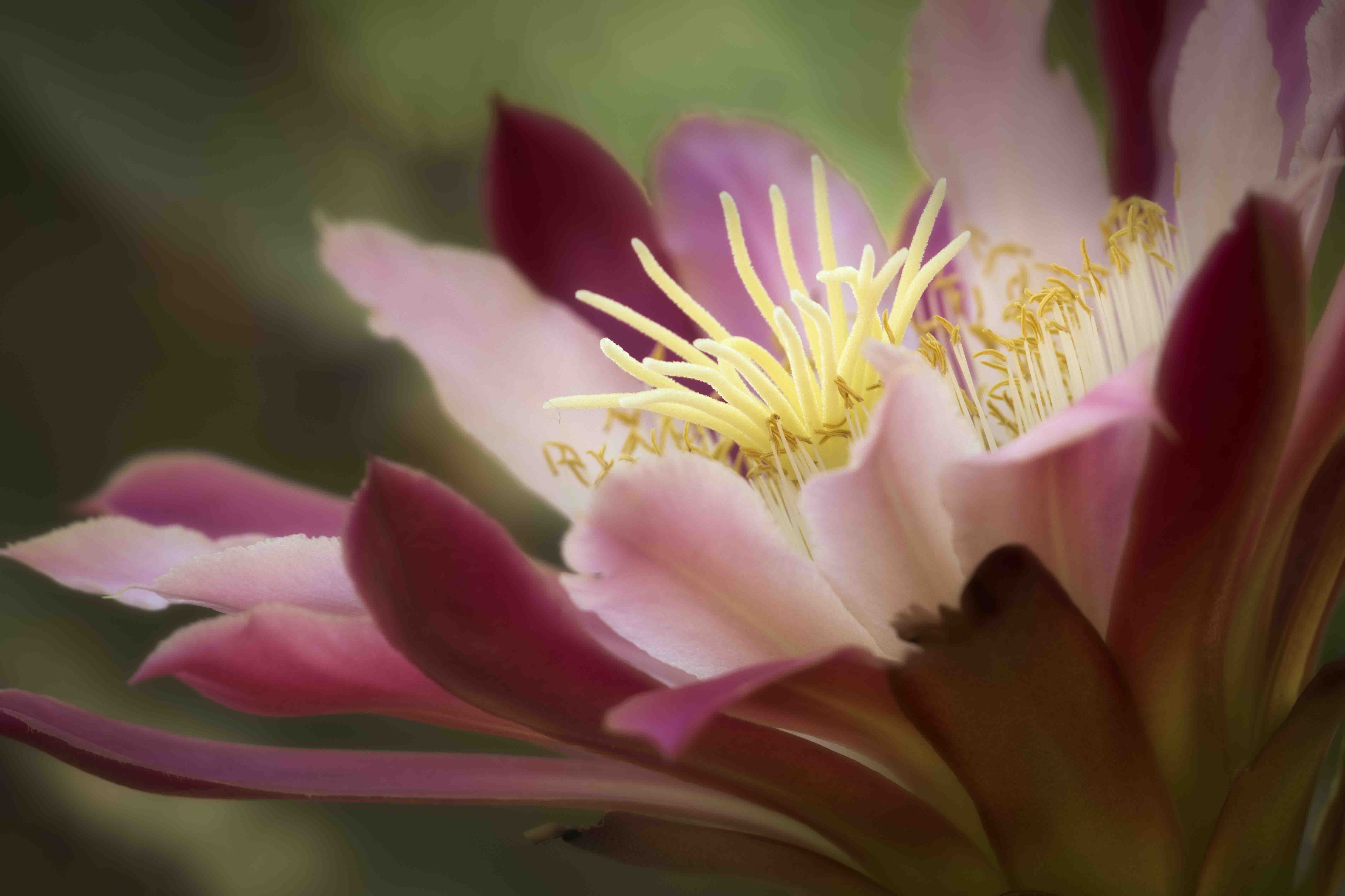
Colors don’t bother me, but then I don’t know what they were like - these seem plausible and remind me of some Columbine cultivars. The angle and magnification is really nice - lots of depth and soft light. I wish that there was a tiny bit more room on the left or that the light petal was cut off more solidly instead of touching the edge. There is a lot of banding and pixelization in the background that I’m not sure of the cause. And I wonder about bringing up some detail in the yellow parts if possible.
I love the point of view in this image and the depth of field, Don. The center of the flower has a very interesting look-almost like two blooms. I"m not sure if it’s the same thing @Kris_Smith was mentioning or not, but the edges of some of the background petals have an odd fringe that doesn’t seem to go with the softness of the rest-I suspect a bit of blending or blurring would take care of it. I downloaded your image and circled the spots I’m referring to.
Kristen, Dennis, thanks. You’re both right about the edges in the background. I did what I could to fix them in this revision. I don’t know what the best fix is.
Don: I especially like your DOF choice and management of this beautiful flower. I’ve developed a love affair with cactus flowers and succulents so this is a treat. Your revisions make a fine image even better. >=))>
This is a great perspective on this bloom! I like what Dennis suggested and your edited image is lovely. I think the darker pinks could be a bit softer, but it is nice as it is. Nice work!
I love the colors because they are counter-balancing each other: red, pink and of course, the yellows. Excellent composition too, not too much and not too little. Wish I had taken this frankly.