The photographer is looking for generalized feedback about the aesthetic and technical qualities of their image.
Description
I was fortunate to spend four days in the Redwoods on a workshop with Adrian Klein and Zach Schnepf and this is one of the images from that trip. I would appreciate any general impressions of the image and also ways that I might tweak PP that you would opt to do. TIA
Specific Feedback
I see the main elements of this image are the two Redwoods (one standing and one that has fallen) the forground of ferns and the background of the other Redwoods and vegitation. My goal was to highlight the two Redwoods without overprocessing them in relation to the other elments. Too much ? too little?
Also I tried to minimize the sky but had challanges with the UR portion of the image. Any imput on how to best deal with this in LR or PS would be appreciated, if you find it troublesome.
Technical Details
I used masks for each of the main elements, two trees, ferns, and background.
Not that it matters but shot on Sony A7RV, 24-105, F11
Critique Template
Use of the template is optional, but it can help spark ideas.
Pat: I was in the Redwoods last October and enjoyed many such scenes. I do find the bright area on the right side distracting and think the simplest solution is to just crop it away. The rest of the small sky pieces don’t command my attention like the larger area on the right edge. This is a magical place and I envy you the time. I had parts of two days and could have spent two weeks. As for your main subjects I think you composed and captured them very well. Nicely done. >=))>
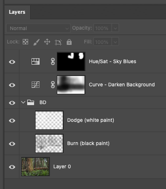
Your composition immediately caught my eye, with the gnarly old vertical tree and that fallen one, fronted by those lovely ferns. I’d say you haven’t over-processed them too much at all. Both elements feel very much the same as the other trees. I had a thought to try some targeted dodging/burning of the two trees, to separately darken the darks and lighten the lights (this is my favorite way to increase contrast without making things too crunchy and overly contrasty). My idea is below.
Your sky in the UR does bother me, not because it’s sky, but because you have a lot of chromatic aberration there (that blue tinge around the dark elements where they meet the sky). That oftens happens in the corners of the frame where there are very dark elements against a very light sky. As part of my edit, I brought this into ACR and did chromatic aberration removal - worked like a charm. I did bring down the highlights, also.
Here’s my edit (may have darkened that sky too much, it looks a bit odd - but you get the idea):
@Bill_Fach’s crop is the best idea for that piece of sky in the URC. I think @Bonnie_Lampley 's tonal adjustments go a bit too far in that the luminosity of the original image is lost, in my opinion.
Regarding the tonality, I fall between the original and Bonnie’s rework, leaning more toward values closer to the original.
@pat2, I think this a fine piece of work and with some minor tweaking along the lines of the other’s suggestions would make this ‘large print’ quality.
-P
Bill, Bonnie and Preston, thank you for taking the time to share your valuable input. You have given me a lot to consider..
Bill, cropping the image is certainly the clean straightforward way to go, which I like. However I have played with that and I think I lose some of the sense of depth in the image. Bonnie I like what you have done. As you mentioned it might be a bit too dark but I think by warming the two trees up a bit, and with an edit similar to what you have done, might give me what I am looking for. I just need to figure how how to do it in PS, of which I have limited experience.
Preston thank you for your encouraging comments. This image has really grown on me and could make a nice larger size print.
Pat, I think you’ve done a nice job with the processing. I much prefer the more expansive crop of the original than cropping out the sky, although @Bill_Fach’s version still looks great. Wish I could help with processing the sky, but I don’t spend as much time as I should learning Photoshop. I do have one small nit with the original. I would crop that small sliver of openness on the right side of the RH tree or include more of it.
What a wonderful scene you happened upon. The light is perfect and the composition is well crafted. I do not mind the sky in the URC, as it does not distract me. But if you must then I agree with @Bill_Fach’s crop. I do not think it takes anything away from the depth of the scene, in fact I think it strengthens the composition by squarely placing the vertical FG tree on the 1/3 line of the frame (I know don’t follow rules) but it does make the image compositionally stronger. Maybe a slight boost in contrast could help define the depth of the scene, but not too much.
Hi Pat,
I have to say that I am really enjoying this scene you captured. It is not one of those wow images, but if the viewer takes the time to look around the frame there is much to savor. The soft light is exquisite and I love all the verticals of the tree trunks encased in the horizontal format. The ferns are also quite lovely, but what makes this image for me is the fallen redwood; it creates some nice visual tension with all the verticals. I could see toning down the sky peeping through towards the URC, but I also like @Bill_Fach’s crop. Bottom line this would make a beautiful print. Very nicely done.
Ed, I always value your comments on the images that you spend time with…very insightful. This was my second trip to the Redwoods and I have to say that I find it somewhat of a challange to find compositons there because there is sooo much beauty on such a grand scale. Others might think I am crazy but my challange was trying to get translate that enorumous beautiful environment somethign that could be easily photographed and shared. Hence my focus on smaller simpler, less dramatic but hopefully easily and understood and appreciated.
Youssef, thank you for taking the time to view and share your thoughtful comments on this image. Believe me, I keep going back and forth on to crop or not to crop. A nice problem to have in light of all of the many problems in the world.
I LOVE this image and composition. With the bold right angle of the standing vs. fallen tree, you’ve really put a mark on the old saying, “order from chaos.” As we all know, the forest is mostly chaos and it’s almost always difficult composing a compelling image. You’ve certainly done that.
I agree with you that any more than just a tiny crop off the right (to remove the brighter, leading edge on the RH side, takes away or reduces the sense of depth you’ve created here.
As I said first, I love this image. The only suggestion I have would be a tad increase in vibrance - but of course that’s all in the realm of personal choice. No other nits or suggestions.
The only thing I would suggest and that nobody has mentioned is that the brighter areas of the fallen log to the left of the tree do draw some unwanted attention. I would burn that down since the tree is where you want people to look. But since no one brought it up it may just be me that sees it that way. I like the colors and the original composition.