The photographer is looking for generalized feedback about the aesthetic and technical qualities of their image.
Description
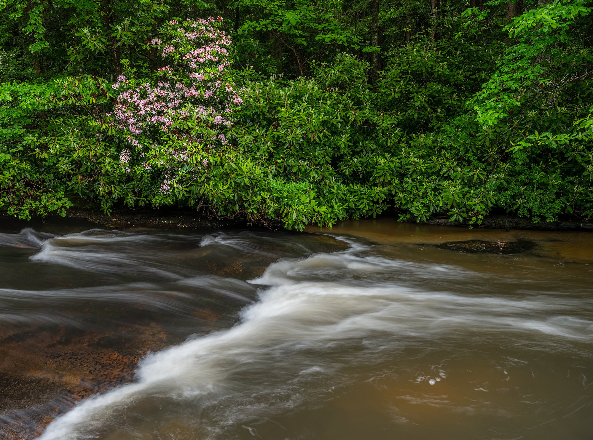
This is a view of Muddy Creek just before it plunges over Muddy Creek Falls in Swallow Falls SP, MD. The conditions were just about perfect this particular day with a light off and on rain which saturated the colors beautifully. It would have been nice if more mountain laurel were situated along the bank, but it is what it is.
Specific Feedback
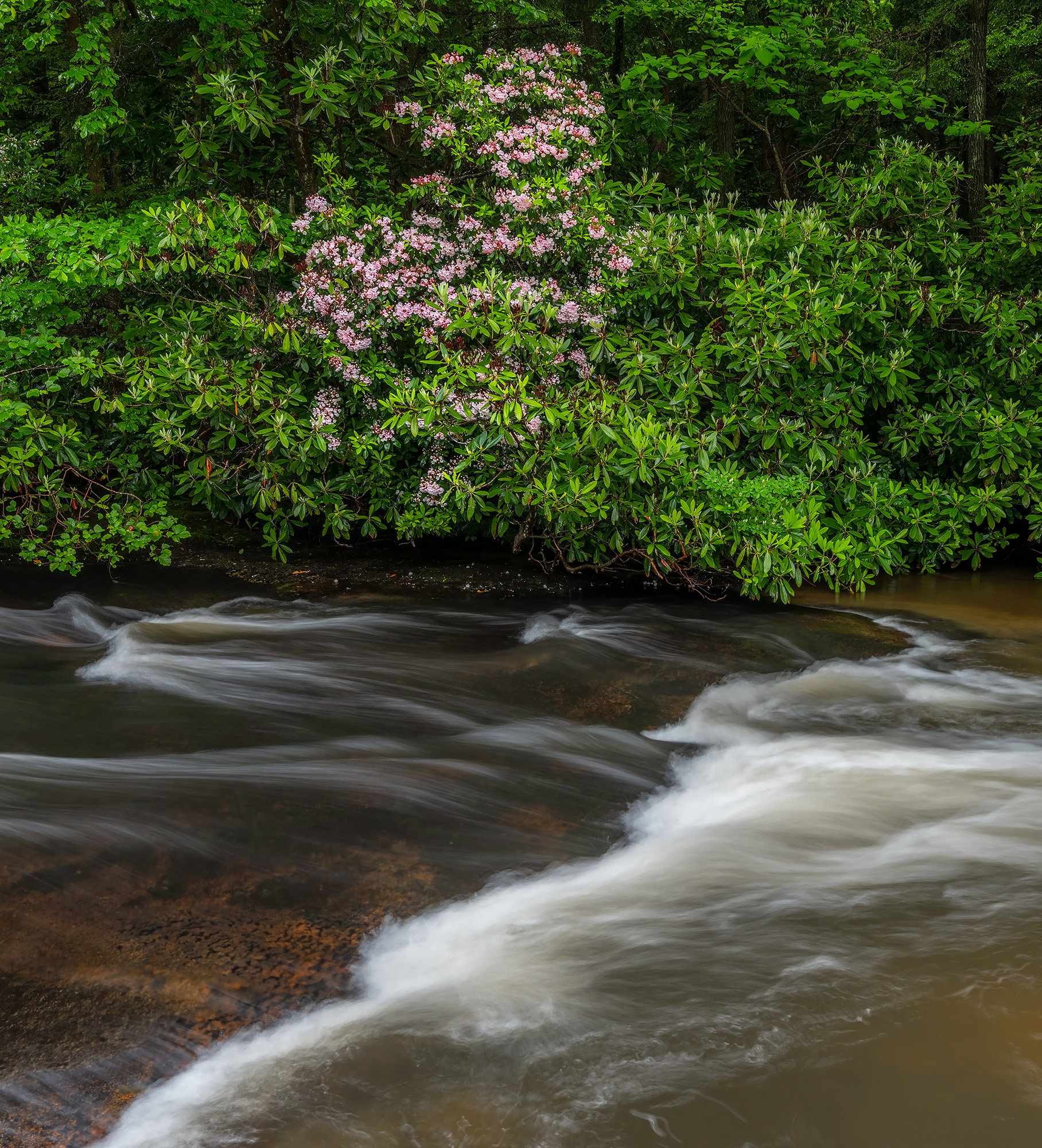
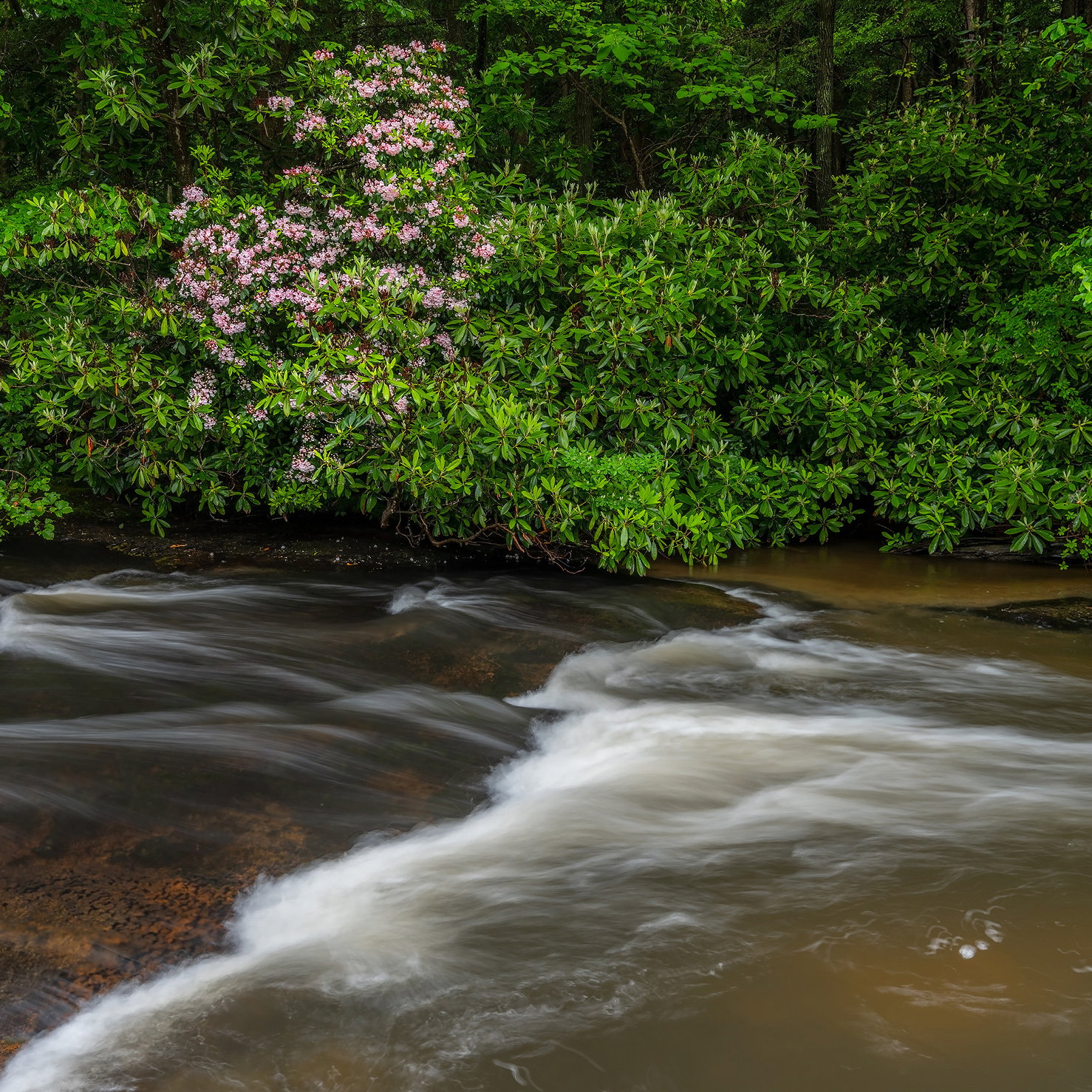
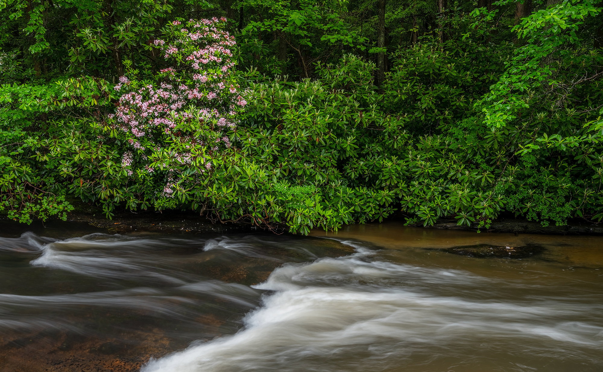
Just curious as to which version you might prefer as I have been sitting on the fence so to speak. Sometimes I prefer the horizontal for the way the water flows through the scene and the next time I prefer the vertical because it seems to place more of an emphasis on the mountain laurel. Anything else you notice please feel free to mention it.
Technical Details
Nikon Z 7, Nikon Z 14-30 @ 20 mm, f 11 @ 0.5 sec, ISO 100, Kase magnetic CPL, cable release & tripod.
I like Door #1, but @Preston_Birdwell has a good idea. Were the two photos separate frames or was Door #2 a crop from Door #1? If it was a crop, then just don’t crop as much. Like this
Ed, I like the second, tighter crop for the reason @Preston_Birdwell stated. Perhaps if the top of the falls was included, I might have chosen it. Then it would have matched your title.Both are nice.
I also like the second the crop, maybe Youseff’s as well.
I love Swallow Falls SP. I grew up at DCL in the summers (parents were teachers) and went there ALL the time–before I was a photographer. I can feel the damp!
Many thanks everyone @Preston_Birdwell, @Youssef_Ismail, @Michael_Lowe, @Marylynne_Diggs and @John_Williams for taking a moment of your time to leave your thoughts on my indecision about this image as it is always appreciated.
Youssef : Thanks for taking the time to do a rework; I like it. The second image was a crop.
Marylynne : It definitely was a wonderful area to grow up in.
Ed, I vote for #1 because it combines the Laurel with the sense of flow in the river. I like the various colors and steps in the river. I could see #2 provided you moved the Laurel to the left in the frame or something more like @Youssef_Ismail’s version.
Ed: I like both versions but my first impression was that I’m not sure about having the shoreline centered in the frame on both. I think a small crop from the bottom on #1 would make the laurel the clear subject and the stream a strong supportive element. As is I find it hard to determine the subject. Just my 2¢ and I certainly envy you the experience and opportunity. >=))>