The photographer is looking for generalized feedback about the aesthetic and technical qualities of their image.
Description
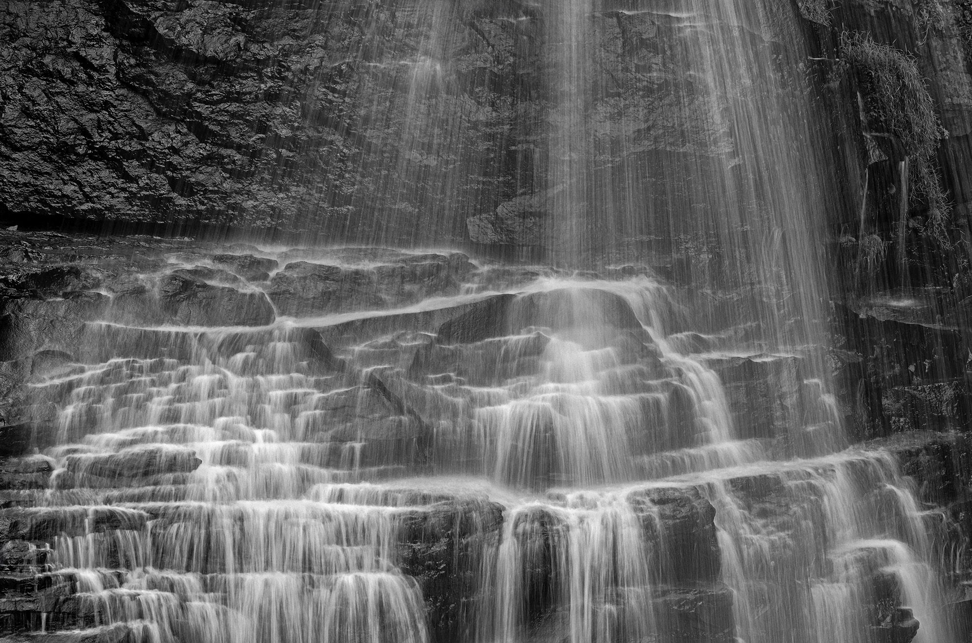
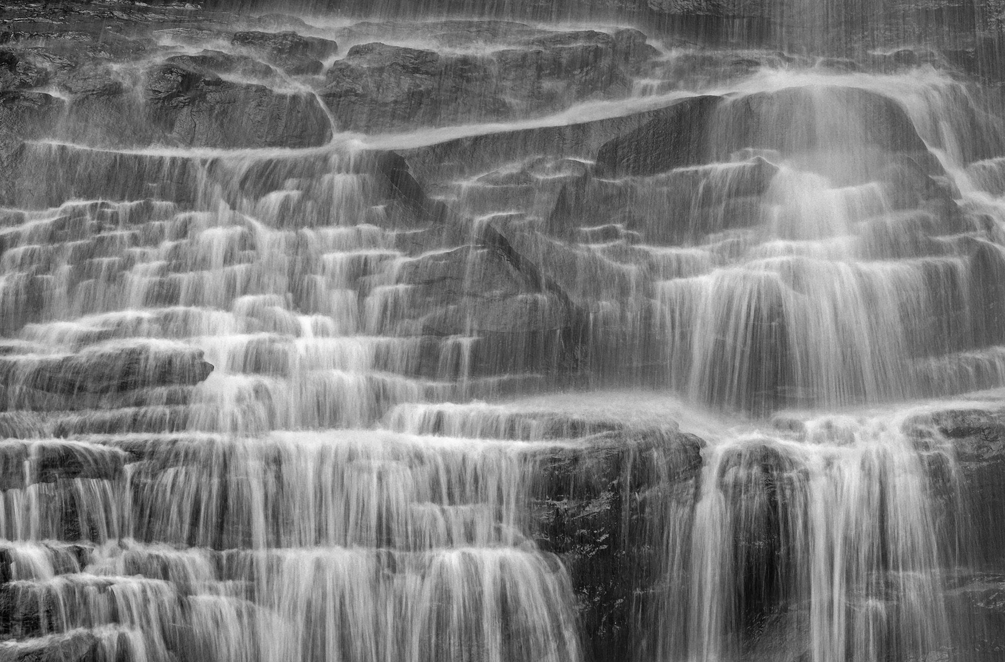
This image is basically a continuation of my last post as I followed the water downward to these lovely cascades toward the base of Blackwater Falls. This view would not ordinarily be afforded to visitors, but since the flows were really low these cascades became the star of the show. I decided to convert to a B&W; thanks for the idea John; since there was basically no color in the scene except for some green mosses.
Specific Feedback
How do the whites look to everyone? Also wondering how you feel about the balance of the ULC with the rest of the image?
Technical Details
Nikon Z 7, Nikon 100-400 @ 280 mm, f 11 @ 1/4 sec, ISO 100, Kase magnetic CPL, cable release & tripod
Critique Template
Use of the template is optional, but it can help spark ideas.
Vision and Purpose:
Conceptual:
Emotional Impact and Mood:
Composition:
Balance and Visual Weight:
Depth and Dimension:
Color:
Lighting:
Processing:
Technical:
Another gorgeous waterfall!! Whites look fine to me, as do the tonalities in general. The ULC is a bit of a quandary, though. Have you tried it with lower contrast there? (Leave the darks and just pull down the lights with a curve.) I’d hate to crop from the left as the falls come to a nice end there. You could have a very nice twofer with some crop from top but you have captured a unique and wonderful view here.
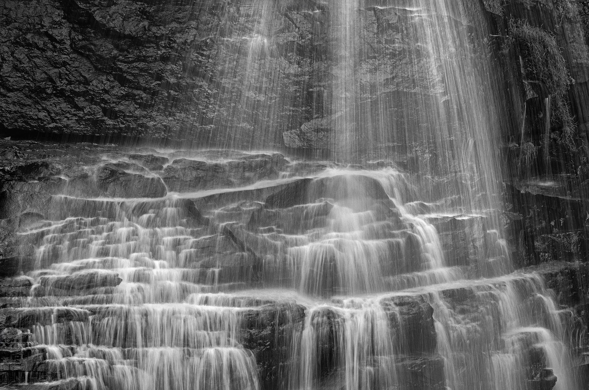
Had to have a play. After darkening the ULC I brightened to top falls a little. A smaller area in the ULC could be darkened a bit more…
Ed, great tonality here, and your shutter speed was perfect in order to catch the lacey nature of the cascades. I agree with the tweaks made by @Diane_Miller . I also think you could crop from the left a bit to reduce the weight of the rock wall, but that’s minor.
Another fine shot Ed. That 100-400 is really earning it’s keep. I think I would go for more contrast. On the fence about a crop from the left. Would hate to lose some of those cascades.
The whites and overall tonality look spot on to me, Ed. The composition doesn’t quite work for me, though. It feels a little bit imbalanced, like it needs a little more on the right side to balance out the heavy, dark rock in the ULC. Your black and white conversions are stellar!
Dear Ed Lowe,
Thanks for sharing this image. I am drawn to the scene and your rendering of it. However, I have a few questions regarding composition. The tonal contrasts in the image are mostly local (rock vs water: Z1-3 vs Z5-7) and do not form global patterns that lead my eye anywhere in particular. Would it be possible to change this, e.g. by cropping? Also, to me the horizontal lines made by the rock layers and the vertical lines made by streaks of water form a somewhat static grid that diminishes the energy of the waterfall. Again, would it be possible to change that? Finally, I see an image in the image, namely the lower left quarter, where the height of the water falling between plateaus is diminishing towards the background: Very interesting patterns. Could that section function as an independent image? Again, thanks for sharing your image.
@Diane_Miller : Thanks for taking the time to do a rework to illustrate your ideas. I like what you have done and always enjoy it when you have a play.
Here are a couple of crops I made with your suggestions. What do you think?
Wonderful!! Both crops work for me (very well!) but I find the first most interesting because the horizontal format emphasizes the extent the falls are spread out, and shows off the horizontal shelves of the rock. Just a bit more unique and unusual, and very pleasing!
A place like this doesn’t offer a twofer or a threefer – it’s an n-fer.
Dear Ed, I like to two crops, especially the first, for the reasons mentioned by Diane. Also, the highlight and movement of the water running out of the top right corner in the second image lead my eye out of the frame. But the first works really well, I think.
Thanks @Diane_Miller and @Leo_Catana for responding to my reworks with the crops; always appreciated. My favorite is also the first one for the reasons you both mentioned.