The photographer is looking for thoughtful feedback on the image as a whole, especially around the areas noted below.
Feedback Focus: Artistic / Expressive
About This Image
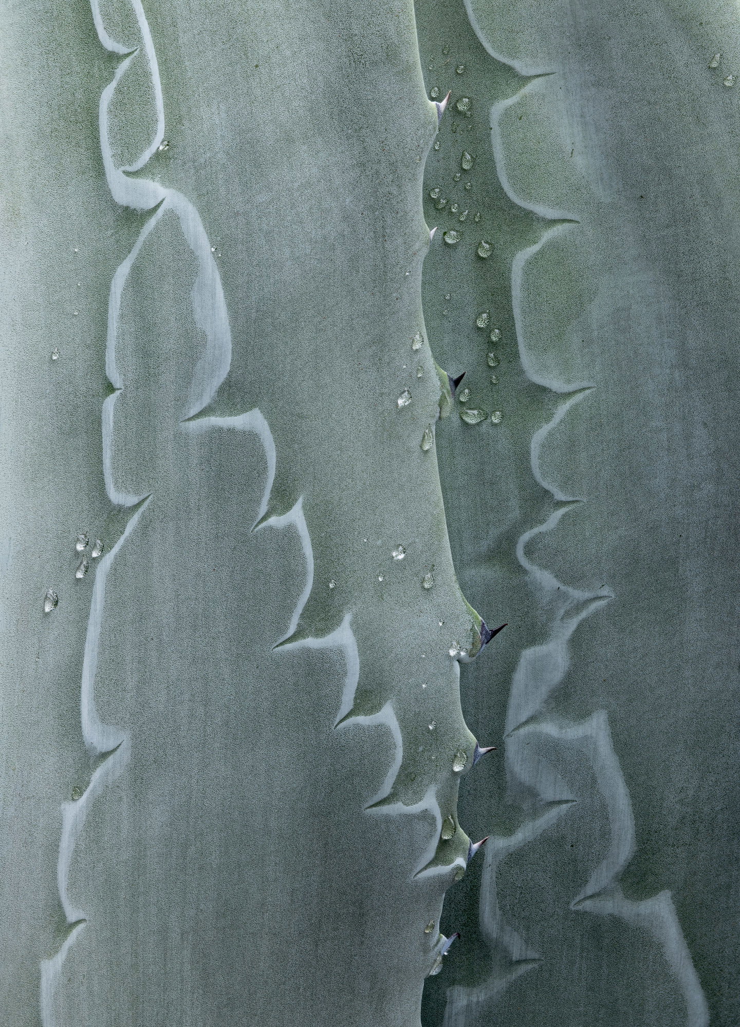
This is another from the newly-discovered Agave, on the morning after a light rain and with some nice clouds for even lighting. These things are easily in the love-hate classification, with first impressions leaning way toward ugly, until you peer closely. On the way to this one I drive by what has to be the ugliest one I’ve ever seen. I would get out and look more closely but it’s the focal point of the front yard of an expensive-looking house.
Feedback Requested
All comments welcome!
Technical Details
Camera: Canon EOS R5
Lens: RF100-500mm F4.5-7.1 L IS USM + EXTENDER RF2x
Focal length: 600mm
Shutter speed: 1/15s
Aperture: f/16
ISO: 100
Processing software: LR, PS
Major adjustments: minor global tonal adjustments in LR
Blending/stacking: Zerene Stacker, then into PS for minor crop and some small cleanup
Other notes:
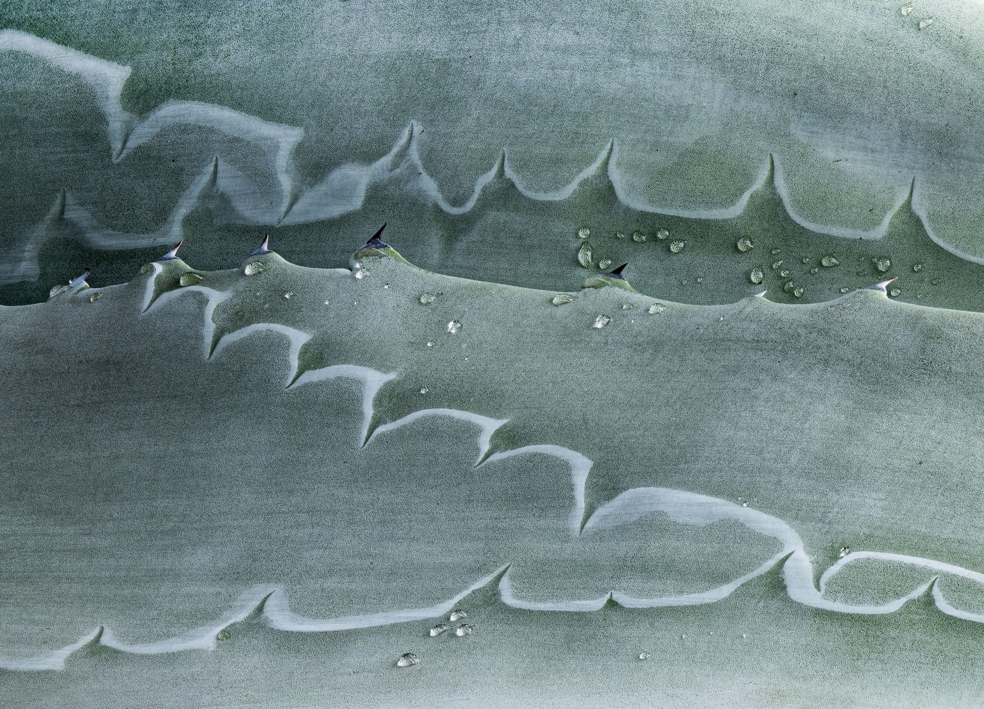
You and Lon are really cornering the market for agaves/yuccas. I love both and the opportunities they give for abstracts. So I hope you don’t mind that I’ve made an alternative version (as a sincere form of flattery). I love how the thorns are echoed by the leaf indentations, so I tried to bring this out in my version, partly by rotating the frame. I also tried to balance the tones by lightening some of the darker parts. Anyway, just for fun, not as a critique, as I find your composition and processing to be great. Here’s my take:
Thanks, @Huw_Thomas and @Mike_Friel ! Mike, I don’t mind at all – I’m always flattered when an image initiates thought, curiosity and experimentation. I had thought about flipping this one on its side but was held back by being satisfied enough with finding the composition in how it actually was. And of course other eyes don’t have that limitation, and it’s better not to have it!
I’ll play with it some more! Thanks for the nudge!
The water drops added a lot to this image, Diane, and you found a very interesting part of the Agave. Mike’s variation is also interesting and as seems to be the case with these, lots of variations are possible.
Diane: Sharp points, tiny drops, soft color; what’s not to like. Subjects like this provide endless possibilities and you’re taking advantage well. I like @Mike_Friel’s flip as well which goes to prove that the subject carries the day no matter the orientation. Most excellent. >=))>
This one is so intriguing. Mainly I think it comes from the subtle shadow in the lower right, but also those water drops. It’s so jagged, yet also soft that it seems like it shouldn’t be real. Living so far north my whole life, I’m completely unfamiliar with Agave and so I have to wonder at how the patterns of the thorny edges are made in the fleshy parts. And no…I will not google, but rather live with my imagination. Superb shot.
You have done such a lot of work with these Agarve images it really would be worthwhile making a series with the aim of seeing where you can take the idea. You have experimented with various processing experiments, rotations, mono/colour, lighting - so you should be getting close to knowing what it is that resonates with you.
All this work is crying out for the next step to exploring this further ? I would explore a series , diptych, or triptych - or any number. Putting images together in a series helps you better understand your vision in these abstracts and it could be a stunning display.
I was really awoken by the book “Overtones” by Ralph Gibson - how images put next to each can alter our appreciation of both images. How pairs of images can be more than the sum of its parts.
Kris, the leaf edges create indentations where they overlap as they grow. You can see how it starts in my first Agave post – Agave bud (+revised). But the end result is always puzzling to me.
Huw, very interesting idea, and I will look into the book – thanks! I was vaguely thinking of a diptych or triptych, but haven’t yet got ones that I think pair interestingly. Something to keep in mind, for sure. I need to find more examples that I can walk around and look for compositions. Years ago I was also looking for one nearby, after a trip to the desert SW, and finally found one that I had been driving right by on my way to play tennis. Alas, it disappeared shortly after I found it.
Always late to the party lately.
You’ve hit the nail on the head with your “love-hate classification”. I had several very large thornless Agave. One day in a gardening fit I chopped them out, put them on the footpath for some passer-by to take home and love…and now, I miss them. They were picked up by me when someone had left them on their footpath. I wonder if they loved them once.
The colour is delightful. There’s soft and hard lines that play against each other. And, of course the droplets are the icing. I like not knowing what is exactly going on.
Hi Diane - This is such a lovely image - beautiful soft colours and textures. And with those shapes and lines, I imagine you could take this image - and others of this plant - in many directions. It’s such a beautiful image without any mods at all tbh.
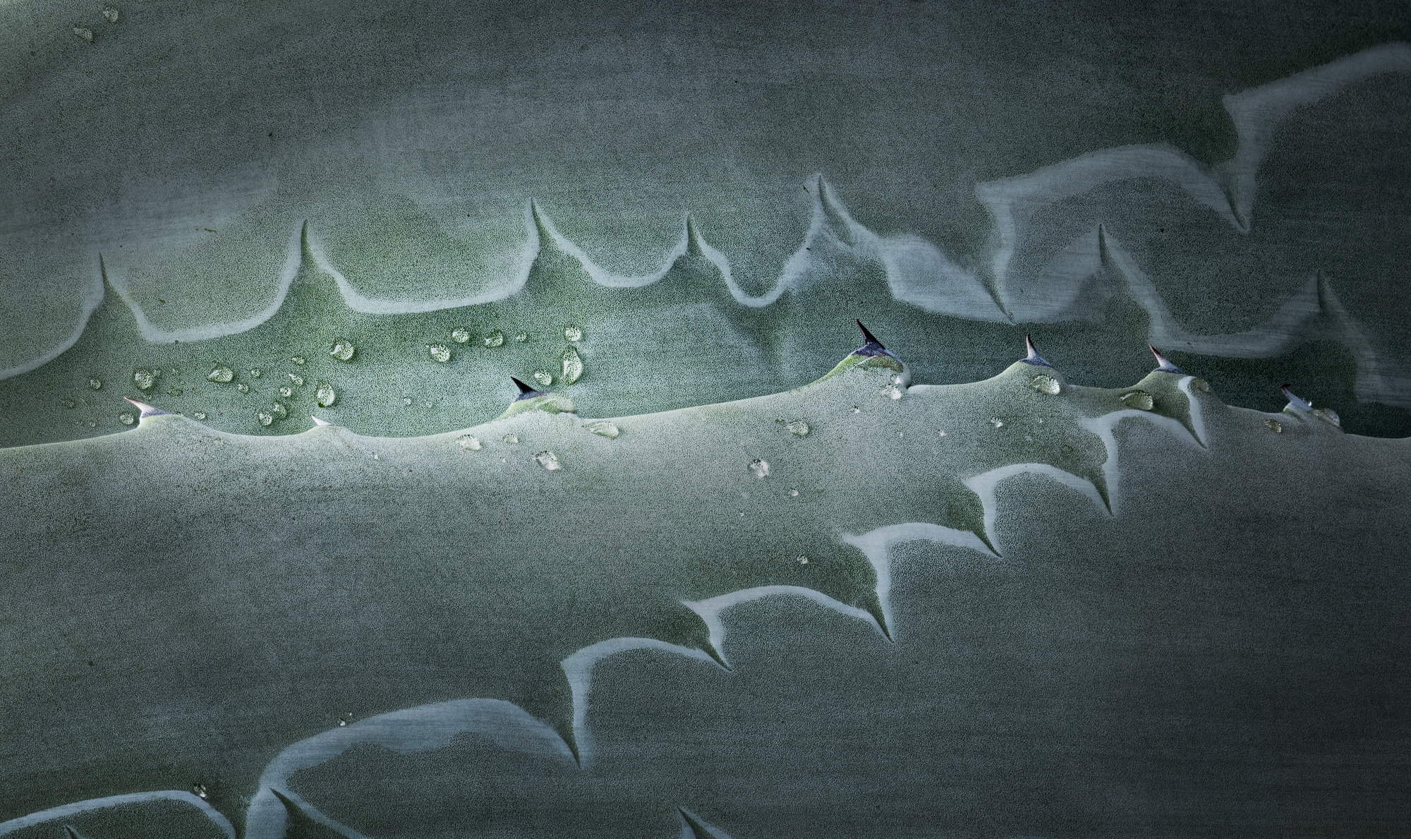
I had an idea, but please tell me if I, as a newbie around here, am crossing over the line of what’s acceptable here in NPN. But it occurred to me that a story could be about those droplets through the window on the leaves. I rotated it the opposite way of the others (because i wanted to try the leading lines coming in from the left) and did some masking and vignetting to highlight that area. i think i may have got a little carried away but I’ll add it here strictly as food for thought.
I think i may be taking this image in a direction you hadn’t intended, and perhaps I’m overstepping what’s considered acceptable, but i thought i’d throw the idea into the pot in case it might spur some other ideas in future.
Wonderful image Diane! You’ve certainly found and taken advantage of such a great subject
The water drops certainly add great visual interest and add to the images story. Of course like your earlier image(s) this would sure work without them!
The vertical orientation is quite natural of course and works very well. Like others perhaps, I also quickly thought about a horizontal presentation. When I tried it, (can’t remember if I first tried CW or CCW,) but something interesting happened that didn’t work for me and that was the water drops became almost irrelevant and it just didn’t look right to me.
However, upon further review and seeing Doug’s revision above, I think horizontal is more than viable. In fact, the image overall lends itself to many options, which in most all cases is a good thing and goes to the strength of the original capture.
Textures, details and color/tones are all wonderful. Well seen, captured and presented.
Thanks, @Glenys_Passier , @Doug_Wilson and @Lon_Overacker ! Doug, you are doing exactly what this place is all about – exchange of ideas and learning! And I like your take on it! I would clone out the tips of indentations along the bottom, and I’d bet you would too!! It’s a crazy plant and just about anything goes. Lon, maybe the water droplets being irrelevant is part of the story. They would be pretty unusual in a more correct climate for these things.