Critique Style Requested: Standard
The photographer is looking for generalized feedback about the aesthetic and technical qualities of their image.
Description
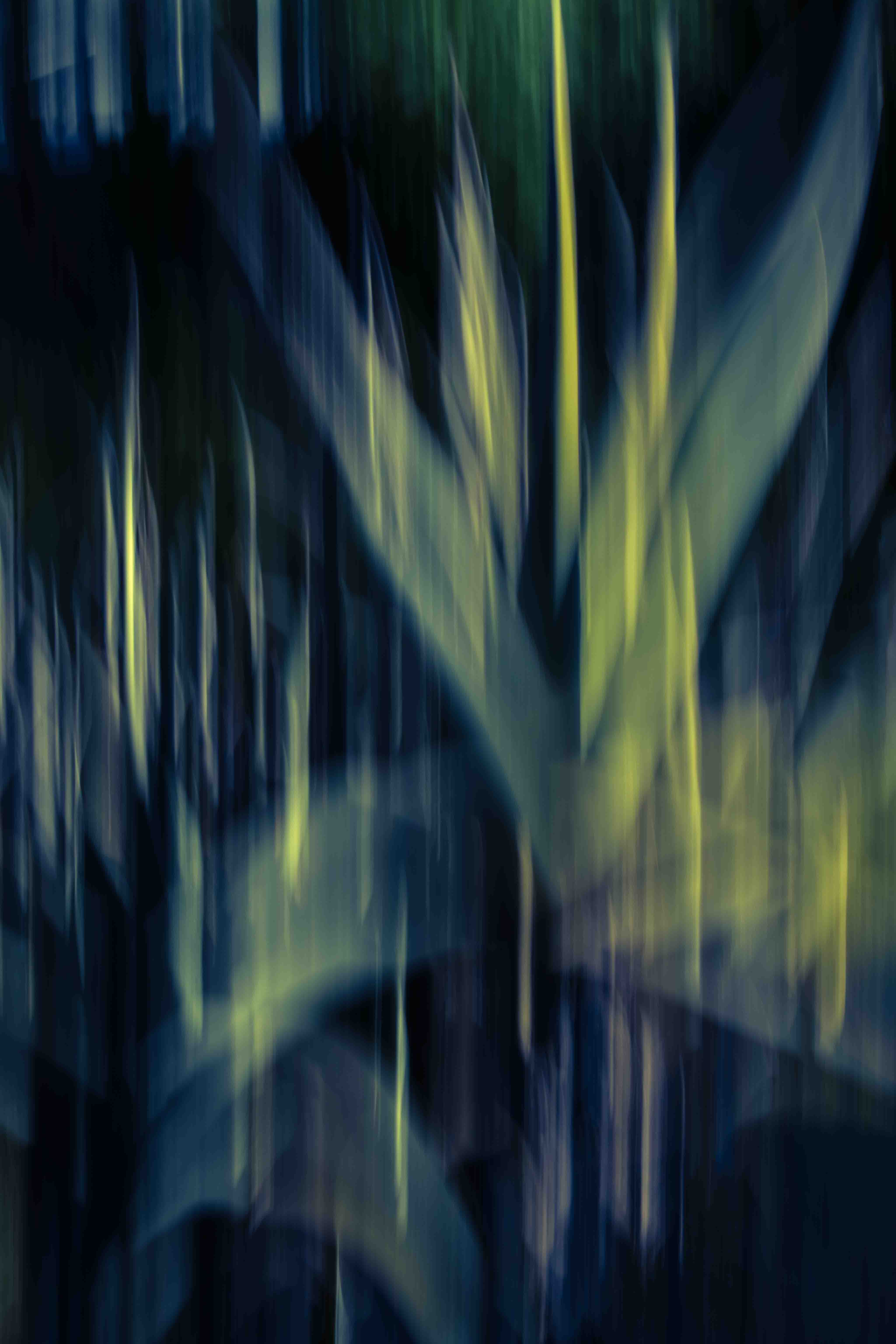
This is an ICM shot of some aloes. I must have been moving the camera rapidly.
Specific Feedback
All comments are welcome.
Technical Details
ISO 100, 70mm, f/32, 1/2sec. I didn’t do a lot of processing but I added contrast and altered the colors with curves layers.
Critique Template
Use of the template is optional, but it can help spark ideas.
- Vision and Purpose:
- Conceptual:
- Emotional Impact and Mood:
- Composition:
- Balance and Visual Weight:
- Depth and Dimension:
- Color:
- Lighting:
- Processing:
- Technical:
Whoa!! Sooo nice!! I love the vertical streaks of warm light against the ghost of the plant and I love how they taper at both ends! Lovely colors and tonalities! I’m a bit distracted by the patch of streaks in the UL corner which pull my eye from the gorgeous off-center center. If they were burned down or removed that corner would echo/balance the slightly empty patch in the LR corner.
Diane, you make a good point about the upper left. That was in the background. Because I know it was background, it adds depth for me. But viewers don’t know what I was seeing and they may also find it distracting. I think I’ll put this aside for a while and then see what I think. I appreciate the feedback.
ICM ??? YES … Caught my eye this morning. Really nice blend in the colors and tone. The lines and curves really stand out !!! ICM photography is a unique way to express yourself. You did that Don. Beautiful abstract image.
Thank you, Gill. One thing I like about ICM is that you never know quite what you’ll get. I like surprises.
This is gorgeous, Don. Somehow it evokes feelings of a cathedral and/or one of those giant pipe organs.
An interesting reaction, Dennis, and I can see why you would say that. Thanks for commenting.
Yes I agree. I have done a few. Didn’t know what i was doing. I posted one a few years back. In my images. Very cool style of photography.
Don,
I’m very often attracted to color, contrasts, shapes, motion, etc. when reviewing ICM’s. This has all of that in spades! The streaks (shapes), vertical flow combined with a full range of tones from deep shadow, to the limey highlights. Great balance.
I do agree a bit with Diane about the upper left streaks; combine that with my minor disdain for full digital verticals… I could see cropping that out for something close to a 4x5 ratio(maybe some off the bottom to achieve that ratio - mind you, the format is irrelevant, except I don’t like the tall verticals.
Interesting thought about having a “background”. I get what you’re saying in that you KNOW what the scene was and so yes, I can see bg items creating “depth” - for the photographer creating the image. What’s interested and maybe the opposite for me, is that ICMs in general flatten most all scenes; ie. shapes, colors, patterns etc., all exist on a single plane (after the fact, the result). And so for me, I’ve actually never considered “depth” in an ICM. But now I have something to consider! Thanks for that!
It may have been there but the viewer wasn’t. Gotta go! 
Thanks, Sandy,
Lon, you’ve given me something to think about. Most ICM images are indeed lacking in depth. I have some ideas for getting around that.