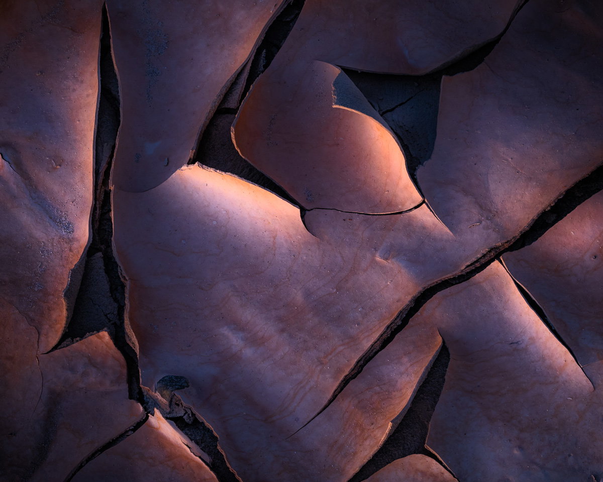
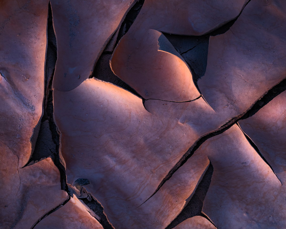
@Youssef_Ismail Yes, the border makes a huge difference. My intent was to minimize the effect a user’s screen would have on the presentation: lots of people like dark themes; I like light themes. And I learned recently that using a white background is apparently “better” when working in post, so I’ve changed from dark gray to white in LR. Still getting used to it.
I’ll also say that I find most images don’t care a great deal about the luminance of the border, despite the effect you mention. This one, however, does. I figured anyone interested could drop it into LR/PS and easily crop out the frame (leaving a 4x5 ratio image). I might be the only person that does that…
@Gary_Hook thanks for the repost without any borders. With this comparison, clearly the third rendition looks best to me. I agree with you about processing in a lighter environment, while I do not use a pure white background I do my processing with a light gray.
Gary: I had meant to comment on this earlier but got sidetracked and forgot to come back. I’m glad I waited to see the progression of iterations and all the subsequent commentary and discussion. All three are fine renditions and your last version is indeed as @Dennis_Plank said, “Exquisite.” Marvelous vision and just a superbly crafted image.>=))>
For me it’s, definitely, the “second edit”.
I believe the white border is a really winner on this case, and I like this one much more than the original edit: its more “clear”; more define.
Love this one.