Managed to be here for a clearing storm. Does the B+W or color version work the best for you? As usual, any suggestions are welcome.
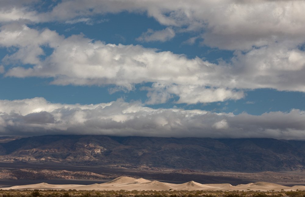

Tony, both of these images work okay for me. If I had to choose, as presented I think the color version has a little more impact, with the contrast in warm/cool colors (dunes vs. sky). However I think the B&W could benefit from some stronger mid-tone contrast and a darkening of the blue skies, and the background mountain to set off the dunes. A higher contrast version of the B&W with some more emphasis on accentuating light and shadow would then probably have more impact for me than the color version.
I will second Ed’s thoughts here,Tony. With the couple of small tweaks the B&W would be even more dramatic.
Tony,
As presented, I would lean towards the b&w version and would also agree some processing tweaks are needed. Both version just lack something. Actually the color version looks quite accurate actually. I’m wondering too about having so much of the sky and clouds. To me, the interesting part is capturing the large dune field - which to me leads naturally to a more pano presentation? So perhaps cropping some of the clouds.
Definitely need to boost the contrast in the b&w. If you’re inclined to anyway.
Thanks for sharing.
Lon
I definitely prefer the B&W version. As is, it has more impact, and if you boost it some, it will make those dunes really show up.
I know this spot!! I took a bunch of photos from there in March of 2013!!! Wow, it’s hard to believe it was that long ago.
Not sure what the subject is here, what you want to draw my eye, what you want to say, what feeling you want to convey. The dunes are too small to really draw my eye, the clouds and color are not unusual or dynamic.