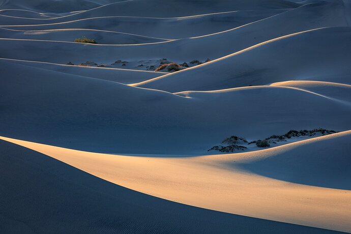
I made a trek into the dunes one sunrise while shooting with Harley G. in Death Valley. The sky was featureless so changed plans ands put on my long lens looking for more intimate scenes. I was able to isolate these backlit ridges just as the sun hit the dunes. I was shooting almost directly into the sun but was able to some creative lens shielding with my coat ; o ).
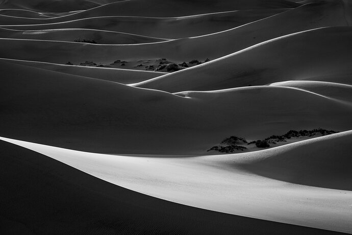
I don’t normally convert to B&W but this image seemed to be a good candidate. Interested in any suggestions on processing, composition as well as preference between color and B&W.
Thanks, Dave
Real nice lines and light. While I love the warm light, the more abstract presentation of the B&W makes it no contest for me. B&W all the way.
Color all the way. Compare the distant bushes in color to b&w. No contest. It’s backlit warm colors look dead in b&w. The image is really all above the large sunlit dune. Crop it and everything below and the image triples in value. It starts to look like Pacific combers rolling in to shore.
Incidentally this is very similar to the compositions photographers come up with in Palouse county, Oregon. The difference being that they use barns instead of bushes, but the overall idea is the same.
I love B&W, but I think the color version really stands out here. The contrast between the cool and warm tones make the color image spectacular and give it more depth. Such a stunning image! I would consider an oh-so-slight crop off the top:
Love the folds of sand with their blue glaze and rim lighting to separate them from each other a large scale abstracted view par excellence. I think the original rendition is the best as it extends the folds into the distance without the distraction of anything to compromise the repeating shapes.
It’s no question, I prefer Color all the way. While graphic shapes normally translate well to B&W, I don’t think this one does. I think the bottom half of the B&W works, but the top half does not. The top half of the B&W has an overwhelming amount of shadow area relative to highlights, and the highlights in the top half are not strong enough to create visual interest against the shadows (unlike the bottom half). The shadows in the top half of the B&W are just blah. But in top half of the Color image, the shadows come to life with the cool blue color, which contrasts nicely with the warm highlights. The colors and contrast create visual interest in the top half of the Color version.
Dave, as I’m a Velvia 50 only shooter the color was an immediate draw for me.
The undulating sequences of sand dunes makes for a perfect composition. The white sand, the smoothness of textures, and the slight blue cast easily could pass for a snow scene too.
Wonderful DVNP work here…
Dave,
Another big vote for color. Spectacular image. I think it’s the contrast in cool warm colors that really makes the color version stand out. Also, I think the vegetation in the valleys works so much better in color; and overall, the presence of these plants as they repeat in the scene help add depth and interest.
The b&w is beautiful too! I just think there is so much MORE in the color version to enjoy.
Lon
Yes - color! The cool/warm, dark/light succession is wonderful. And I love the plants in between the dunes. Just super. 

Add another vote for color. I really like the hint of blue in the dunes. Great light, too.
I have to vote color too. Wonderful lines, and the blue/gold really adds.
Dave, the processing looks fine to me in both versions, but my preference is definitely the color one. The scene is very graphic with the undulating lines of the dunes and the bands of warm and cool tones. The back lighting does a masterful job of highlighting the ridge lines of the dunes. Great eye to isolate this gem.
It’s tricky to choose between them, both are very strong, however, forced to choose I’d go with the colour because I really like the colour contrast of that first swooping line. But hey, whatever, I’d be so so happy if either of those images were mine.


