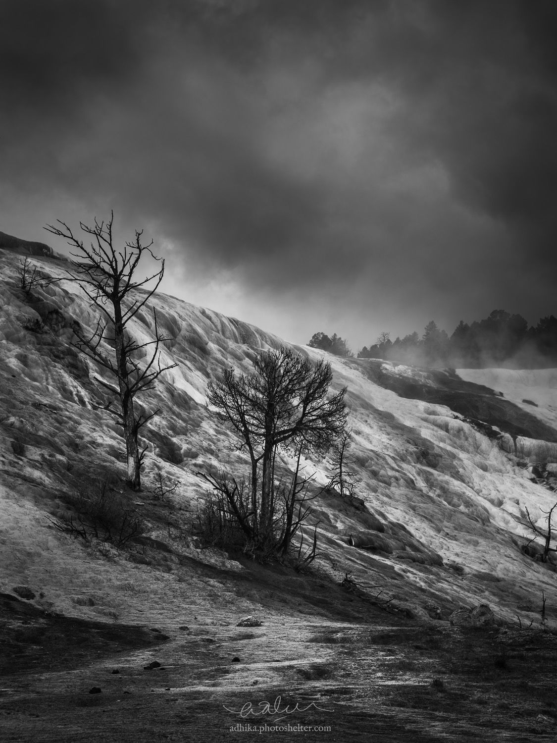
I started doing photography in 2015 after a trip to Death Valley in January. Like many people, I quickly become obsessed with it and a few months later I found myself on a photography trip to the Grand Teton and Yellowstone. This image has got to be one of my favorites from the trip and it has been on my portfolio since then.
I stumbled upon it while cleaning up my portfolio last night and I chuckled at how bad I was, especially at processing: The black was blocked up, heavy handed vignettes, etc. There are some technical flaws in the capture, too… like, I wish I knew about focus stacking then. Anyway, I reworked the image. I stayed true to the image design, fix the tonality and selectively sharpen some areas of the image (I think my lens was decentered because the right side of the image is softer than the left side). Let me know what you think, perhaps I am missing something that needs to be worked on or there is something else that can be worked on here.
Nikon D750, Nikkor 35-70/2.8D at 70mm, f/8, 1/160, ISO 100.
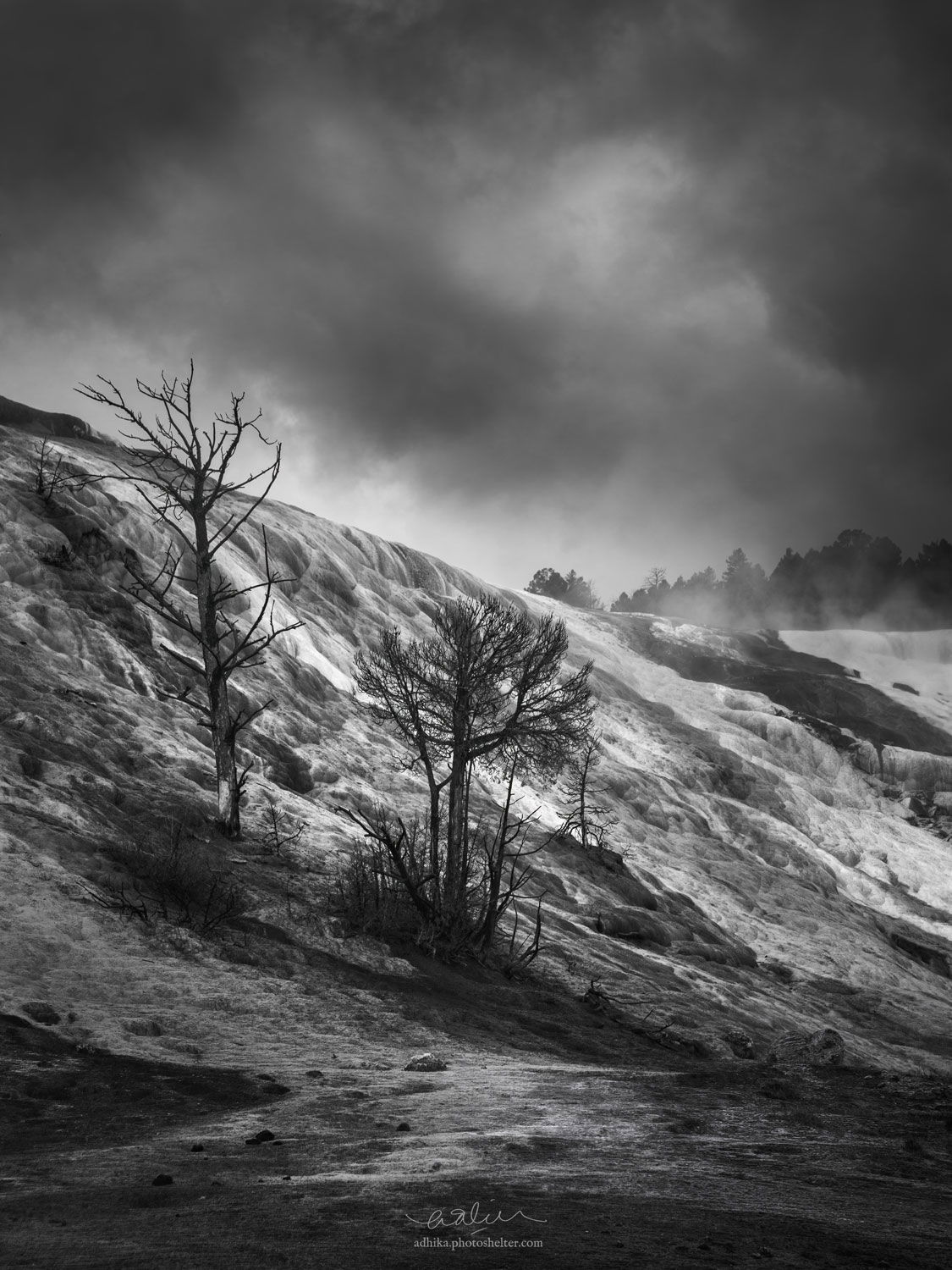
Repost after suggestions:
Removed the trees on the right edge, some tonal work as suggested below.
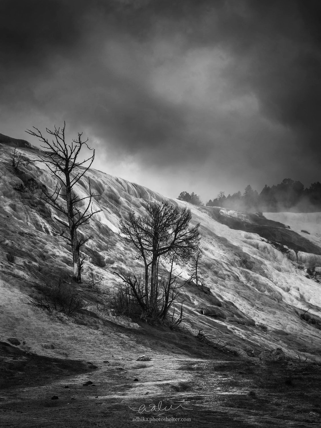
You may only download this image to demonstrate post-processing techniques.
1 Like
Adhika, using B&W was a great choice for this subject, it substantially increases the drama in this scene. I like the composition, the near 50/50 split in the sky vs. land works for me because 1) the horizon is diagonal, and 2) the clouds/steam are interesting enough to warrant including this much sky. And I love the positioning of those two large trees.
In terms of processing, I think it is still a bit too dark, I would like to see more detail in the two large trees. There also was lots of room to the right of it’s histogram, and I think increasing the white point would add more contrast and drama. I would also recommend cloning away the two tiny trees near the frame edge in the LRC. I re-worked it to do these things. I also did some luminosity painting to the sky using TK luminosity masks, L2 to dodge the lighter areas, and D2 to burn the darker areas, adding some more sky contrast. With B&W images you can get away more of this kind of stuff than you can in color. I also added some vignetting to the corners.
Very moody and foreboding. I prefer the original post as I find lightening it robs it of some of that mood. Real nice.
Thanks, @Ed_McGuirk and @Harley_Goldman! Consider those trees at the right edge gone. Immediately after posting it, I wanted to eliminate them.
@Ed_McGuirk: I totally see your point regarding the tonality, Ed. I agree with Harley that it robs some of the quality in the original, but I also agree with you that adding more white points to some of the brighter part of the BG will separate the tree at the center more from the BG.
I think I can incorporate these suggestions and refine them. Thanks, guys!
EDIT: I incorporated the suggestions and appended it on the original post above.