The photographer is looking for generalized feedback about the aesthetic and technical qualities of their image.
Description
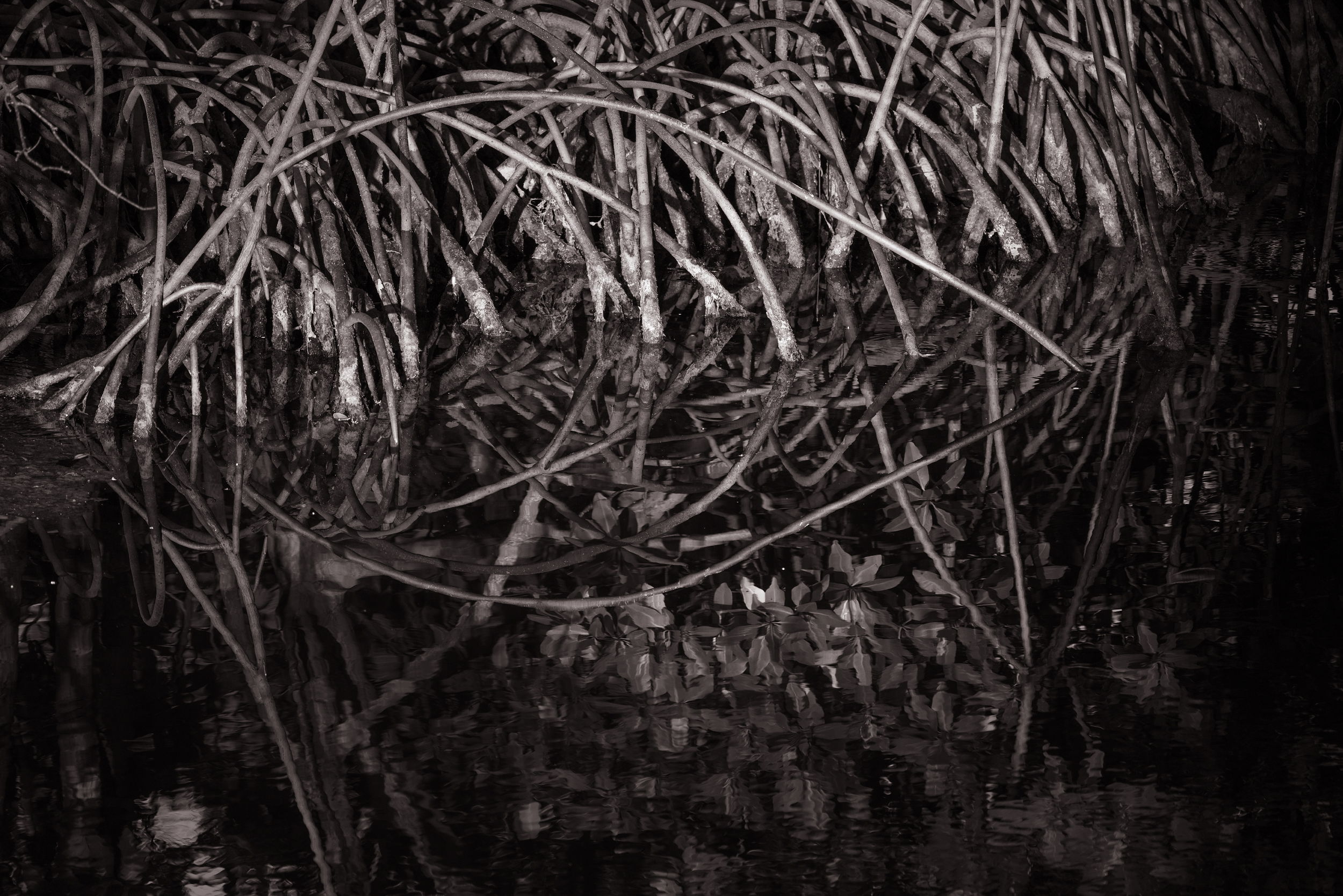
Such a nature experience…taken from the balcony of my hotel in Key West!
Specific Feedback
I sat on this one for over a year because I wasn’t really sure about it. There are parts that I like but I wasn’t sure if it was too messy, too complex…I didn’t even know which category to put it in here! I tried to simplify by going black and white with just a bit of warm toning to it (never done this to be honest). Curious about your reaction/thoughts.
David, it is always nice to find nature right in the middle of a city. You proved that all it takes is to look around you. I like the BNW treatment because it emphasizes the contrast between what is above and what is reflected. I only have two suggestions that you might want to explore if you’re so inclined. I am somewhat distracted by that reflection without a corresponding equivalent above. I’m talking about the LLC reflection. I also wonder if a tighter crop and leveling would make the image even stronger. In other words, maybe straightening out the reflection line and cropping the image to have it a perfect and equal reflection of what is above and below. It’s just a thought that came up as I looked at your intriguing image.
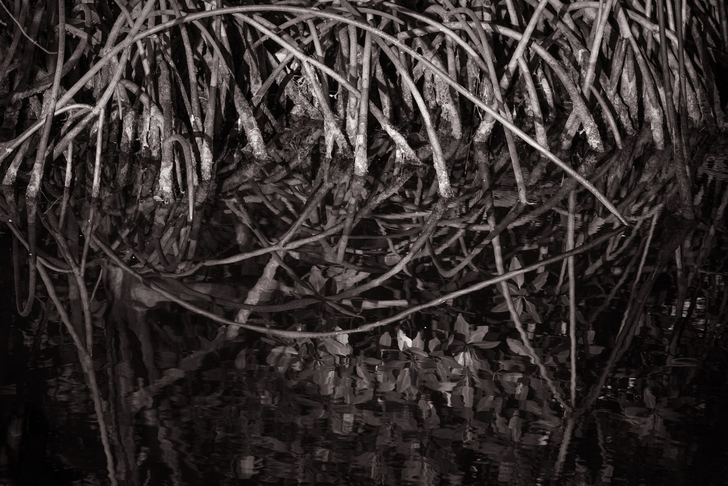
Thank you @Egídio for the response. I gave both of your suggestions a shot. The first one I had already considered regarding the distraction and I wanted to see if it was bothersome to others or just me! I’ve also straightened the image here. I wasn’t sold on it at first because I thought it would make it too much of a 50/50 split. But I don’t hate it…not sure which way to go on that now!
I never knew how much picking up photography would infiltrate my non photographic life. It’s like I’m constantly looking at things differently and I can’t really turn it off now!
David, you did a nice compromise by not making it 50/50 in your crop. Like you, although I suggested it, I’m not really sure the crop is effective. I do like, though, that the image is more leveled. I’ll be curious to read what others suggest. Thanks for trying my suggestions.
David, I’d like to ask what drew you to the scene when you were on that balcony? If it’s the lines and reflection, then I would recommend simplifying the image to focus on that. From the recommended crops, I think it’s headed in the right direction.
The black and white edit with toning was a good choice. I like the tonal relationships between the lighter branches and the ones in the reflection surrounding by the darker tones. I agree that a 50/50 crop is likely not as dynamic as the one you provided in the revised image. I also tried rotating the image and flipping it to give it more abstract feel. I think the results can be interesting.