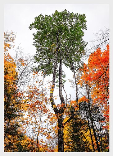
This photograph was taken early last October during absolute peak colour. What I like about this picture is that it is not, in fact, about the colour but, instead the colour serves as a dramatic frame for what the picture is actually about – the extraordinary birch that caught my attention in the first place. The birch stood out for me for several reasons. First, is spatially how it appeared to stand so central and solitary, second, that among the bright yellows and reds of the surrounding maples, it was still mostly subdued in green and, finally the beautiful and sensuous triune curving of its trunk moving up to its square-shaped crown. The birch was so proud and elegant, it was as though it didn’t need to show off with blazing colour.
Any comments or critique would be most appreciated
just beautiful Kerry, such a striking image. And I agree, this is not about autumn color, which is only a platform for the look of this amazing birch. I have spent many years in eastern hardwood forests, seen a ton of birch trees, and none of them are near as wonderful as this one.
This is one of those images where the whole is greater than the sum of the pieces. And the pieces have a lot going for them when you break this image down. I like the spiderweb of twigs in the URC. I love the lacy veil of beech leaves in the bottom center. The green of the birch outshines the fall color (not easy to do). I normally hate forest images with bald white sky, but I absolutely love it in this image, it makes the colors jump off the screen.
My only suggestion, ever so slightly drop orange saturation in the tree on the right (but not in the center leaves), to balance the saturation better with the saturation level in the yellow tree on the left.
Stunning image 

This is striking. The colorful trees appear to be bowing before the majestic tall birch. I’m with Ed on desaturating the right-hand oranges a bit, just to balance the frame. And the bright sky works; good job on keeping details in the fine twigs in the bright sky.
@Ed_McGuirk, @Bonnie_Lampley. Thank you both for your very positive feedback. I have posted a re-work at the top of the page. I just desaturated a tad to pull back the electric red and orange on the right side. Fairly subtle. Does this feel about right to your eyes?
Kerry,
I think you nailed it with the repost, although I very much like the vibrant oranges in the original. First off I like the POV as the stately birch is surrounded by all the gorgeous oranges and yellows of the peak autumn color. Usually I would avoid high key skies like this, but here it works beautifully. Very nicely done.
Yes the rework does the trick for me. It brings the orange saturation in line with the other trees. I often pay more attention to balancing saturation on a local basis than making global saturation tweaks.
I find this to be a very original perspective on fall colour here Kerry. The re-work is an improvement for me mainly as the birch trunk appears darker which emphasises it’s form. The contrast of these trees on a stark background sky is striking.

