Critique Style Requested: Standard
The photographer is looking for generalized feedback about the aesthetic and technical qualities of their image.
Description
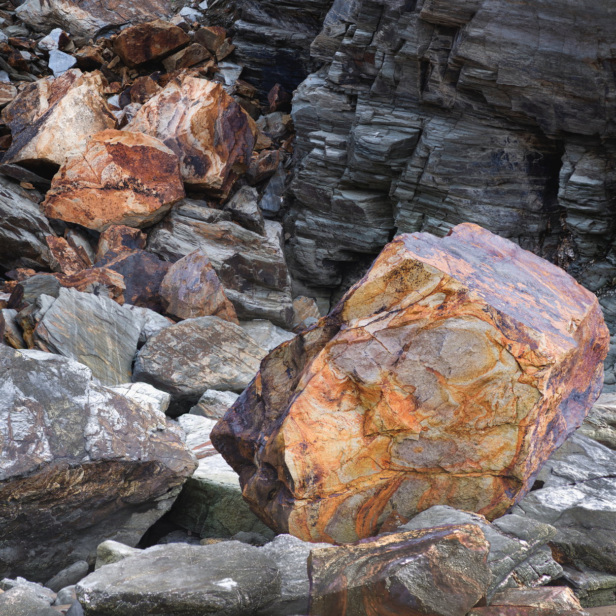
This is a small scene I found while exploring a length of eroding coastline. I was drawn to the placement of the large boulders, their scale and colouring
Specific Feedback
I initially dismissed this image. I’m curious what others think, I am conscious of how close to the edge of frame the boulders are and while that was intentional to create tension I’m wondering how others will perceive that.
Technical Details
Fuji GFX 50S II
Focus stack of several images
Critique Template
Use of the template is optional, but it can help spark ideas.
- Vision and Purpose:
- Conceptual:
- Emotional Impact and Mood:
- Composition:
- Balance and Visual Weight:
- Depth and Dimension:
- Color:
- Lighting:
- Processing:
- Technical:
That’s a real mix of patterns, and I love the color of the orange rock; it looks like a jewel. It would be interesting to see how much this scene would vary with different lighting.
My personal taste would be a bit more breathing room, but that’s always easy to say when you don’t know what the other options might have looked like.
1 Like
Dom,
I am not so much concerned with the breathing room around the main subject, but more so with the compression in the depth as it seems like there is some distance between the FG colored stone and the BG darker rock, but it all seems so flat. Some perceptual separation would be nice.
1 Like
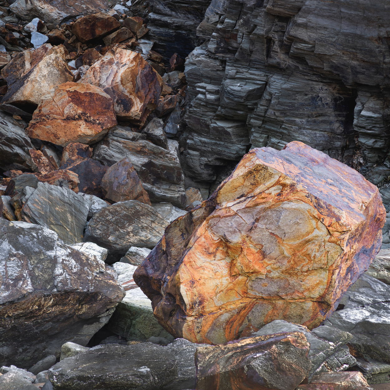
Yep, I agree. Maybe something like the below helps. I think ultimately the image probably just isn’t that strong but it’s always interesting to understand why that is, through other people’s eyes
1 Like
As I studied the initial image I made some mental notes of what I would do to enhance it, and then I came to your re-work and realized you’d already made the changes I would have suggested. This is a quiet, yet strong, image. That foreground rock is really something special.
1 Like
I think the right half of the image is its strong point. The vibrant rock against the dark back cliff is great. The left half competes with it however and diminishes the image. It’s still a good image but also a valuable in composition in terms of achieving balance.
1 Like