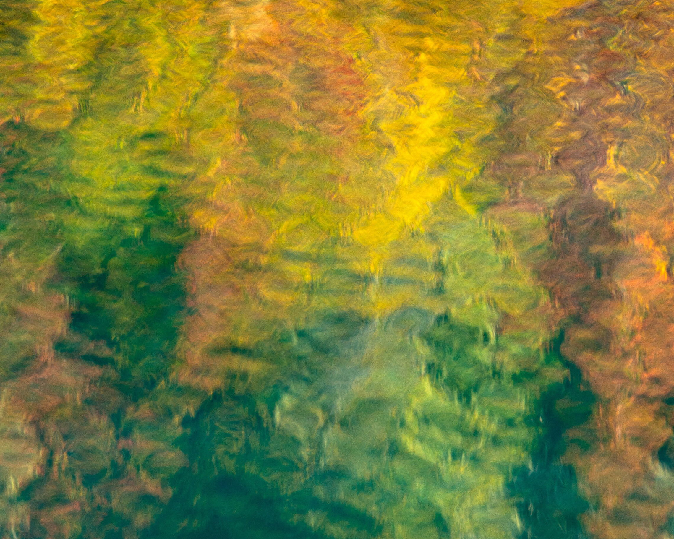
I was looking for leaf color in the bushes along the edge of the lake in hope of getting shots of the leaf color and the blue water of the lake. There was only spotty color and not enough for a decent landscape photo, but I found that by isolating a small area of the colors reflected in the water I could get something interesting.
Specific Feedback and Self-Critique
Any suggestions are welcome.
Technical Details
2 Likes
Lovely textures and colors. How about flipping it vertically? The way you framed the colors and the textures, I think it would have more energy with the yellow on top. It feels to me as if there is a flow from the green to the yellow. Flipping it would give a sense of upward movement (well, at least for me).
3 Likes
@Bonnie_Lampley
Yes, I think flipping is better. Thanks.
2 Likes
Excellent find! I love the rippling colors and shapes. Not so sure about the flip, though, as the slightly greater detail at the bottom provides a good anchor in the OP. I wonder if the darker tones toward the UL could be lightened with a gradient pulled from the corner to almost halfway across diagonally. Very nice in either orientation, though.
@Diane_Miller
Good points, Diane. Thanks. That’s one thing I like about getting other’s feedback, it gets me thinking about the photo differently. You get kind of stuck after looking at it for a while.
Chris, isolating reflections always offers lots of possibilities. This is an excellent example. The mix of colors and their distribution throughout the frame look very good. While both versions are thoroughly enjoyable, I do slightly prefer the flipped version (maybe because that’s more “landscapy” with brightness up top. These would be a good pair to be able to flip back and forth between.
@Mark_Seaver Thanks for your feedback, Mark.