The photographer is looking for generalized feedback about the aesthetic and technical qualities of their image.
Description
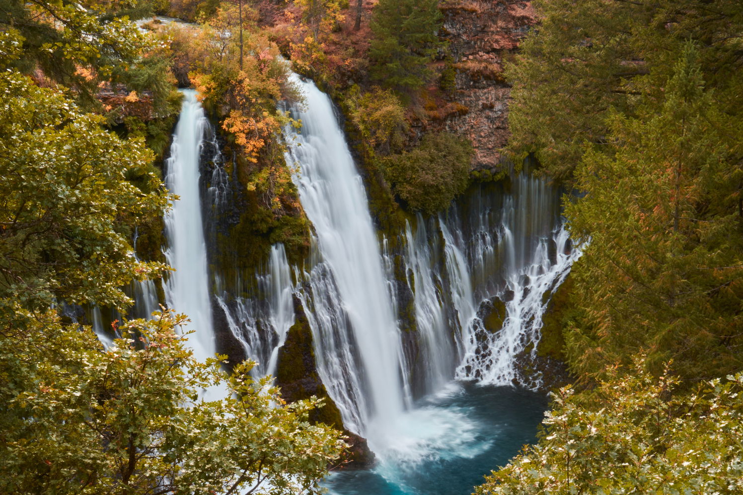
From my recent visit to Burney Falls.
Specific Feedback
What are your overall thoughts? Is there anything else I can do to make this image pop more? Are there any areas that are too distracting?
Technical Details
Sony a6000. 35mm. f/22. SS 1/3.
Critique Template
Use of the template is optional, but it can help spark ideas.
Vision and Purpose:
Conceptual:
Emotional Impact and Mood:
Composition:
Balance and Visual Weight:
Depth and Dimension:
Color:
Lighting:
Processing:
Technical:
Oh man, I just LOVE Burney Falls but I’ve never been there in the Fall. The color of the blue pool looks just about right. I know in some of my images that blue gets electric but it’s real. The water looks great. No real hot spots and the shutter speed used still leaves a smidgen of texture which I love. To answer your question, How can I make this pop more, I’m not sure there is anything you can do that hasn’t already been done. I wouldn’t take the colors or the contrast any farther. It all looks pretty natural. Not sure why you want more pop as it looks great as is. As for the composition, I know those trees from the upper rim of the trail preclude you from seeing the left portion of the falls and much of the blue pool below but there is nothing you can do for that. Did you happen to hike to the bottom?
I wandered by Burney when we moved to the Northwest in 2002, and would LOVE to go back as a photographer. It’s a pretty amazing place.
I think this is great overall Matthew. As presented at this resolution, it seems a bit soft to me. I think a bit of sharpening would help to make it pop more.