The photographer is looking for generalized feedback about the aesthetic and technical qualities of their image.
Description
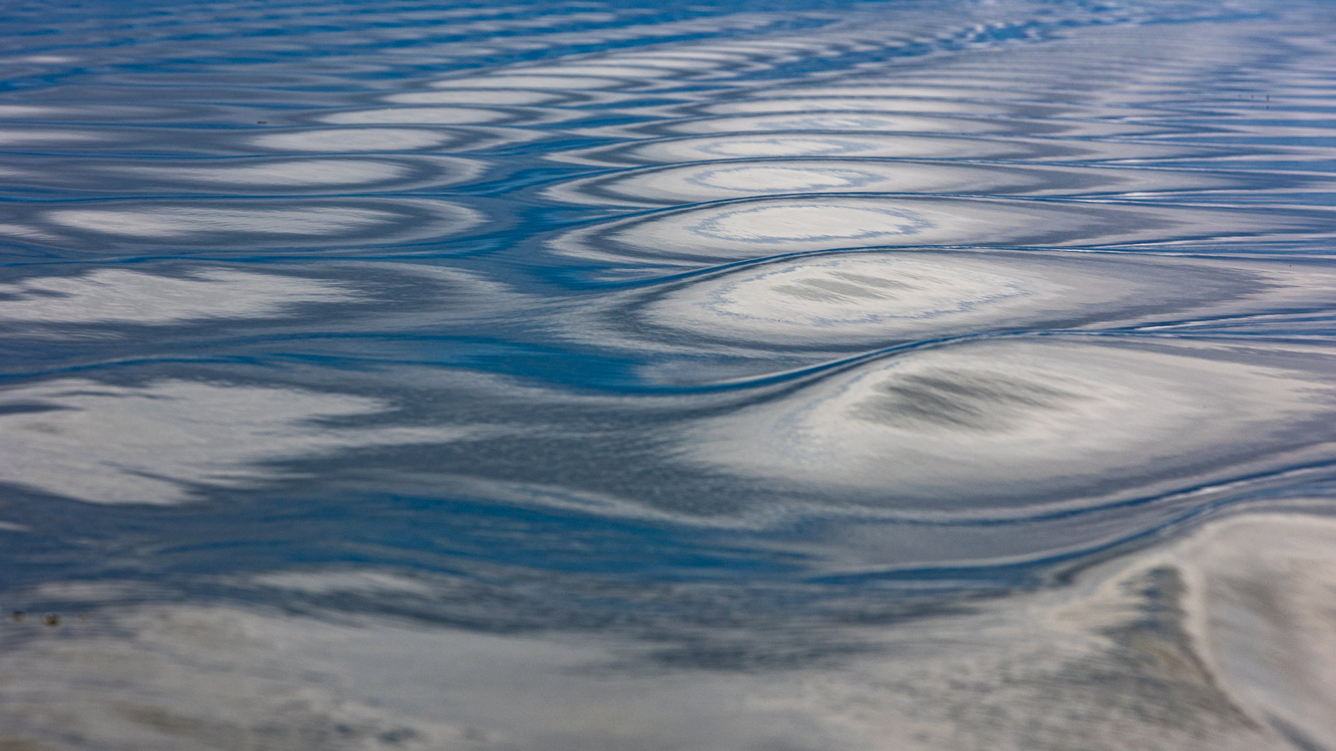
I very much like patterns. This one followed my boat. I thought the curve added to the recurrence of the waves.
Specific Feedback
I cropped the picture to improve the composition. I hesitated to give it more contrast. I am interested to know if you agree with my choices or not and why of course.
Technical Details
Canon EOS R6 with FD 70-200mm f/2.8
ƒ/8
1/400
200 mm
100 ISO
This one caught my attention in the Critique Thumbnails. It’s really cool, and I can feel the boat gently turning. The contrast feels perfect. I’m curious to see what others say about that.
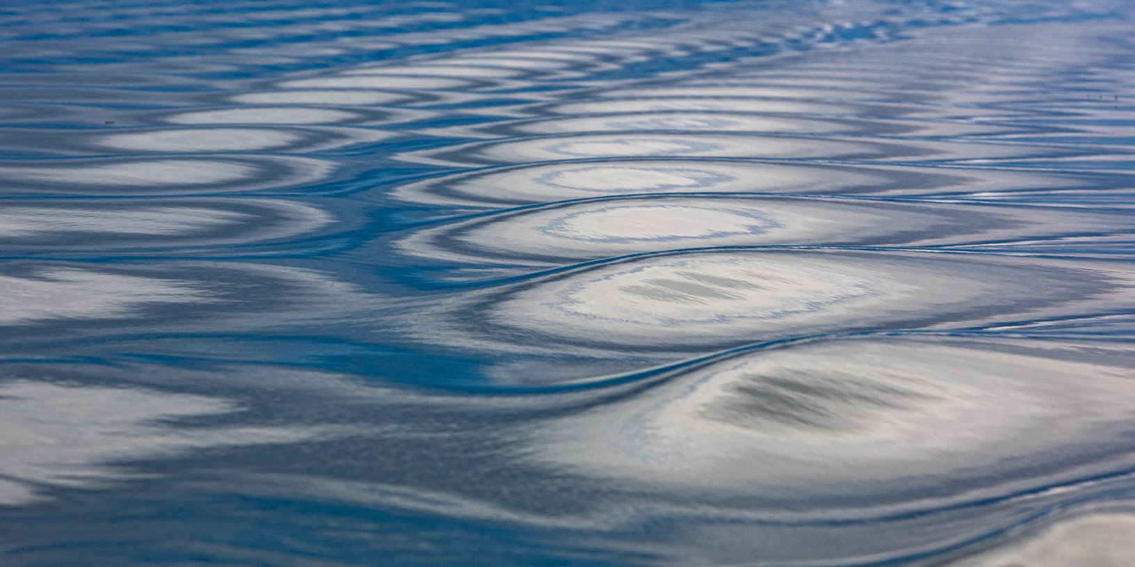
For me, the nearest set of shapes in the wake are a bit too out of focus for my viewing comfort. It’s always a challenge in near-to-far compositions, and especially moving compositions. I hope it’s okay: I took a stab at a slightly different crop. You mentioned that you cropped it too, so it would be interesting to see the original frame (especially if it includes the back of a 1950s Chris Craft or something, but that’s just me!)
Anyway, here’s another crop, which eliminates the foreground blur and still captures the repetition of the lateral ripples and the front to back curl of the wake. I didn’t do anything at all with color balance, but apparently, downloading and cropping and uploading made the blues more green. That was not my intention, but I guess it’s something else to consider.
Xavier, the contrast looks fine. I’m struck by how many repeated waves there are across the frame. I’ve done shots like this but only gotten two or three waves across the patterns. @Marylynne_Diggs’s cropping off the oof lowest wave looks good.