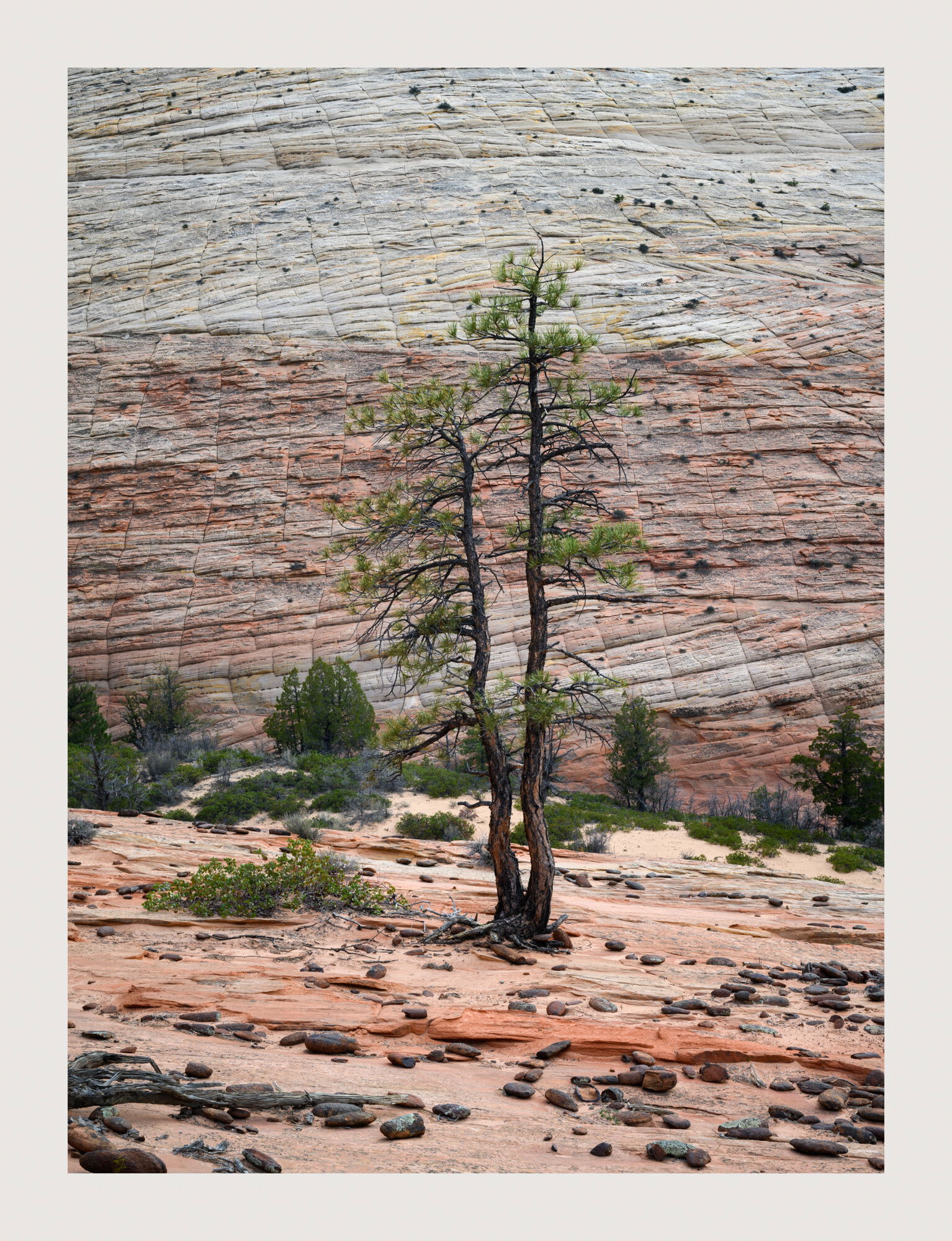
This image is from my Spring Zion trip earlier this year. I had never visited Zion in the Spring before and quickly fell into a creative rut. I’m usually there in the Fall when the colors are amazing and I know what to do and where to go. I also visit frequently in the Winter when I know a storm is rolling through. But Spring mystified me. The bushes, shrubs and trees that I normally shoot were a monotone green. I was forced to see Zion in a completely different way. So I set about looking for trees and rocks amongst the sandstone cliffs that stood out. This also forced me to explore different canyons that I’d never been to before. I made two or three images on this trip that I had never pre-envisioned and came away with a newfound appreciation of Spring in Zion. This was shot on a day when the skies were clear making for good reflected light. This was taken at sunset as the sun was falling behind the cliff face in this image. it was still throwing good reflected light off the wall that would be behind me while I took this. This creates a relatively warm and even toned image. I love how many of the trees in Zion grow directly out of the sandstone cliffs and rock faces.
Specific Feedback Requested
Is the log creeping into the scene from the left an eye grabber? I have a landscape version of this as well that includes the whole log. I’ll post that for comparison.
Is the yellow strip of rock at the top of the cliff face too saturated? This is presented with almost no adjustments to the image and I could easily remove some of the yellow cast in that one area.
Anything else catch your eye?
Technical Details
Z7ii, ISO 80, 24-70mm lens @ 49mm, f/16, 1/4 seconds
Hi David, what a wonderful find. I recognize the general area and would never have thought to try to shoot it. Well seen.
The colors and saturation are fine and seem representative to me. I prefer the second image because that lower log is all in the scene. Plus, that orange streak in the upper background cliff above the tree in the first image is a bit distracting. Both actually work fine, I just feel the second one feels more concise and complete.
Hi David! That’s such a wonderful tree, and I love how you found such a clean background to put it against for this composition. I prefer the first because it helps to emphasize the vertical aspects of the tree. The second image instead emphasizes the horizontal lines in the background so the tree blends in compared to the first where it really stands out. The foreground is also quite interesting with the scattered stones. If this was mine, I would play with lightening the background a bit by pulling up the middle of the curves, and using a layer mask so it doesn’t affect the foreground. The foreground is naturally bright, and since the eye is generally drawn toward light areas, I find my eye being stuck in the foreground which steals attention away from the tree. When the background is lightened a bit, more attention is placed on the tree and the tree also stands out more from the background.
I agree with most of what @Ben_Horne wrote. The vertical seems to be a more appropriate composition due to the main subject. I also think the empty area in the lower left corner of the horizontal is not optimal but it’s really not a big deal. I also agree that the back wall could be lighted a bit but not too much because the tree will start to look too dark. It’s already pretty dark so a balance needs to be found. But what I find most interesting are those scattered dark round rocks on the smoother red hard surface. The ones that look like beans. The striated rock wall is fascinating too. I think you might be able to bring out its texture and really make it sing.
Interesting to see both, find a preference then read the comments of Ben and Igor. I very much favor the second one. While I agree about the first emphasizing the vertical nature of the tree, I find the closer view of the tree in the second provides much more emphasis to the tree and it also really nicely shows its environment. That said, hard to go wrong with either. Both work really well in a little different ways.
Great photo, nice soft light and such deep colours. Both are nice but for me the second is the stronger. It gives the context and gives the lines in the cliff more space to spread out and show the vastness of the space. It has a peacefulness I don’t feel as much in the first. My 2 cents, nice capture!
Great image, David. The log is no problem, but IMO you could desaturate a tad the yellow strip. I like the vertical orientation the best. Maybe the ground could be toned down a tad since it may take away some attention from the tree?
David, I’ll go with my normal default preference here with the horizontal. Usually there is a distinct reason behind my choice in this case not so much. I do see your point on the log creeping on the first image, and yes that can be part of my thoughts between the two choices as well. Regardless, both work fine as well scouted out scenes and compositions in the end…
David, This is an area I’ve only explored once before, a couple of years ago. I do like the second image but as Igor pointed out, there is some blank canvas in the LLC that bothers me just a little. I could clone in some boulders but have chosen not too. Just not me. It seems that there is a split between both versions. I understand each of the reasonings. I took care of the yellow line in the portrait and think that helps quite a bit actually. Thanks David.
Ben, I’m glad you love that tree. Split personality! I slightly prefer the vertical for the very reason you pointed out. It emphasizes the vertical nature of the trees and I feel in the landscape version, things feel just slightly cut off. I took your suggestions to heart and dodged the background wall only. I also, ever so slightly, burned the highlights in the foreground, but not much. I also toned down that yellow strip on the background wall. This was tough to compose. I didn’t want the foreground tree or branches to bisect any of the background trees and tried to include the entire foreground log but it just wasn’t fitting in the scene. There is no more room at the top as the top of the mountain is just above where I framed this shot. If I moved to the left or the right I would intersect with those background trees,
I think this will be the first year in 4 or 5 years that I won’t run into you at Zion this Fall. It should be a very interesting year with all the water runoff from the monsoonal storms this year. Anyway, good luck and get some good ones, Ben. Looking forward to your video on it. Have you been back to the Bristlecones in the white mountains since I ran into you there? The new Podcast is great!
Igor, See above for my response to Ben. I also took your advice and added a little bit of texture and sharpening to just the back wall. I’m not sure I remembered to sharpen this image so that may help bring out the texture a little bit more. I totally agree with you about the LLC in the landscape version. That is my main reason for liking the vertical slightly more than the landscape version. Thanks for your input.
Harley, Like I said to David, this one has people preferring one or the other almost equally. I really like the landscape version but the LLC bothers me a little with the negative space down there. I totally get why you are drawn to that one though. Thanks for your comment.
Charles, Thanks very much for your 2 cents and your honesty. I appreciate it and I’m glad you like it.
Ola, I re-edited the vertical using both of your suggestions. Thanks very much and let me know if that did the trick or not.
Paul, Many times, in fact most of the time, I have no idea why I prefer one image over another so I totally understand where you’re coming from. Thanks very much, Paul.
The harmonious alignment in the vertical (especially with the rework) is quite striking and indicative of where you shot it. Your narrative about the difficulty in finding good compositions and subjects is interesting given the sparse nature of this photo compared to my Remains of a forest giant photo. Goes to show that we worry and fret in the field no matter what. Your efforts paid off here and I quite like both aspects for different reasons. As I said about the vertical it’s harmonious in an expected way - we are used to seeing this arrangement and treatment. But the horizontal is more surprising and has a higher level of tension as a result. I would consider adding canvas above. When you were on the spot, would moving to the right have put the log(s) in a better position? Sometimes it can and sometimes it can’t, but either way, I like the tree and its companions.
@Kris_Smith, Thanks very much for taking the time to comment and offer up suggestions. If I had moved to either the left of the right I would have intersected the main tree with the background trees and shrubs and I was trying to find a position where the tree and it’s branches didn’t touch the background trees. In the vertical, I couldn’t move back any more because I would have brought the sky into the frame. As for the landscape version, I don’t have any more canvas to add at the top. This is pretty much full frame. I was trying to compose this so that it eliminated the bright yellow strip that runs across the top of the vertical image. Your points are well made, Kris and I appreciate your input. @David_Bostock …Glad the revision works for you. The suggestions really helped out with that one. I will apply the same to the landscape image. Thanks David!
A little late to the party, but had to stop and comment. Love this setup and image(s). Fantastic job sighting and working this little scene - and in a time of year that as you mention, doesn’t have the obvious comps calling out to you.
I think the processing in the reworked vertical is a great improvement. I think comments were made, but have read all of them… that in the vertical, the image is about the tree, IMHO. The horizontal is more about the “place”, the environs and I think tells a more interesting story. I really like the scattered rock/debris of the horizontal and think it balances nicely with the back wall. The tree then becomes the connector between the two and I think just works better.
The only nit I have with the horizontal is wishing for a skosh more breathing room above the tree; the exsisting space causes just a little bit of tension. But not a huge deal.
I love your eye, David. You are able to find the intimate amidst the vastness of the landscapes you so often photograph. This image is no exception. That is why I prefer the portrait view - precisely because it feels more intimate and lets me experience the “vulnerability” of this tree. For that reason I am more emotionally affected by the portrait rendition.
Thank you so much for your comments and suggestions @Lon_Overacker, and @Kerry_Gordon . I’m sorry it took so long to get back to you both. I’ve been on the road for several days now shooting fall colors in Utah.
Lon, You are correct that the two images tell a different story. I’m not sure that I prefer one over the other. I really like both of them. I wish I had more room at the top of the landscape version but it’s full frame top to bottom. I agree, more room would be terrific but I just don’t have it. I certainly appreciate your suggestion. As always, I appreciate your input.
Kerry, Glad to have you back. The vertical is certainly more intimate. I love that you feel the vulnerability of this tree. Me too. Thanks for your comment and for taking the time to let me know how you feel. I always appreciate it.