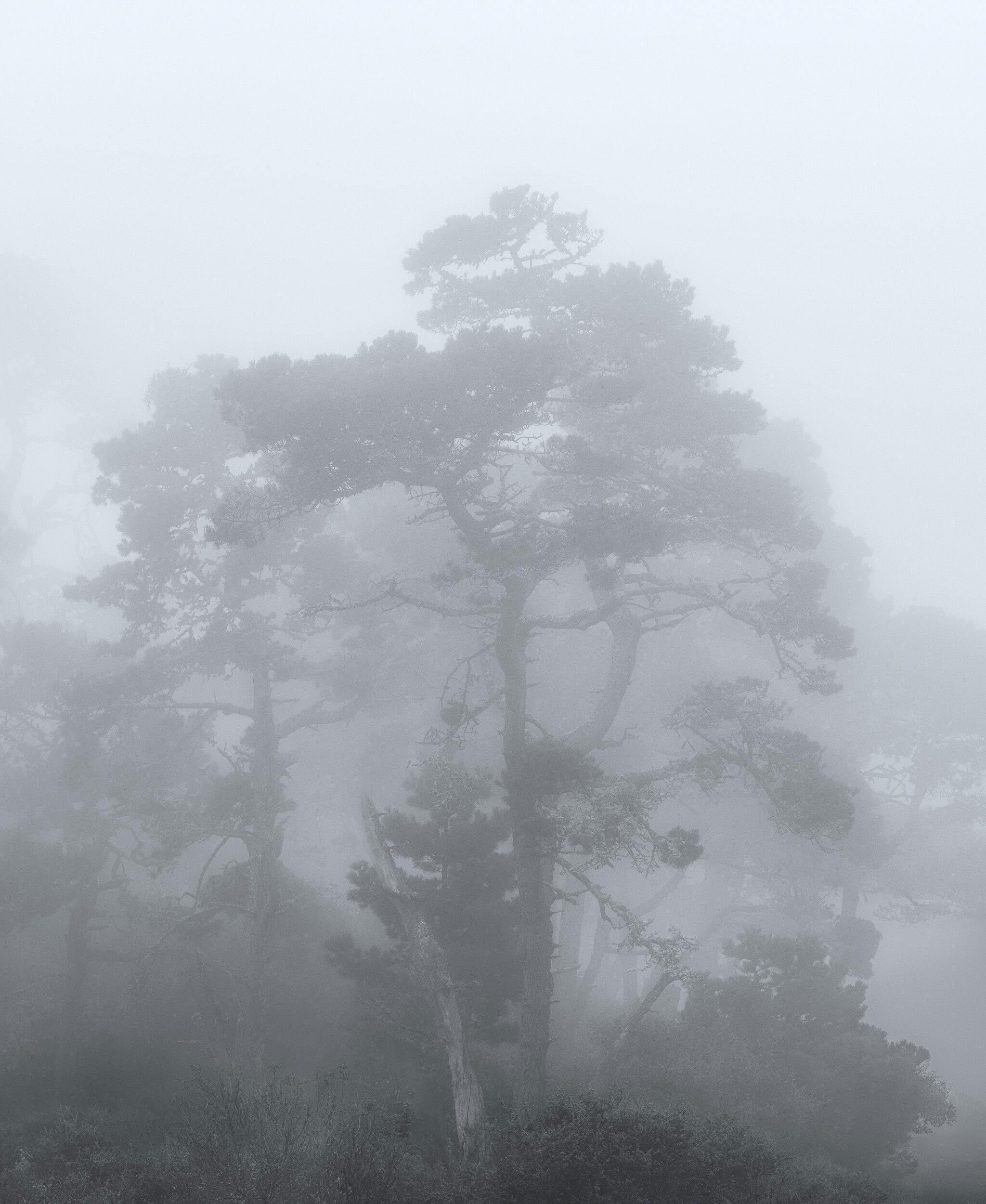
Diane, I really love the dreamy look of this beautiful tree. I took liberties to further emphasize that feeling for me with my crop. Your group had great conditions and came away with some fine images, including this one.
Great foggy image! I like that you have a ghost tree in the BG having similar shape as the main tree. I think the image would work great also as a B&W image.
This is a fairly unique fog picture. I like the browns at the bottom and even the darkness of the bottom. Although I would raise the very darkest of the dark just a tiny bit. It is bottom heavy but I think that’s part of what makes this image interesting.
Oh I can see why you stopped so often! Amazing fog and equally wonderful trees. Such sprawling shapes they achieve on the coast. I like the hint of color you left and the deepening layers as things are further from the viewer.
The bottom of the photo is very heavy visually and keeps dragging my eye down to it. I do think a crop from the bottom is needed but probably not as much as Harley cropped, because his crop loses all the fascinating interplay of the fog with those tree trunks.
Such moody conditions. I love it. The bottom keeps drawing my eye. I think it’s a couple of things. First the bottom feels unbalanced. It’s darker on the center and left side while the right side is lighter and doesn’t have those same green bushes making it feel like there is a whole or a gap there. You could maybe burn down that LRC which might help solve that. I very much like the crop that @Harley_Goldman came up with and it solves the unbalanced feel that I get with the original. It also focuses more on the atmospheric conditions you were presented with. Love those trees.
The fog most certainly created some great photo opportunities and you maximized yours with this image! Great mood and just the right amount of fog.
I’m torn about the bottom as well as far as cropping or not… I do think this works beautifully as presented. Cropping then would be an alternate view, no necessarily a better image. I do like Harley’s crop very much as it condenses the image to it’s core. But also agree with Youssef that perhaps a smaller crop would work too. But no matter how you slice it, you’ve got a winner here!
You and I are both fog lovers, Diane, and this one has a beautiful ghostly, other-worldly feel to it. However, I do find the image bottom heavy and, for me, that feels unbalanced. I like Harley’s crop but, really, it is a different picture than the one you seem to be envisioning and has an entirely different feel. I would be loath to abandon where I think you’re coming from with this image. I would therefore be tempted , as Igor suggested, to bring up the darks in the bottom of the frame although I’m thinking of going somewhat further with that than what Igor seems to be suggesting.
Just lovely! I’m so sorry I missed this trip - that fog is heavenly.
I’m with everyone that the bottom is a bit dark. I brought it into ACR and raised the black & white sliders (but not shadows or exposure) for just the dark bushes part, and it seemed to do the trick. I wouldn’t crop anything because you’d lose the depth relationships.
I went to B/W to remove the difference in color of the FG then added back a slightly cool cast overall. Decided to sacrifice some of the right side to minimize the brighter area in the LR, but still reduced it some. Straightened the apparent tilt of the main tree a bit more. It feels a bit boxy but that was the shape if the tree.