What technical feedback would you like if any?
What artistic feedback would you like if any?
Pertinent technical details or techniques:
(If this is a composite, etc. please be honest with your techniques to help others learn)
(If this is a composite, etc. please be honest with your techniques to help others learn)
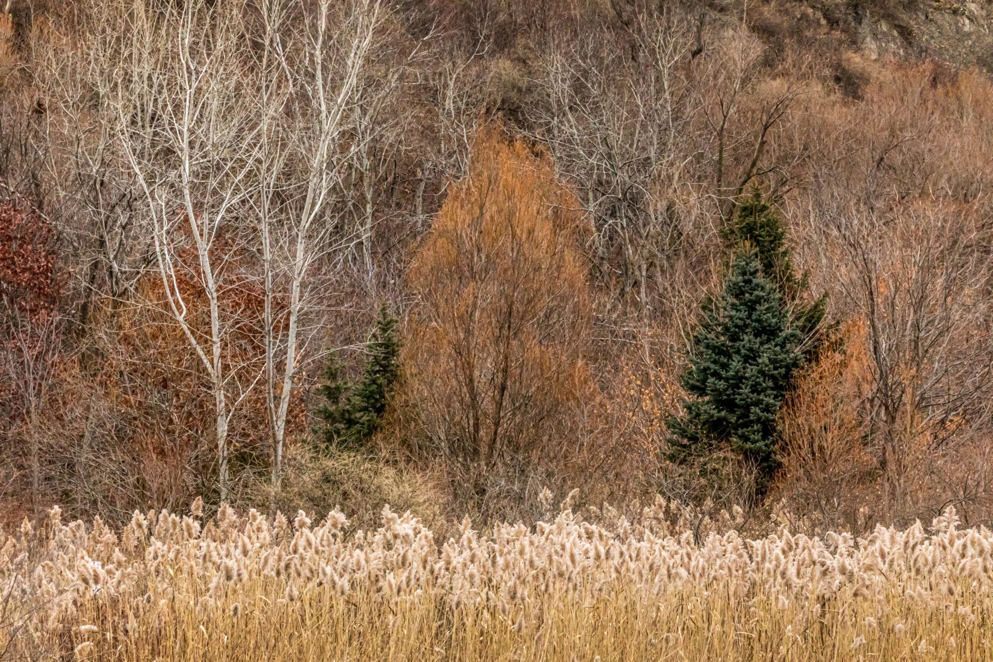
I like how you composed this scene, the entry with the dry grasses looks nice! You’ve a special colorpalette with all the brown tones. I think a vignette and some more dodging and burning might create some more depth to the image and could emphasize the different hues slightly more?
It’s an interesting late autumn scene!
Nice image. I like the comp and the subtle earth tones. Normally I think the lighter colors should be further into the image because lighter draws the eye, but I think the lighter fg works here.

Larry,
This is quite appealing. I like the variety of elements, textures and colors captured here. Have to start with the hard line of the grasses/seed pods? anchoring the scene, then followed by the colors, textures and contrasts of the varied trees and vegetation. I think normally I might be put off by the darker evergreens here, but somehow I think they really add and complete the image.
for me, I might trim/crop this a tiny bit to remove the open space in the URC. But that’s pretty minor.
Lon
This is a really interesting image Larry, there is a lot to appreciate here. There is a wonderful variety of warm colors that blend together beautifully in this image. And I love the way the shape of the aspen separates out against the background.
I agree with @Lon_Overacker, the darker patch in the URC does not seem to fit withe rest of the background. I think you have plenty of room to crop a good portion of that away.
I have cropped the image but also reduced the relative contrast of the foreground with the background. I believe the crop is an improvement but very interested in people’s opinion on the contrast change?
The crop helps, but I strongly prefer the contrast/color in the original post. To my taste the stronger contrast loses some of the subtle warm tones that were present in the original image.
Much improved Larry. I like both the crop and the contrast/luminosity changes (repost is a tad brighter up top?) The only further tweak would be to drop the brightness of the bare white branches in the UL quad by a 1/2 stop or so. Otherwise, I’m really liking the changes.
thanks for taking the time!
Lon
ps. quick tip - when adding reposts, feel free to edit your original post and that way viewers can page through all the versions for comparisons. No biggie though
My tastes run with Ed’s Larry; I like the crop but prefer the lighting of the original.
