I have not been posting images here recently due to the sudden death of my photo desktop, and my laptop having a poor screen. While waiting for a new desktop to arrive, I have been intrigued by discussions in recent posts regarding the use of image borders.
In these posts @Igor_Doncov has made some very interesting points on the use of borders to enhance image presentation. I was impressed by how adding borders to a recent image by @Adhika_Lie helped the image presentation. I have some images from a recent trip on my laptop, so I decided to experiment with borders.
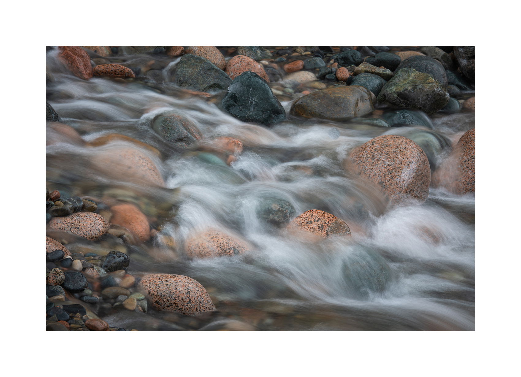
I am not seeking critique of the image, but rather thoughts on borders vs. no borders, and on the use of different border widths. For my personal taste, I prefer white borders for a clean and simple look. I also like having all 4 borders the same width, but I’m experimenting with border width.
Here are some alternate presentations of the same image. Looking for any and all comments on the aesthetics, especially of the border width, or using borderless vs. with borders. The last image with the widest border, uses a border width based on the golden ratio, that I read about in an article. This states that the border width should be about 10.9% of the longest side of the image.
I actually use and like that ratio when I frame and mat physical prints. But I think it is too wide for display here at NPN. That is my only bias I will disclose, otherwise I’m seeking any and all input and comments. I know the images are slightly different sizes, but am looking for comments on relative proportions.
I should also say that I am only looking for comments on how this affects the aesthetics of display here at NPN on a dark background, and not at other places images might be posted.
Borderless

Image 2

Image 3

Image 4 - Golden Ratio Border