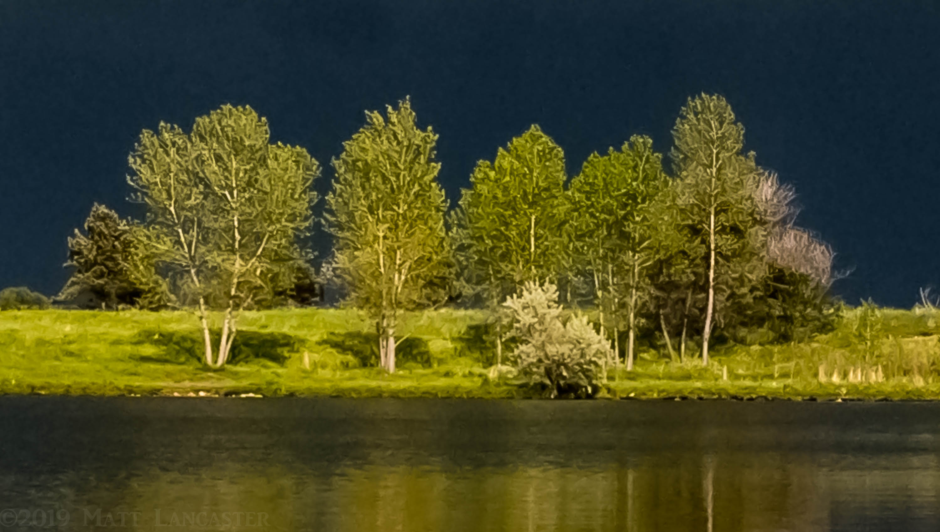
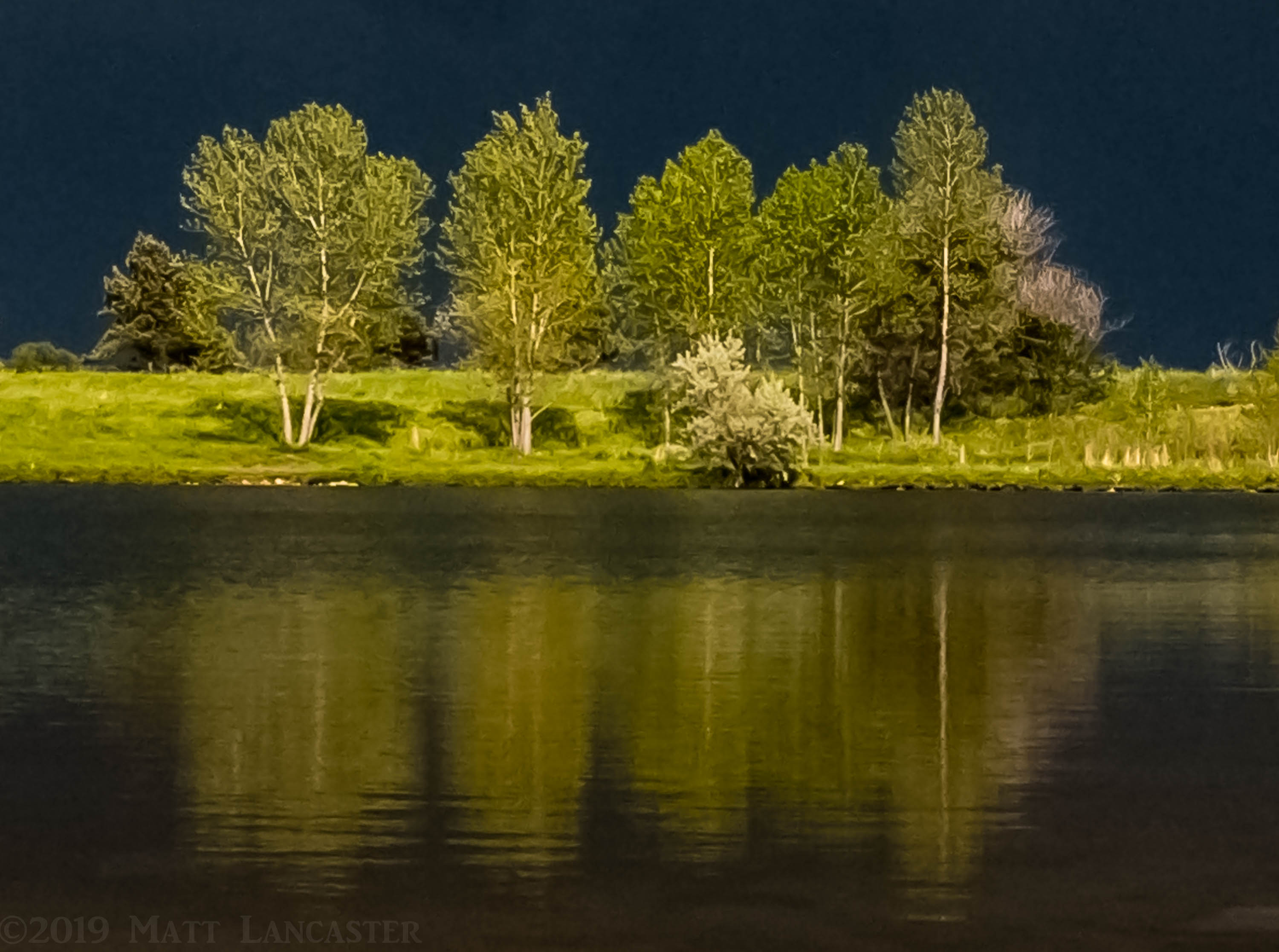
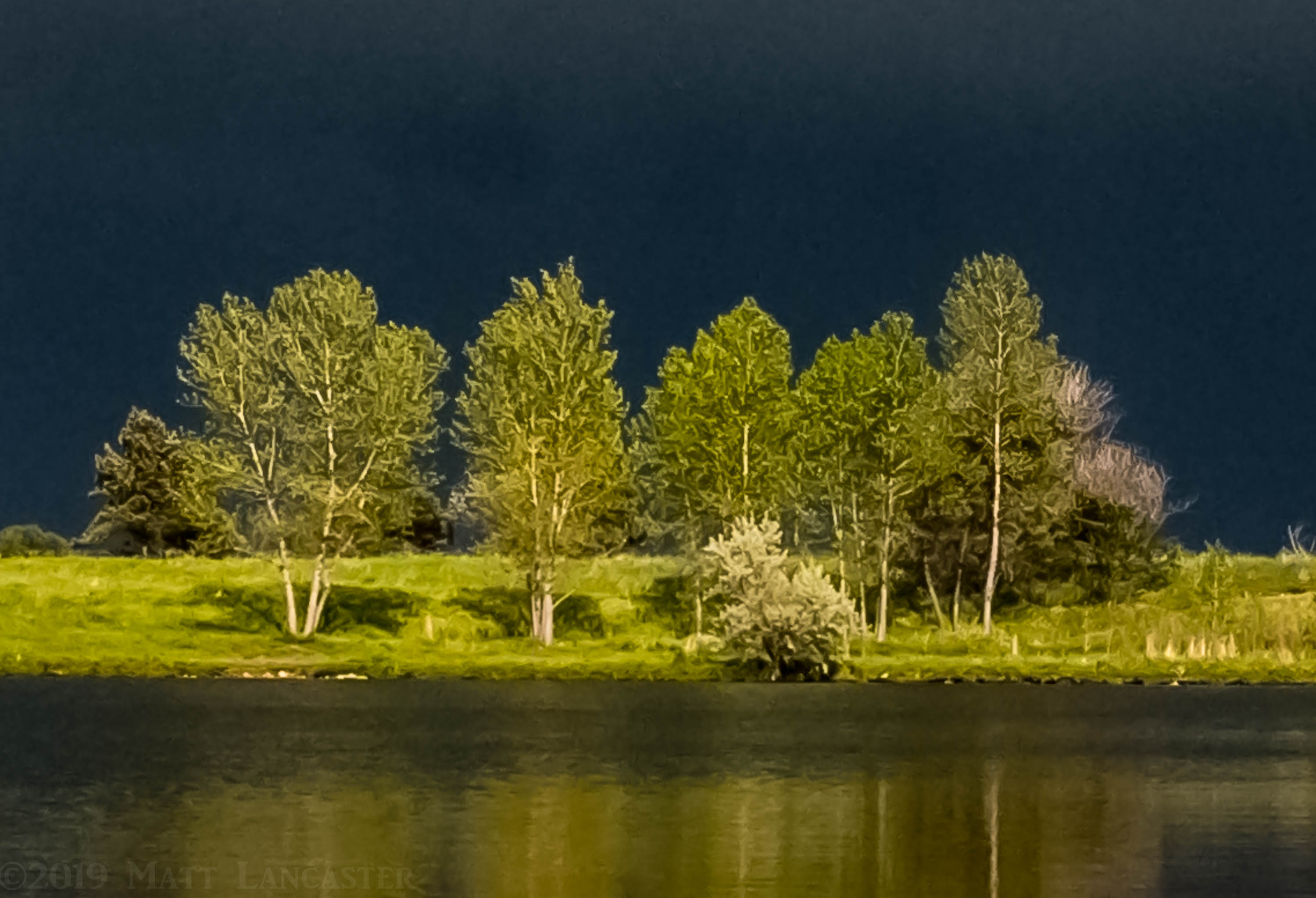
All of the following 3 images derive from the same original photo. Their edits are identical but their framing/cropping varies. Which composition and framing do you prefer and why? Also, what do you like and dislike about the editing? Looking forward to comments.
What artistic feedback would you like if any?
My goal with the edits is to achieve an abstraction of the details to present the familiar subject in an unfamiliar way. The image then takes on a symbolic meaning - an abstraction of the reality.
Pertinent technical details or techniques:
Adobe Lightroom Classic for processing (desktop). Adobe Mobile Lightroom app for in-app capture and processing (iPhone).
What technical feedback would you like if any?
I encourage viewers to open on a large screen to enable a detailed view. Do the irregularities of the rendering of the sky pass for artistic technique with the tool?
If you would like your image to be eligible for a feature on the NPN Instagram (@NaturePhotoNet), add the tag ‘ig’ and leave your Instagram username below.
#igremarkableearthphotography
You may only download this image to demonstrate post-processing techniques.
My gut feeling is the top one. If you’re aiming for abstraction with this scene then I think simplification can sometimes help the image work
As you say it’s all subjective
1 Like
The middle one for me. I really like the full reflection. In that one, I might clean up the branches on the right edge ridge line, but otherwise, it looks really good to me.
1 Like
@stevenm, @John_Neish, @Harley_Goldman: Thank you for your feedback. Agreed, a subjective evaluation, but that’s precisely what I’m asking for. Everyone’s opinion is different and valued.
Steven, while I appreciate your feedback I would appreciate if you would deliver it without being rude. In fact participation in this forum requires it. I asked for your evaluation of what you like and dislike about the editing and framing but instead you insinuated the image was not worth your evaluation. Likewise, the cropping of the image is not a problem, it’s my creative decision. If you don’t like something about my image or any image on NPN don’t simply criticize it, state why and what you might do differently so that you are contributing to learning.
I prefer the middle image because I think that the reflection does contribute to the image and I prefer to see it entirely instead of a portion of it.
1 Like
Matt,
First of all, love the light and the colors. The nice greens are contrasted nicely with the steely blue background. Can’t figure out though, is that sky? Or those wonderful conditions with dark, stormy clouds in background when the sun decides to pop out from behind you? OR, could it be this is an island and it’s yet just a body of water? a great and enjoyable mystery.
As to the crop, I prefer the middle one as well. The top and bottom are nearly identical. By cutting off the reflection, the image becomes almost exclusively about the trees and the light. Keeping the reflect adds another element of symmetry, which I think works nicely in this presentation.
And if you keep the reflection, you might consider content-aware clone of the thing in the LRC - a submerge rock or something? Not a biggie though.
The greens with that beautiful light look spot on.
Lon
1 Like
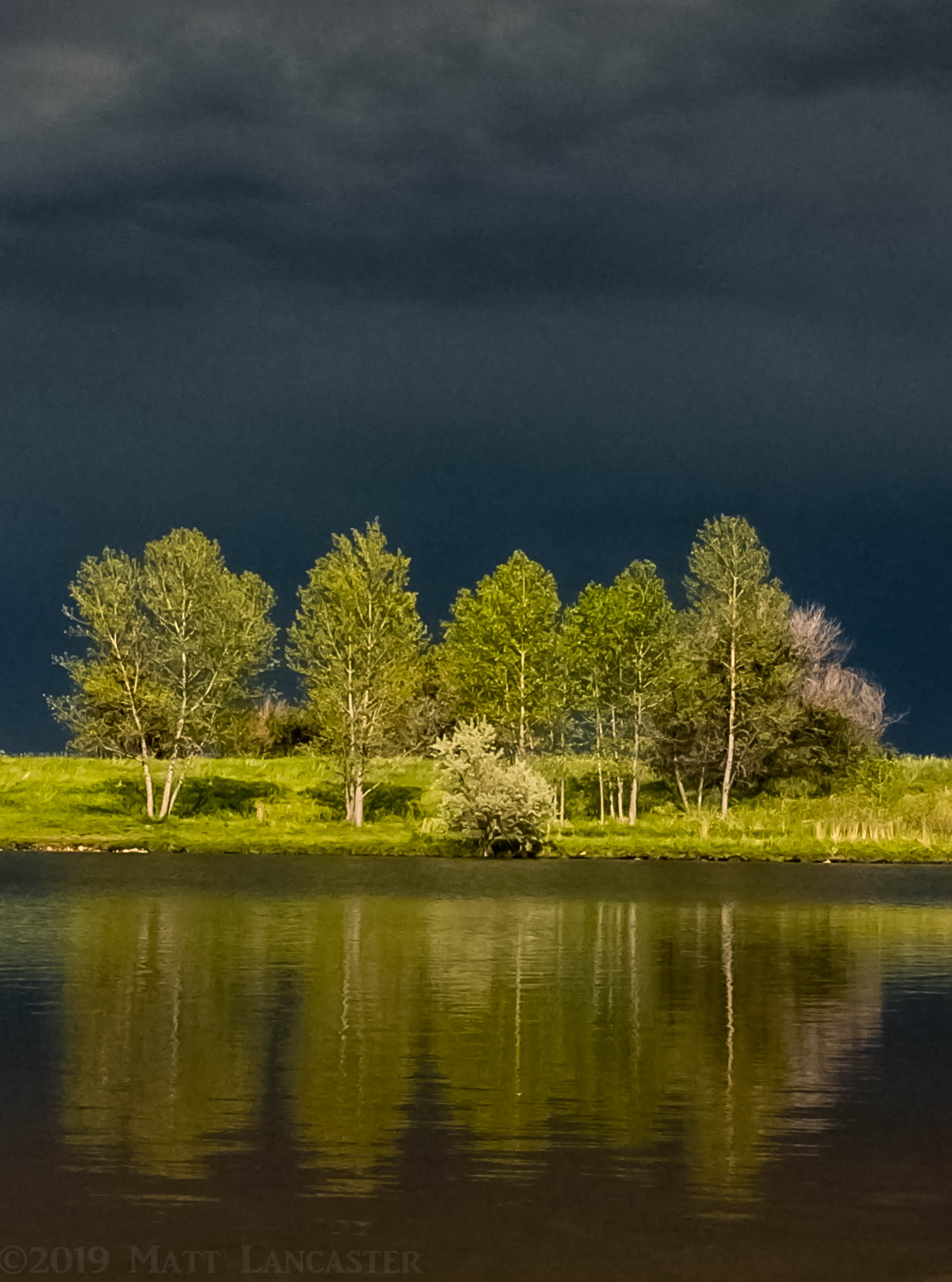
@Igor_Doncov, @Lon_Overacker Thank you both very much for inspiring me to copy the settings to a vertical framing of the same scene, below. It provides plenty of sky and lowers the horizon. It’s slightly cropped from the left and bottom and I’d be interested in how you might further crop it.
Lon, thanks again for going the extra distance on your comments. Really love it. I think you see this image as abstractly as I intended. Glad to hear it had the desired effect.
I’ll tend to the submerged rock later. Great catch.
Matt