@Igor_Doncov convinced me of the benefits of presenting the image with borders/a frame on the last post. So, I will give this a try and see how it goes.
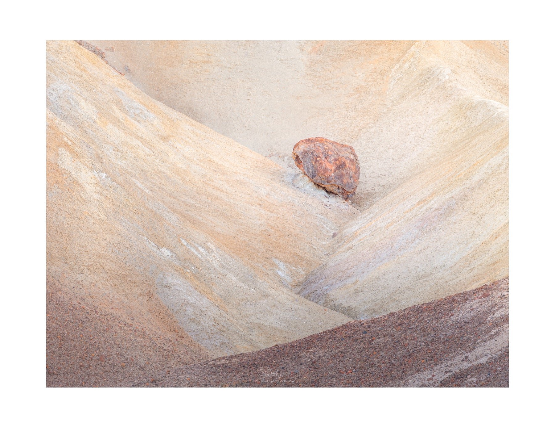
This is a vignette from one of my favorite spots in Death Valley. Sunrise is very subtle at this location, but the bounced light helps create a more contemplative mood, in my opinion. As always, all feedbacks are most welcome!
Adhika: Marvelous pastel color palette and a compelling comp IMO. I like the fine textures evident in the largest version and the lack of obvious scale. Beautifully captured and presented. >=))>
This is wonderful Adhika. I love the subtle, pastel color palette and the nice soft light. I think the composition is very nicely handled as well. Overall this is a very nice intimate scene, and I’m really enjoying it. I love how the color of the boulder is repeated in the LRC as well. Please take me to this spot if we manage to connect in DV this December, this is exactly the type of stuff that I love to do.
I too have been intrigued by @Igor_Doncov discussion of the merits of framing images. His points about how lines and shapes interact with the border, and how they help to make the composition stand out have made a lot of sense to me too. I am refraining from posting images currently due to some problems with my photo desktop, but I fully expect to give using borders a serious try once I am up and running on my desktop again.
If you wouldn’t mind, I would like to ask a favor. If it is not too much trouble, please post a border-less version of this same image back up top with the original post, to allow a side by side comparison. I suspect this will show an even more significant difference than your recent Desert post, and it would be very helpful see the before/after borders.
Great composition, @Adhika_Lie. I’m a big fan of abstraction, and especially geometric abstraction, which I find more difficult. You’ve done it well here.
I am curious, since I’m viewing this on my phone and can’t determine, if it’s in fully in focus from edge to edge and whether you feel that is important to this type of image.
This is a beautiful image in an artistic mellow sense. I can see it hanging in a room with light furniture, a sunny room. I think the white border helps enhance that mood.
It might be interesting to play with that wedge in the bottom right by reducing it’s tonality a bit. I like it fine the way it is but would be interested to see it otherwise, to say the tonality of the llc.
This is an excellent image in my opinion. It’s somehow very soothing. Good seeing on your part.
This is a very interesting perspective which I have not thought about in this image. I guess there is some kind of relative size information between the boulder and the small rocks in the foreground but no “absolute” size information is readily available. And I think you are right about it adding interest to the image. It reminds me of the comments made on my other image how it is not immediately clear whether you are looking forward or downward on the image. I might be on to something here.
Ah, I am glad you like this element of the image, Bonnie. That was the one thing that drew me in and made me take out my camera for this shot.
Good point, Ed. I was not aware of this until you point it out. To @Igor_Doncov’s point about lightening that wedge on the lower right, it seems that the different tonality between that and the one on the LLC adds to the depth of the image, but definitely something to play with.
I have also posted the borderless version on the original post. You are right, huge difference. This is really fascinating. In my estimation, this is very similar to Igor’s version of “One Rock”. The borders add so much to the image.
Definitely! Time flies, it’s already the end of February. December will come really fast.
Thanks, Matt. Yes, it is in focus from edge to edge and I do think it is an important part of the image. If I were not able to get it sharp from edge-to-edge with f/10, I would have focus stacked this. Perhaps I am traditional, but I have not found a “landscape” image where shallow depth of field actually adds to the image. What is your thought about this?
This is excellent, Adhika. Maybe not as strong as the prior comp. from this spot but beautiful nonetheless. I like the high-key processing although I could see burning/adding a slight vignette around the frame edges.
You know, great depth of field is the norm for images that portray a landscape, as you said. However, the greater one isolates a subject against a background in which the ground plane is unseen or unimportant, the greater the opportunity for shallow depth of field to put attention on the subject.
I combed through some images and found an example where I shot a group of aspen trees that were some distance from the trees behind them and where I showed no groundplane. And it was foggy. This is a prime occasion for a shallow depth to blur everything but the subject trees.
Thanks for taking the time to add the borderless version. The difference with and without the borders is very striking, my perception of the image significantly changes with the border. I may be sounding like Captain Obvious, but the border lends a “print like” feeling to the image, and that is a good thing. It’s an elegant way to present images here on the dark background at NPN.
Isn’t it interesting? I also think the color looks more pastel-ey with the borders than without. Now this is a white border… @Doug_Blunt has experimented with different borders and I think it’s worth experimenting, too. To @Ed_McGuirk’s point about “print-like” feeling to the image… I am old fashioned. I love matted prints. But there is also a trend these days to have borderless metallic/acrylic printing. I am not fond of those. Have you guys experimented with that?
Matt, this is interesting. I did a thought experiment with the shooting situation that you’ve just described. The two methods that come to mind immediately for subject/background separation is by using fog/mist and tonality. I instantly think about @Ed_McGuirk’s recent articles where he uses fog so effectively in some of the images there. I leveraged tonality on my other image. But these images were taken with small apertures to retain a big depth of field (at least I think that’s what Ed did, too). You bring up a good question if there is some merit in using a shallower depth of field in these situations. I need to experiment with this in the field but would love to hear other people’s thoughts and experience.
I am old fashioned too, I much prefer a framed/matted print presentation over acrylic or metal prints that have no borders or mats. I prefer the aesthetics of the framed/matted presentation over acrylic/metal. The advantage of the acrylic/metal presentation is of course the lower cost and effort involved. But I just like the way a tastefully framed & matted print can look.
Adhika,
I have been absent for a while but I wanted to stop by very late and tell you that this image really grabbed my attention. I love the colors and the simplicity, brilliant work and the white framing is my preference. I agree with you and @Ed_McGuirk and do prefer the old school matted/framed look for prints.
This is superb, Adhika. Appears to be very carefully and masterfully composed and crafted. So many wonderful colors, shapes, and textures to explore and enjoy. As for the border, I say it depends on how it is viewed. For web use with a dark background, I prefer no border, but if this was printed and framed, I most always print a border for mine, both for accent and as a place to sign the image.