The photographer is looking for generalized feedback about the aesthetic and technical qualities of their image.
Description
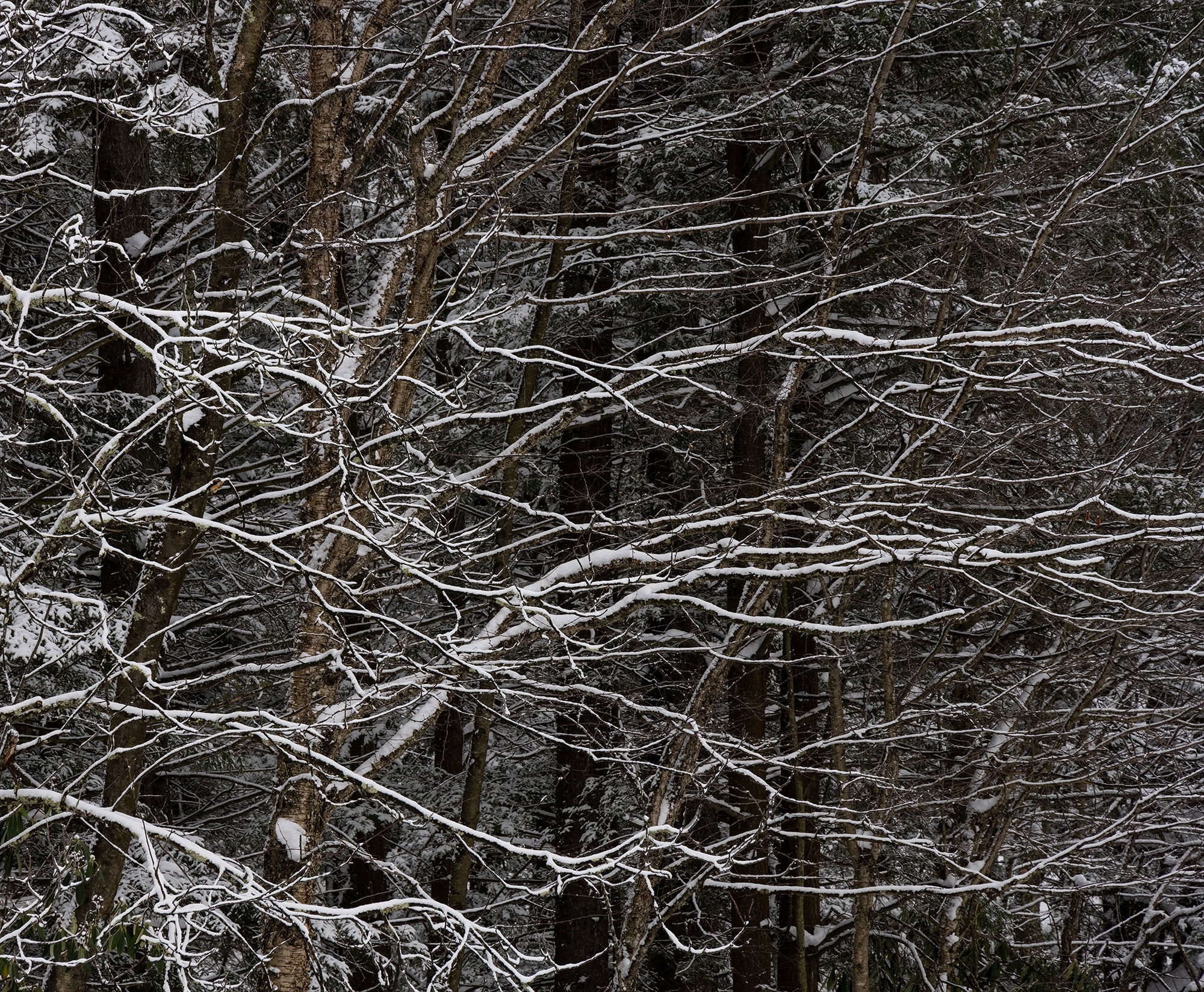
I do not know how much interest this image will have; but I like it; so I thought I would put it out there and see. Not much went right on our last trip to Blackwater Falls SP and we were really hard pressed to capture any images. I tell myself that obstacles are sometimes a good thing as you are forced to change your mindset and be on the lookout for something different that you might not ordinarily take notice of; as was the case here. I was intrigued by the way the limbs seemed to be reaching out for something just outside of the frame. The light dusting of snow on the limbs gave them some separation from the darker BG vertical tree trunks. I also liked the implied left to right motion as well.
Specific Feedback
To boring or busy? Anything else you notice please feel free to mention it.
Technical Details
Nikon Z7, Nikon 24-200 @ 200 mm, f 11 @ 1/100 sec, ISO 400, cable release & tripod.
My initial reaction was that a crop from the left could simplify and improve the composition. However, I found that the non linear shapes on the left provide balance to all the lines going out on the right. I think your composition works quite well in that regard.
Like Igor, I was momentarily distracted by the visual weight of the left side, but it is so integral the the effect (the very effect you mentioned) that I think it’s an important part of the frame.
I really like the energy in this piece and the three dimensional quality of seeing the trees behind the branching.
Ed, the wavy branches reaching across the frame are good fun and nicely dynamic. I could possibly see cropping about 1/4 off the top to further emphasize those wavey branches and how the forest is reaching out for…
I like the lines of the branches against the darker background, Ed. It works very well and I can see why you like it. I think I saw something from Tony Kuyper recently on a technique for separating the image into different depth slices for editing. If you could do that to this image, I could see bringing up the whites of the snow on the foreground branches just a touch.
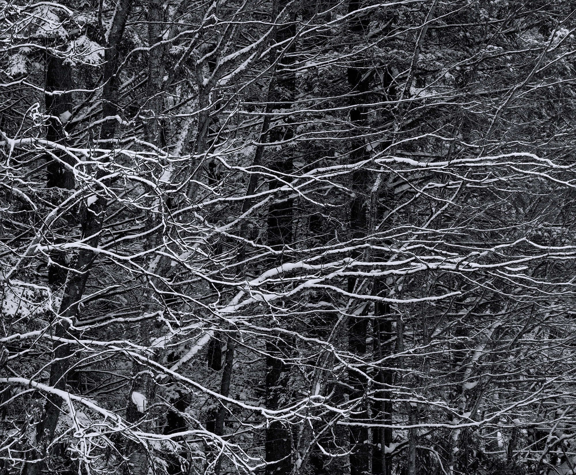
I think you dealt very well with the obstacles in your path and saw some order emerging out of the chaos. I wonder how this would look in black and white, with a contrasty look. That might further simplify the image. But I’d have to see both versions to make a decision.
Hello, Ed. At first glance a person wouldn’t think this image has any focal point. But imho, you’ve organized all the different elements into making the wonderful snow encrusted horizontal branches the center of attention. They contrast wonderfully with the darker vertical trunks in the bg. I like @John_Williams B&W. It takes away any distracting color and lets the viewer focus on the fg branches.
Greetings Ed, I enjoy the patterns of the branches highlighted by snow and the depth with the darker trees in the background and the way the background gets brighter as my eye moves to the left which balances the image. To my eye, this image is not too busy. The patterns and complexity of the images makes me linger.
The more I study it, the darker background trees in the middle break the flow of the image. I tried a variety of ways to raise the darks on the trees mentioned but I found the darker trees in the background are needed to highlight the branches in the foreground.
Many thanks everyone @Igor_Doncov, @Marylynne_Diggs, @John_Williams, @Mark_Seaver, @Dennis_Plank, @canan, @Michael_Lowe and @Bill_Bomberry for taking a moment of your time to leave your thoughts on this image; always appreciated. It is a complex image and the snow covered branches against the darker BG is what originally got my attention.
Igor and Marylynne: That was my original thought as well, but when I tried a crop it just didn’t work for me.
John: Thanks for taking the time to do a rework as it looks great. I like the slight blue toning.
Mark: I will try that crop a little later and post it.