The photographer is looking for generalized feedback about the aesthetic and technical qualities of their image.
Description
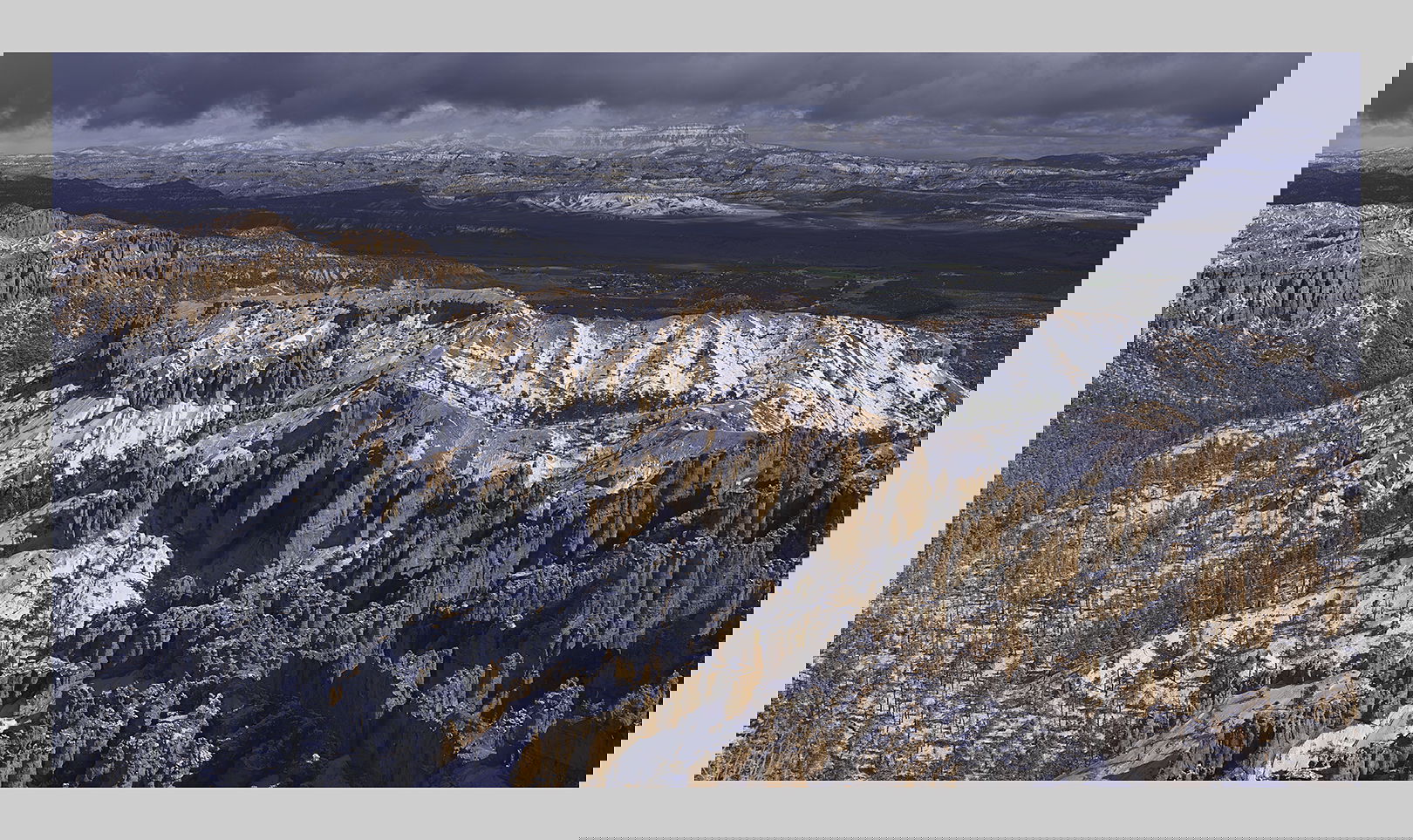
After reading Tony’s comments about the absence of grand landscapes in being recognized I felt somewhat guilty. Fortunately I had stumbled on one of my older images this morning and was taken aback. The view and experience was incredible as I recall. Obviously I lucked out. It has just snowed and clouds still hung over the scene.
Specific Feedback
Don’t know what to ask for in this case. I don’t see any issues other than that I took this from a platform with other visitors. Actually Bryce is usually shot with stronger oranges. Do you think I should do that?
Technical Details
GFX50R, 32-64mm, f/8.
Critique Template
Use of the template is optional, but it can help spark ideas.
Vision and Purpose:
Conceptual:
Emotional Impact and Mood:
Composition:
Balance and Visual Weight:
Depth and Dimension:
Color:
Lighting:
Processing:
Technical:
This is a beautiful shot of a beautiful place, Igor. It kept me looking for quite a while.
I wonder if the rocks should be a little warmer. The answer may well be no. There’s a small bright spot in the lower right that keeps distracting me; you might consider deleting that.
Hi Igor,
I had to look twice when I saw this was yours as I am so used to enjoying your more intimate landscapes. This is a grand view for sure. The light is quite nice and I like the diagonal placement of the rock formations as they do a wonderful job of directing my eye into the scene. I am also enjoying the shadows on the landscape as well as they give the scene a nice sense of depth. For my own personal tastes I could see the formations as being a little more red.
Beautiful image of a beautiful place, particularly in winter. I was just there in Fall and it lacks the contrast that you get in the winter with white on orange.
I think the oranges could be brought out a little bit more. It seems just a tad flat to me but I also think the whites might have a little more room for brightness although I have not brought it in to PS to see the histogram. I could well be wrong.
The shadows look great as they can sometimes go very dark here. Well done. If you have any more canvas at the top with more clouds I’d love to see more from the top. It feels slightly cut off.
By the way, congratulations on your first place landscape win with a beautiful intimate scene. Maybe my all time favorite of yours.
Yes, I’d love to see more grand landscapes posted in the landscape forum. I know @Tom_Nevesely had mentioned this just this year. I think almost every intimate scene is unique and has never been photographed before making them maybe a little more interesting but I still love a really good grand landscape scene. Maybe we’ll get some more GL posted this year.
I think there quite a lot of grand landscapes posted in the forum. The moderators may not have made their choices based on the type of image as suggested/implied. It’s interesting to me however, that whenever friends ask me for a print it’s always of a grand landscape. I think it’s because they want a reminder of what the subject looks like rather than an image itself. It’s kind of a disappointment for me actually because it means they ‘don’t get it’. But I don’t tell them of course. I used to be a David Muench admirer myself at one time.
@Igor_Doncov I really quite like the dichromatic effect of this photograph. Everyone knows what the brighter more saturated colors of this area look like. This is a very interesting new look at the scene. I wish I had thought of it when we were there. Of course, we had no snow to contrast with the rocks. Altogether I find this a wonderful photograph and would love to see more scenes taken in this direction.
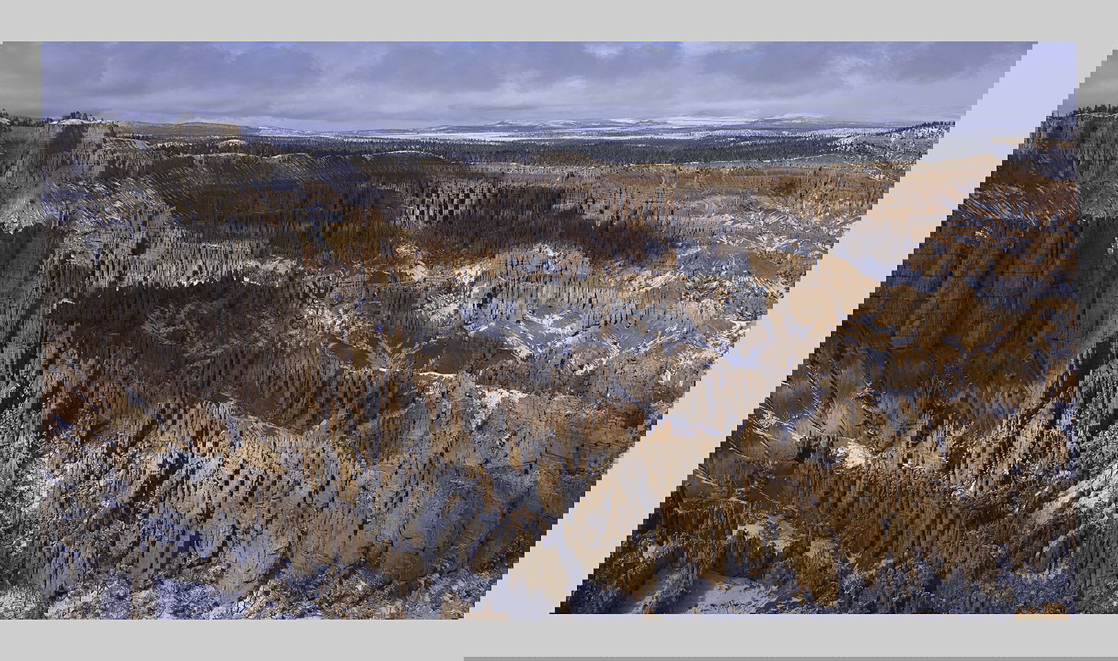
Done. I also took this one at near the same time. Here I wanted to concentrate more on the spires/hoodoos. This is all pretty much unprocessed except for the profiles supplied by Fujifilm. I’m sure these could be ‘improved’.
Nice example of a grand landscape. Having been influenced by seeing thousands of images of Bryce, originally I wanted more orange in your photo. But it has grown on me. Pleasing color palette. Was this the actual colors or a conscious processing descision on your part? Looking at the trees, it looks like you just desaturated the colors.
Igor, that is one very beautiful photograph. It has so much detail that I could easily spend a long time with it studying every part of it. The colours are vivid but not so much that they distract from the image’s content. I like this very much.
On the topic of grand landscapes, I think they tend to resonate more with the general public because they are immediately accessible and easy to appreciate for most people. Intimate scenes can be just as beautiful, or even more so (depending on your tastes), but just as the photographer must learn how to see them in order to photograph them, the viewer must also learn how to see them in order to fully appreciate and understand them.
Igor, the irony that you are posting a spanking good grand landscape and I just posted an intimate photo is not lost on me.
I enjoy both grand and intimate landscapes. What I chafe at is the not uncommon insinuation that grand landscapes are not artistic and that grandeur and beauty are not enough to make an image desirable. For me, I enjoy photography the most when I follow “this above all: to thine own self be true.”
One thing I would like to point out, for both grand and intimate landscapes, it is exceptionally frustrating as Moderators that we have to toss some really good photos out of consideration for Weekly Picks because of this (from the FAQs):