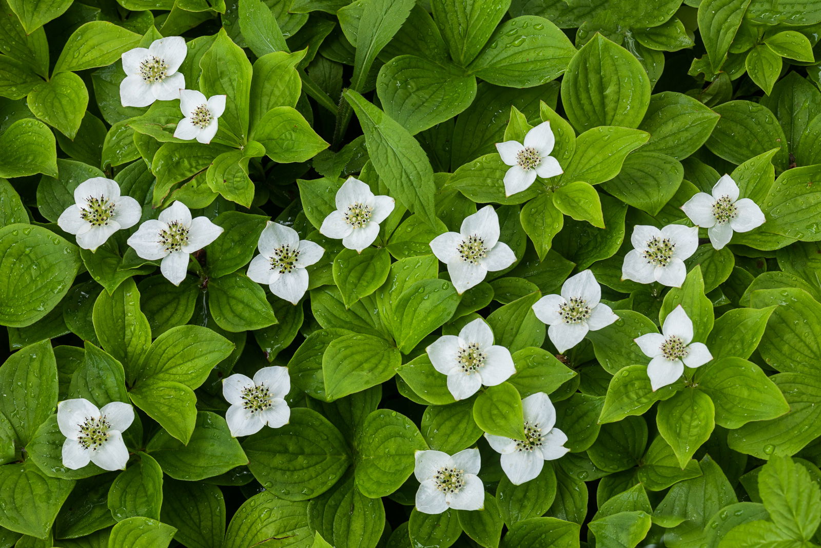
A view of a bunchberry patch taken on a rainy day during our June 2019 NPN meetup in New Hampshire. This image was taken about 10 feet away from where @Michael_Lowe was standing when he took his recent Editors Pick image.
I’ll keep this simple, do you prefer color, B&W, or both, and why…
What artistic feedback would you like if any?
Any and all comments are appreciated
Pertinent technical details or techniques:
Canon 5D MkIV, Canon 100mm Macro lens, ISO 250, 0.3 sec at f16
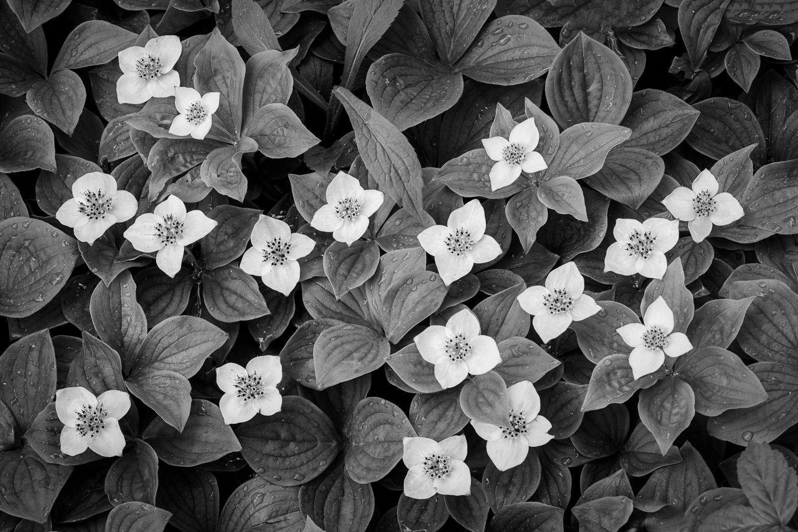
Ed, count me in on the color too. In the B&W the blooms tend to get a little lost. You really got some nice DOF at f16 to have it all sharp. And since you’ve shot downward, for me I think this would work better as a vertical. Just my opinion, but the horizontal for some reason has a “studio” feel, maybe because of the centered framing? Oddly enough though, the vertical doesn’t give me that same impression. This of course is purely subjective. Overall a nice take on these little gems.
@Kathy_Snead@Harley_Goldman@Bill_Chambers@Bill_Leggett thank you all for you comments and input, they are appreciated. I guess color rules the day here, and it’s my favorite too, but I’m thinking of some other things to make the B&W better, such as making the green leaves darker while retaining highlights on them.
@Bill_Leggett, I see what you are saying about a vertical comp, if I was trying to emphasize the flowers more I think that would be the way to go. In terms of my own goals for this image, I was actually trying to make this more about the leaves, I love their shape and texture, and the water drops on them. So I went horizontal and wide to show as much of the leaves as possible. If I was trying to emphasize 3 to 5 flowers, a vertical would be the ticket though.
Ed: As an unrepentant color junkie I do prefer the color but agree that darkening the leaves and giving the conversion a bit more contrast and punch would be a worthy experiment. Marvelous intimate scene superbly captured.>=))>
Ed, I missed this one (in Floral) but wanted to offer my 2 cents. This is very close for me because I love B&W so much. I will reluctantly concede the color is my choice but not by much. I could be swayed to the B&W with your rework and will look forward to it.
This has wonderfully sharp and processed perfectly.
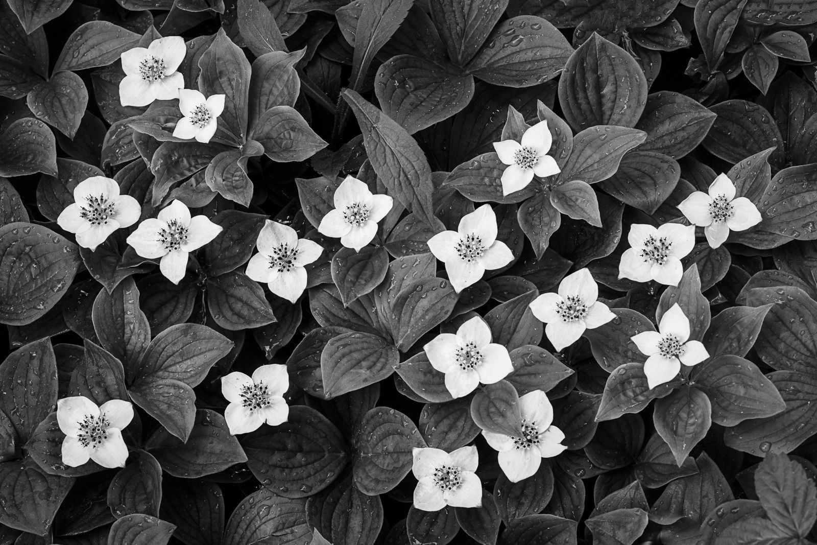
@Bill_Fach@Alan_Kreyger thank you for your comments guys. Here is the experiment as discussed by Bill with darker leaves and increased contrast. I think it is better than my prior B&W conversion, but I do still prefer the color version. At least in this B&W rework the white flowers stand out better against the darker leaves,
Ed,
This is a close call especially with the reworked B&W version; but I have to go with the color due to those lush green leaves. I wish I had been paying attention to where I was going as I missed out on these beauties. As many times as I have been to Maine and New Hampshire I still have no bunchberry images. Maybe that should be on my white whale list. The large version is a real treat with those raindrop laden leaves.