Critique Style Requested: Standard
The photographer is looking for generalized feedback about the aesthetic and technical qualities of their image.
Description
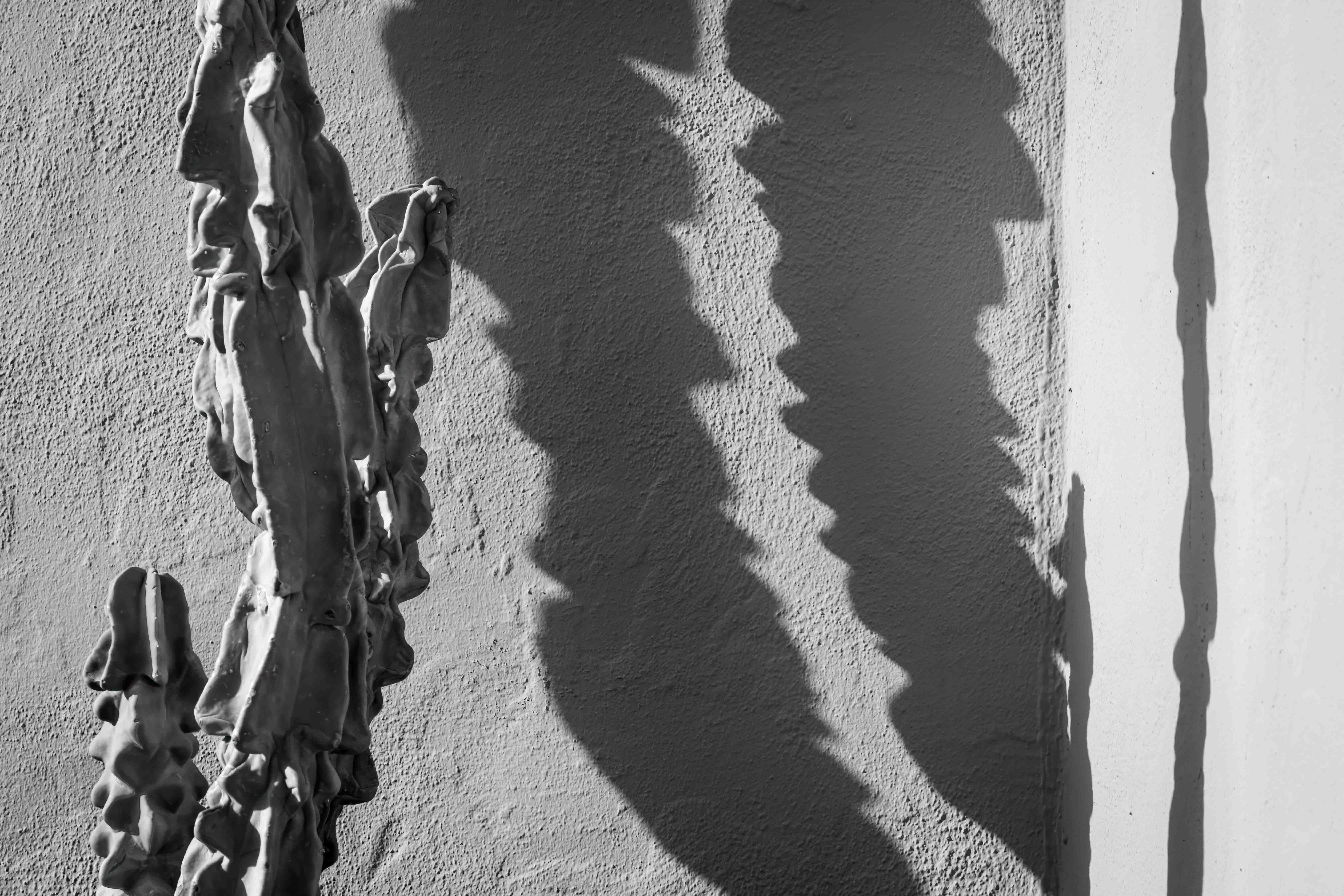
The shadows drew me to this one. They upstaged the cactus.
Specific Feedback
Is it interesting?
Technical Details
ISO 400, 158mm, f/11, 1/640th. Routine processing.
Critique Template
Use of the template is optional, but it can help spark ideas.
- Vision and Purpose:
- Conceptual:
- Emotional Impact and Mood:
- Composition:
- Balance and Visual Weight:
- Depth and Dimension:
- Color:
- Lighting:
- Processing:
- Technical:
Good Lord Don. I open the lap top go to NPN and this popped up. Caught my attention !!! So Cool and So unique… The Light and the Texture and Tone is just so COOL !!! Edward Weston would be proud. Works perfect in B&W…
Gill, it’s very gratifying to know that this one grabbed you. Thanks.
Definitely an interesting composition, Don. And you’re right, the shadows upstage the cactus completely. I’m a bit unsure about the brightness of the wall on the right. It tends to pull my eye in that direction a bit more than I find comfortable, but I’m unsure how it would look toned down a bit.
Thanks for the comment, Dennis. It’s helpful. I tried darkening the wall a little bit but I didn’t like it as much. I don’t think I mind having that area be the center of attention.
Don,
Kudos for spying this one. This is quite the eye-grabber. And for me, for some reason I’m glad you included the bright wall, and shadow on the right. I think without that, despite the brightness, the photo would be rendered down to almost just the classic, “me and my shadow.” But that secondary shadow really elevates this.
I agree B&W is perfect for this. Beyond that decision, the rest is all personal choice. I could see a darkening (more contrast) in the center shadows. As far as the wall/shadow on the right, I think also you could boost the contrast. In PS/ACR with the Texture/Clarity and other manipulations, I think you could bring out more texture on the right wall to help compensate for the brightness. But this is just as I mentioned, personal choice on how you want this presented. But for sure, this has the makings of reaching towards that Weston type image.
Beautifully seen and captured.
Lon
Thanks, Lon.
You’re suggestions all make sense. The walls on the left and right are identical. The one on the left gets sunlight coming in at an oblique angle, which brings out the texture and lowers the luminance. The wall on the right gets direct sun and there are no shadows other than the cactus. So there’s no detail to bring out on the right. And I don’t know that I’d want to.