Updated with suggestions:
Original Version:
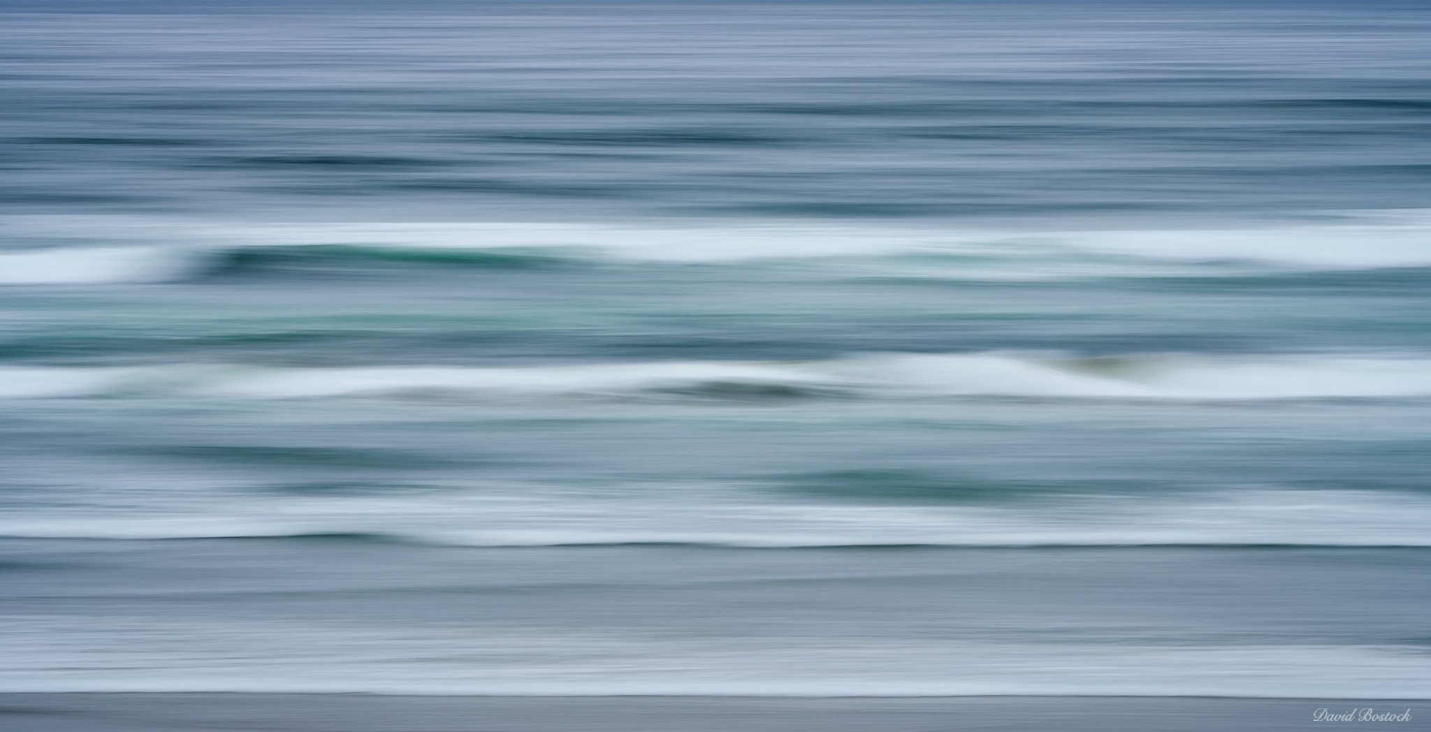
I knew when I went to the coast last week that the waves wouldn’t be all that great, but wasn’t expecting them to be quite so wimpy…and the light was rather soft too. Anyway, since I was there, I tried some ICM pano movement. I’ve been sitting on this one because I don’t want any emotional attachment skew my objectivity. So far, that hasn’t worked so I’m asking for your input. Simply, does this work at any level?
Specific Feedback Requested
Any comments appreciated.
Technical Details
200mm, 1/3.1 sec @ f/32, ISO 100.
I read about another photographer shooting at f/32, but the diffraction is just too much so I won’t be doing that anymore.
Hi David. Great job in getting those lines under the challenging light conditions. I would crop off the sky in this one.
I find that with ICM wave shots there are so many different directions you can go. It all depends on the look you are going for. It looks like you used a tripod, which is good if you want clean lines.
I usually use a tripod for mine but sometimes throw in a few handheld shots to see how they turn out. Besides having the right type of light you are looking for, the 3 most significant variables are your shutter speed, how far the camera is from your subject, and how fast are you panning. 3secs is a long time for me. Most of my shots are around 1/5 s to 1.0s.
You could try sticking to 1sec for a few shots and just vary your panning speed.
I have a few ICM panning shots in my gallery and shop on my website. If there’s a particular look you like with any of the images, I can let you know what my settings were.
You’ve got some nice hues in this image, I would try to bring those out some more.
Hi David, kudos for trying an ICM technique on the waves. The do like the motion captured here. Sounds like there were some challenging conditions for photography. As Andre mentioned, I would crop out the sky and bump up the exposure in the midtones. There are some nice horizontal lines in the waves especially the upper part of the image. My recommendation would be to try some free hand captures with a longer focal length to isolate some of the waves.
@AndreDonawa and @Alfredo_Mora thank you for your comments. Here is a version incorporating your suggestions:
Andre, that was not a 3 second shot, but a 1/3rd second shot. Just for clarity. 
@David_Bostock . Sorry, missed the 1 
1 Like
Hi David,
I really like the colors (darker steel blues and a few steely greens) and the lines in this one. I agree with others on cropping of the sky and your final redo does that nicely. Is the redo toward the bottom is the same as the the one posted above the original? I like that new trend, posting redos at the top so those coming later can see where you are now with an image. I’ll do that in the future. It’s very helpful.
The increased mid-tones in the final version add to the striations in a really nice way (at least I think that’s what achieved the effect, but perhaps simply removing the sky made them more prominent?) I’m always amazed out how much more of an emotional response I can have to an ICM scene compared to a grand landscape. Maybe I just got jaded by dramatic scenes with direction foregrounds and eye-popping color in good light. Maybe it’s just that ICM is kind of where I’ve had most success most recently. Either way, it’s not just you. This one is very nice.
ML
1 Like
Thanks Marylynne, I appreciate your comments. Yeah, posting your redos at the top also makes them the new thumbnail that gets displayed.
I’m still on the fence with this image so will let it brew for a while.
I like the soft gray-tending-to-blue-and-green palette in this image and you did really well with the panning. Don’t see any real problem with diffraction? For me, the sense of space is heightened in the original version and I enjoy letting my eye travel to the horizon line and up into the sky whereas in the cropped version it feels like my eye “hits a lid”, though the sense of rhythm is enhanced in the crop. Purely a matter of taste and vision. Finally, I really like how you’ve managed to captured the foaminess of the waves crashing on the shore in the very foreground.
I missed seeing this one David. I love ICM of trees, and of waves. I really like what you did here, and agree that focusing on just the waves (removing the sky) helps keep the theme of horizontal waterlines going. This is just simple and elegant. Beautiful job!
David,
A little late, but I couldn’t let this one go. Really enjoy this one and I especially think the repost nails it. Just the one simple act of cropping the top - the removal of the sky layer, actually made a significant difference in making this more abstract - rather than blurry wave lines - if that makes sense. You could even go a step further and crop the bottom to remove the somewhat “real” foam line.
Does it work? Absolutely. I do also like how the contrast helps define the swells of the waves, yet keeps things on the abstract side. Well done!
Lon
Well done! I really like the different blue/green tones going on here. Very moody. I think an abstract is well done when you can kind of tell what it is, but you still have to look at the photo a while to really be sure. You’ve done that here.
1 Like
@LauraEmerson, @Mark_Muller, @Lon_Overacker, and @David_Johnston thank you for the nice comments. I really appreciate them. This one is still hovering between good/ok for me…will let it percolate some more.
Very late on this David as I’ve been on a 4 week trip with the family and almost completely off grid. I think both versions work but if this is meant to be an abstract then cutting off the horizon is best. However, I’m with @LauraEmerson in that I like how my eye goes up to the horizon in the original and it also gives it a sense of place where the cropped version is very abstract. The colors work really well and the horizontal lines are parallel which is tough to get when photographing waves. They almost always seems to skewed a little bit. The small waves worked to your benefit here David.