What technical feedback would you like if any?
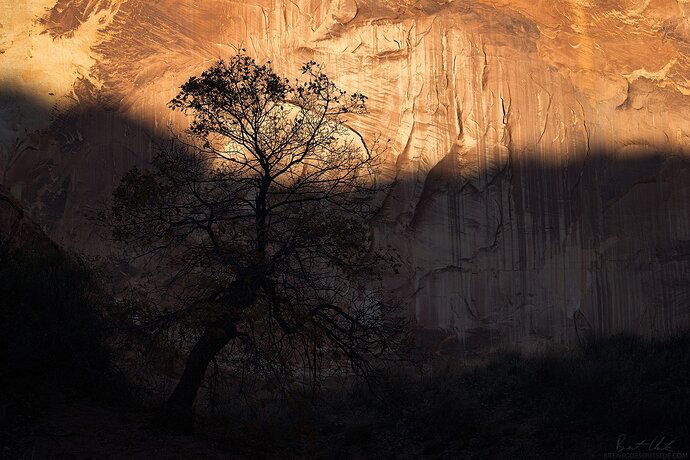
Any and all. Please view on a calibrated monitor - the shadows are quite sensitive and should still have detail in them.
What artistic feedback would you like if any?
Any and all. This is one of those images that I personally really like, but doesn’t seem to be as popular with others (I know everybody’s got those). To me it’s fairly unique and represents the ending of a great experience I had. I would like to know if this resonates with anybody, or if it will remain more of a personal image for me 
Pertinent technical details or techniques:
(If this is a composite, etc. please be honest with your techniques to help others learn)
ISO 100, 86mm, f/11, 1/80 sec
If you would like your image to be eligible for a feature on the NPN Instagram (@NaturePhotoNet), add the tag ‘ig’ and leave your Instagram username below.
@brentgoesoutsidephoto
You may only download this image to demonstrate post-processing techniques.
1 Like
Brent,
I like it. I too have images likes this - not only ones that I like that others may not - but also images in concept like this - half shadow, half light… (Think El Cap…)
I think you’ve bridged the gap between light and shadow with this tree beautifully. The range and processing handled quite well also. What is subtle and most interesting to me is how the light and shadow are reversed between the wall and the tree. Not sure if I can explain. In the upper section where the light is striking the wall, the treetop is a pure silhouette. Contrast that with the shadowed part of the wall where the tree actually has detail and much less of a silhouette. Not sure if that makes sense.
And yes, I see enough detail in the ground and enough to anchor the composition. Perhaps I could see a skosh more room below the tree, but that’s pretty insignificant…
Well done.
Lon
I like it Brent. I love the layered transition from the darker foreground to the light on the wall. But I think like @Lon_Overacker I would want to see just a touch more detail in the darker foreground. But that is definitely personal preference.
I like the concept and comp, but the contrast is too high, IMO. The detail in the level of detail in the lights differs too much from the level of detail in the darks, and so the eye doesn’t venture into the darks as much. I think there needs to be more in the darks to pull our eyes there.
Thanks guys, I appreciate it! I believe this image is uncropped so unfortunately I can’t give it a lot more room at the bottom, unless I stretch just the bottom. That might actually be a good idea to match the space at the top above the tree.
I can try playing with the contrast again. I think I was just in a certain mood about contrast back when I first edited it 
@Lon_Overacker do you maybe mean something like one of these optical illusions? The gray is the same but we perceive it differently because of what its surrounded by.
1 Like
My first reaction was: crop. Then I looked again, and thought, well, I can see why it is all there, but then, how about a square crop? If that is allowed in the way you work. So much depends on that. I like the idea of the moment the light fades. Canyons lose the light so fast. So work on the dying of the light.
1 Like
I can see why you like this. Number one: it’s a very special moment in canyon country that many experience. It also has a fine composition. The tree is marvelous and it’s background is as well. But I have to agree with Mr Kuyper that it’s too contrasty. The shadows, in particular, need to be raised.
1 Like
For what it’s worth: I love the image as is. I can see enough detail in the shadow and lifting the shadows imo would make the shot less special. I love it!
Grt, Ingrid.
1 Like
![]()


